Small Details

Can you provide any examples of how small details will look from this machine ( basic machine and pro)? Maybe show any examples of what the smallest details are that you have produced from a GF. Whats the smallest font size you could produce with the both models. Thanks!

2 Likes

I don’t have any “smallest” designs handy, but for reference, the beam is roughly 0.008" in diameter, and the laser can move with 0.001" accuracy.

So quick google math says that is about 0.2 mm. For reference, a 1pt stroke in photoshop or illustrator would be about 0.35mm tall
(general reference: don’t use these figures for anything mission-critical. I don’t always math so good)

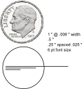
So I am trying to wrap my head around this. What kinds of resolution is possible with engraving letters or musical notes? Lines, kerfs, cuts. We will have to see. Depends on materials type and thickness. Focus, power. Lots of things we will have fun figuring out. In the meanwhile, I tried to come up with some visualization of this. Please correct me if I am on the wrong track. I made three lines, 1 inch, 1/2 inch, and 1/4 inch in length. There is a circle around them that is the size of a US dime, or .705 inches. Included is a picture of said dime scaled to .705 inches. The font is 6 point. The lines are spaced 0.025 inches apart on center and the width of the lines are .008. How this scales in the real world, I don’t know. But at least it gives me some practice in Inkscape. Excuse my Imperial measurements. Will work on metric for the enlightened folks in other countries.

I really don’t know how this translates to engraving with a laser. That part is new territory for me. It will be something to do with resolution, and how it is defined… i suppose.

My math above was based on typography and using point measurements, because that is how I design for print in illustrator. Typography is a whole field of in and of itself, but essentially there are 72 pts in an inch.
So a 6pt font would be 0.083" or 2.11mm from tallest ascender to lowest descender. But fonts are all different…

An extract from wikipedia: Point(Typography)
“In metal type, the point size of the font described the height of the metal body on which the typeface’s characters were cast. In digital type, letters of a font are designed around an imaginary space called an “em square”. When a point size of a font is specified, the font is scaled so that its em square has a side length of that particular length in points. Although the letters of a font usually fit within the font’s em square, there is not necessarily any size relationship between the two, so the point size does not necessarily correspond to any measurement of the size of the letters on the printed page.

How digital designs scale in the real world has to do with resolution of the device that brings it into the real world: DPI (dots per inch) for print (…and maybe for lasers too?) and PPI (pixels per inch) for screen (although the terms are very often interchanged). You were working in inkscape, you made a circle with an exact size, but at what PPI (or DPI, i don’t know what inkscape calls it). Then maybe you scanned a dime, or found a photo of one online… maybe at a different resolution? That would explain why you had to scale it to fit a circle you had designed to be the correct size.

Hope I clarified more than I confused!

Yes. The whole pixels and points and ems is a fascinating thing. Really cool how each trade has its own measurements and descriptions. I spent a while trying to understand leather terms the other day and came up with a whole new meaning of “irons”. Then trying to figure out how it’s going to look on what resolution monitor or what resolution printer. My idea was to give a real world scale of what 0.008 would look in respect to a familiar object. The viewing medium transforms it but with the dime as a reference you can understand what a line might look like. So for example a 6 pt text block is pretty small and I wonder if the GF would engrave that small and still be legible. Maybe. But just barely. So one thing I’ve been thinking of is doing a wooden matches box, like the old time cast iron or sheet metal that you’d have for kitchen matches. It would have a trough at the bottom and then slots on the side for the striker paper. I bought a couple boxes to do some measuring with and then thought that the matches are about .110" thick for the wooden sticks. Could the GF engrave lettering on the side of a wooden match stick and still be legible? So we could use tongue depressors and that’s fine. We could use paint stirrers and that’s fine. Wooden carpenter pencils will be so cool to personalize. And Popsicle sticks would be great for engraving lettering or fancying up. Some type of Jenga/pickup stick/I don’t know what game. We’ll have to think of how to use them in a game. What is the next size common cheap wooden material that we could letter or decorate? Chopsticks have been done. And smaller? Wooden match sticks. And smaller? Flat toothpicks. So no, you didn’t confuse. You provoked more dreaming. Part of my work was just to refresh how to constrain lines and shapes to exact positions and sizes. Inkscape is very precise and you can choose any unit of measurement you want. I now have a better feel for miniscule dimensions.

I think it will be material dependent as well (especially for cutting). The laser focal point is where the thinnest part of the cut will be. Above and below that it spreads (it’s defocused). That yields a wider kerf. For a cut I try to set the Z axis so that the middle of my material thickness is at the focal point to yield the most consistent cut. For marking or light engraving I set it so the surface is just a hair above the focal point. But to be honest, there’s got to be some slop in what I’m doing as we use manual gauges to set the head to material heights & then I use a machinist rule to tweak the Z axis adjustment. It’s not as precise as it might sound when talking about .008" tolerance :slightly_smiling:

Not sure if that’s the way the GF will operate though and what the focus range will be (how fast it shows defocusing as it gets closer or further from the focal point).

Definitely depends on the material and settings. For example, the titanium has an effective spot size much smaller than the beam diameter because the power distribution across the beam is Gaussian. Only the center of the beam is strong enough to penetrate the material, so the spot size ends up being about half the beam diameter. Conversely, if you’re really cranking on wood, you can get markings that extend well past the edges of the spot.

We have a lot of optimizing to do.