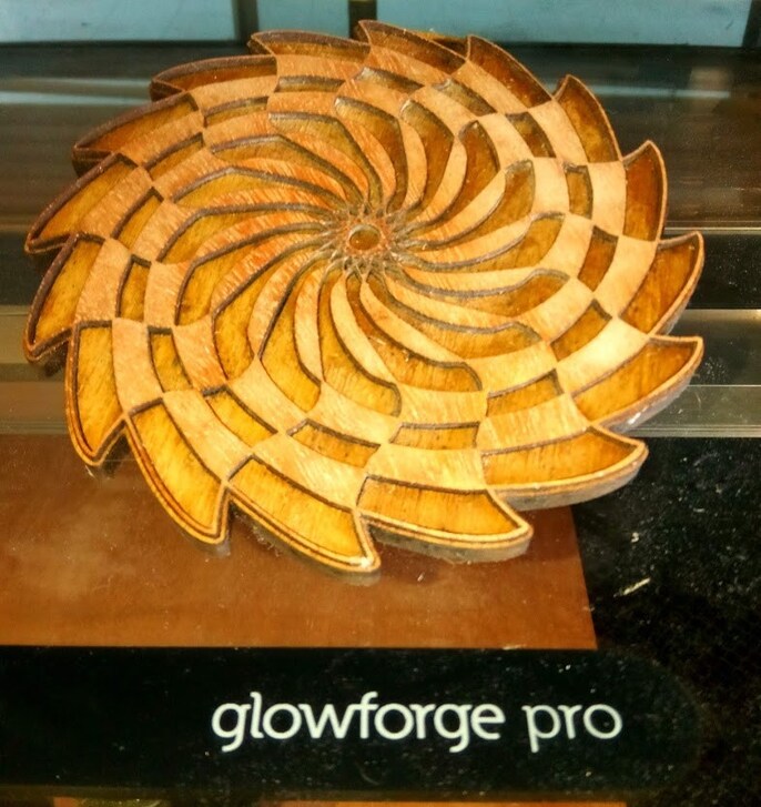
Oh, how disappointing! 
5 Likes
Yikes!! The good news is you have the files and experience assembling - and the weekend is here.
4 Likes
OK, so I didn’t want to say anything earlier because that’s really great work, but…
… now you can focus on perfecting the layer alignment errors you had when assembling the original!
It’s an opportunity!
4 Likes
If you slightly engrave the design of the layer above on the layer below they will snap into place easier and depending on the Glue job may be stronger, If you then engrave a round piece of wood like oak then if it drops is much less likely to break.
4 Likes
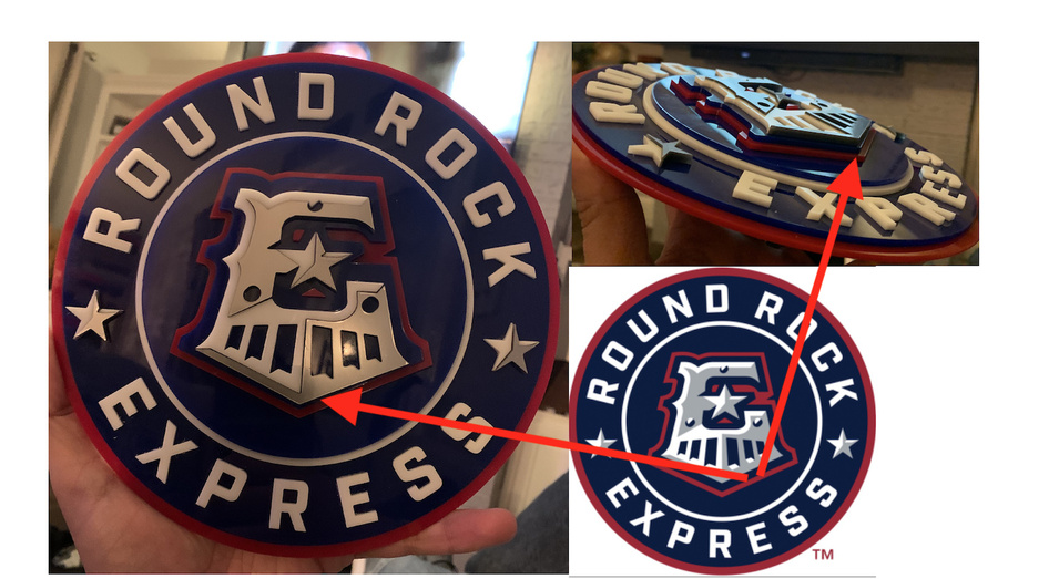
Dang it! I knew it was off!! Do you mind pointing out what you see? Brutal honesty is how I roll! 
1 Like
Already started!!!
1 Like
Great idea! I have been scoring the outline and leaving the paper one to help with alignment.
I will try this suggestion! Thanks!
1 Like
That is what I did here and the upper layer is over halfway sunk into the lower layer, and even the very thinnest bits are strong as a result…
2 Likes
I didn’t really want to like this post. What a shame…you must have been so disappointed.
1 Like
I approve.
2 Likes
Looks good to me. Your alignment looks spot on!
2 Likes
Along the lower edge of the E? In the first pic, I thought it was just the angle of the pic, but from the side-angle, it looks like those layers are not spaced correctly.
4 Likes
I too looked at this with slitted eyes for clarity and see the same thing.
2 Likes
Beautiful!
2 Likes
Looks great, good luck on the second one. I also live in Round Rock, just a block north of OSP, and my pup and I catch games whenever there’s a dog day. 
2 Likes
It’s totally 3Dish!! It looks fantastic!
2 Likes
Great job on the first pass (sorry about the breakage!) Hope the second iteration comes out even better!
3 Likes
I had similar problems with letters
I ended up taking the base-plate into my XCARVE
engraving a 0.5mm well for each letter
leaving a “button” in the middle so the letters “snap in” nice and tight.
Also, Using Acrylic cement and scoring the backs of the letters allows them to “fuse” together. One could play hockey with a piece that is cemented, locked and inlayed.
PS: that crack is fixable!
https://www.google.com/search?q=Acrylic+cement
a little go’s a long way…
Might want to take a peak at this too: “Novus 7100 Plastic Polish Kit”
https://www.google.com/search?q=Novus+7100+Plastic+Polish+Kit
3 Likes
That looks really cool, Rahmin. I’d be proud to display that anywhere.
Curious why you chose not to cut the inside parts of the “E” on your blue layer. From the photos it looks like you went through the extra trouble of adding the red triangles back in. Is that just a trick of the photo, or is there a design reason for that?
A second point of consistency…there are three circles on your logo: one above the “E”, and two flanking the cow-catcher. The top one (white) has the 3d “notch” in it, but the bottom two (silver) do not. However, the cow-catcher slits all have the 3d “notches” included. My eye would prefer to see those notches inside the silver circles. You could even cut those out of white acrylic, if you wanted to stay consistent with the trademarked image.
Overall, outstanding logo, thanks for sharing!
3 Likes
I was totally wondering that too! So glad someone asked.
1 Like