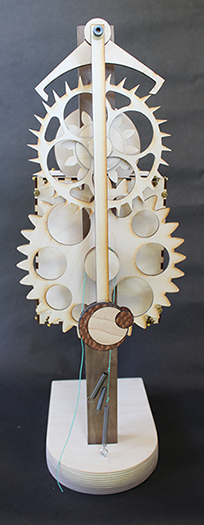
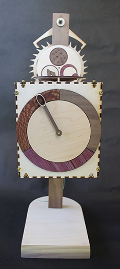
As a data visualization project, a graduate student, Rebecca Gellman, and I decided to make a clock that instead of telling time told you how sick you were and exactly where you were along the illness pathway. We made a clock using real data from our work on malaria infections. The way this thing works is the clock mechanism on the back side is regulated by a pendulum, which looks like a malaria parasite. The escapement wheel drives a circle that shows how parasites cycle quickly in the infection. The inlays on this circle are cartoons of the various parasite stages. The large wheel drives a clock hand that shows the progression from sickness to recovery and back to health. The circles on top of the box are symptoms that change over the course of the infection. These are driven by cams in the box. Notice that the circles flutter in a wave-like pattern. This is the point we wanted to get across, that when we get sick, there is a wave of events that passes through our biology. Neither of us had built a clock before or really understood how one works, though we could both tell time.
It works. This version of the clock takes only 20 seconds to run; who wants to look at the clock for 20 days to see its real run time. All of the laser cutting was done using my Glowforge. We used a drill press to put holes into the main support.
The purpose of this model is to make us think more about the biology. The clock shows us how one infection works, but the infection is different in different people; so we need to make more clocks. The mechanism is pretty simple so there is no feedback, because we didn’t want to build a mechanical calculator that would actually calculate the value of each variable through time.
You can see it run here: https://vimeo.com/270007817