What the Font: 
8 Likes
“I’ll take things that cost as much as a Glowforge for $200, Alex…”
I was reading this thread before heading out for lunch to the best taco truck in town which is in the parking lot of your typical college town liquor store. They have aisles and aisles of Caramel Apple Arbor Mist, and this one little case at the front of the store with these gems:
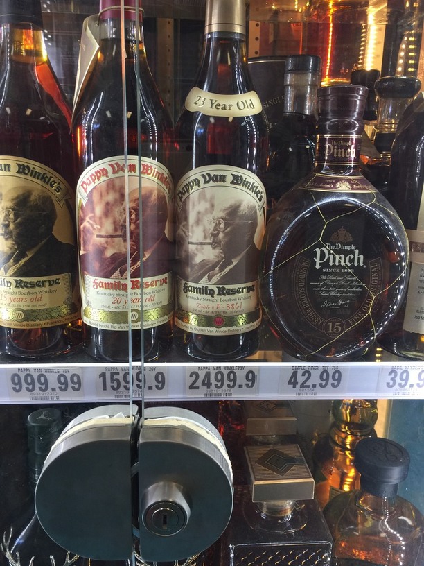
I can only imagine they carry them in hopes of also selling a winning lottery ticket.
8 Likes
I saw it on a menu and we asked the bartender about it. They said they get 1 bottle a year and they always sell out of it by the end of the year. Supposedly the best bourbon on the planet. It’ll be the single most expensive drink I’ve ever had or will likely ever have, and you only turn 40 once!
3 Likes
What did you find? It was indeed hand-drawn.
1 Like
Bespoke.
http://www.dafont.com/bespoke.font
(actually it’s a little more squished than the GF font, but kind of close)
1 Like
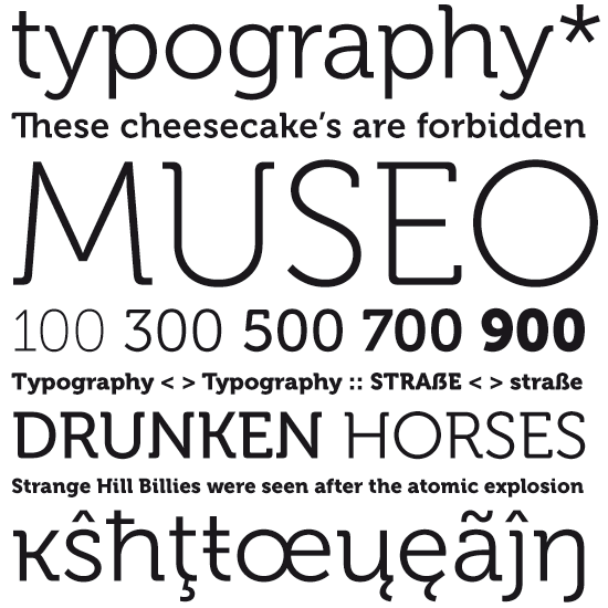
Sorry, wasn’t clear. I meant it was a custom made, bespoke lettering job, not the name of the typeface. It’s resembles museo.
5 Likes
ROFL! Font _(con)_fusion! 
Never mind…
(museo is a better match)
4 Likes
We actually use Museo in some of our designs. At least, it’s in the list of design fonts, so I assume @tony put it somewhere. 
5 Likes
Whatever fits your space I guess. We like our front loader. http://m.thesweethome.com/reviews/the-best-washer-and-dryer/
1 Like
We must be one of the few UK households that has a top loader (they’re seen as a bit old fashioned over here and are quite hard to get hold of), but with three kids below 15 years old, the cleaning power of a front loader just doesn’t compare.
3 Likes
Lots of graphics artists will start with a stock font, kern the heck out of it, convert it to outlines, tweak the curves and/or points between letters… but usually it just starts with a stock font. This is especially true when it comes to single-purpose logos, like a brand logo.
Wouldn’t surprise me at all if it’s all just Museo “with flourishes”.
5 Likes
This is truth.
Source: I dabble in graphics design and have done this on numerous occasions. 
4 Likes
Back to the root topic, I for one welcome our light-sabre wielding robot overlords.
4 Likes
Just tucking this in here knowing that it will come in use some day. I have a feeling that I will discover what fonts work well with a laser.
And this is my go to site for typography.
http://practicaltypography.com/index.html#toc
12 Likes
I really appreciated the link you included. Some valuable info. for me in there.
1 Like
Front loaders because they stack. And different fonts for different purposes. Still can’t get a screen that will render a real garamond properly.
1 Like
Http://Shapecatcher.com may be of interest to those in this thread. You draw on the screen and the closest Unicode characters are matched.
2 Likes
A good find. Thanks
Well, if you want your tattoo to be mysterious… ![]()
4 Likes