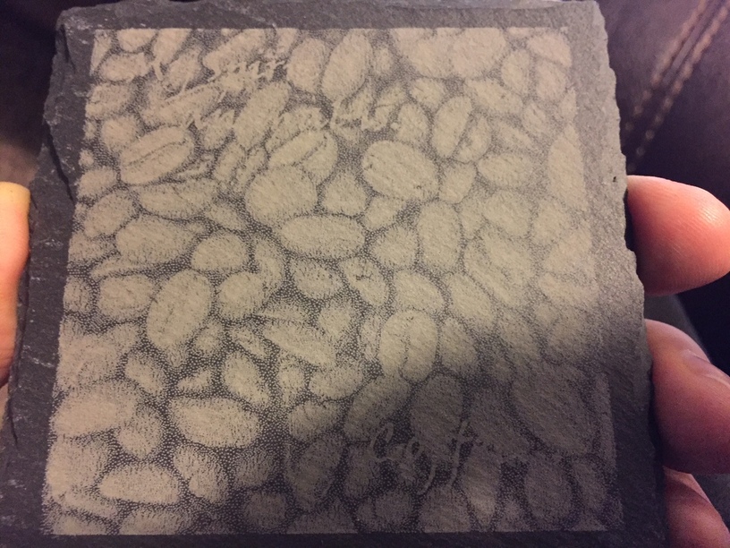
So, I went to test my first slate engrave. I planned a coaster with an image background and text foreground. I even planned for the image reversing (dark to light) from engraving slate.
Round 1: I planned everything right on the image size, but messed up the text colors.
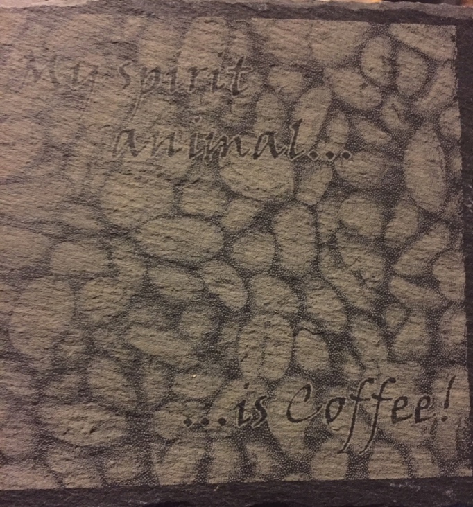
Round 3: Larger text, slight movement of components, and outlined the text for higher contrast. Pop! future versions might have slightly thicker outline to pop more. I’ve sold 2 of these, and have an order for 1 more along with 3 custom, 2 of which I will be able to reuse for many customers to come. Setting up Etsy and Youtube before the end of the weekend, I hope. Paying jobs, here I come.
I have an idea for you… with these slate squares having irregular, non-linear sides, to my eyes the straight borders of the engraved image seem out of place. How about taking your image into Photoshop or some similar app and create one of those distressed artsy borders (they look brushed or ripped) to apply it to your image. I have a feeling the result would really be to your liking. Just a thought…
Excellent thought…I will look into that for some of the future stuffs. I do have orders now, so I can do that along the way for improving the product, or at least seeing it it improves as much as we think it will.