I foolishly signed myself up to do two shows this weekend in different towns. And a lot of my inventory is already tied up sittings on the shelf on consignment at a large event (The Big E for you New Englanders). But I have a laser now! No more taped-on signs printed on paper.
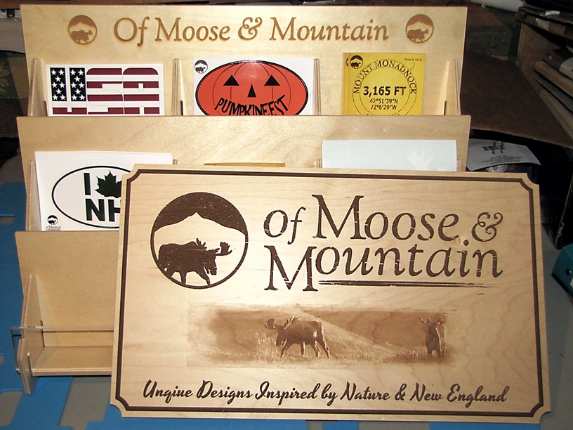
No, @Jules, I haven’t had time to design the ideal decal holder yet. So, for now, I engraved my logo on the Baltic Birch holder I bought a few months ago.
The main sign pretty much took all day today to print (as well as most of last week to attempt to print). It’s PG maple plywood. The finished size is 18" x 10.5". I still need to clean up some glue residue from the masking around bitmap image. Once I get rid of that, the photo will fade away at the edges.
This design was too complex/large to be handled as a single job at this time. I resized it down about 1/4 of the size and that would have worked. Instead, I broke the job up into multiple “prints”. I did the text first. Then I did the bitmap. Then the border. Then the cutout. It took roughly three hours total for all four parts.
Just the border would have taken 3 hours if I processed it as shown. Instead, I broke it up into two horizontal bars and two vertical bars (with the scallops). I overlapped about 0.05". This “only” took 1 hour. The difference is the laser head did not have to scroll back and forth over the whole bed for every line. After doing the horizontal bars, it went up one side (going back and forth 1/4") and then repeated for the other side.
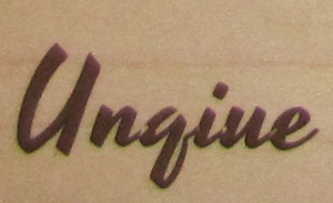
Here’s a good reminder about something I believe has been discussed on the forums. Watch out for overlapping vectors. This is especially important with script fonts where one letter overlaps the next. If you are not careful, you may get some unexpected results as I did below. I should have converted to object and combined the vectors (in CorelDraw language). It’s consistent enough across the whole tag line that I can say I did it on purpose to add some texture. I should be smart enough to know better. This is an issue on vinyl cutters, too.
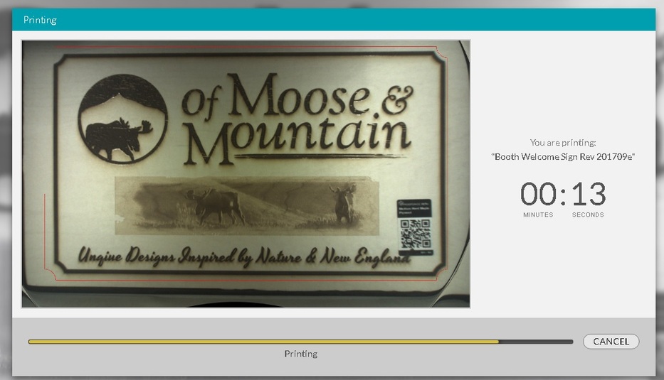
These projects were frustrating when it came to the visual alignment. I have sent an email to support to see if perhaps there is an issue with my camera. If you carefully analyzed the decal stand, you will see the text is not perfectly aligned. Similarly, in the photo below, you can see the live preview of the cut in progress (red line) makes it look like the cutout will be too far to the left. But it was (almost) perfect because I aligned it with the border vector on-screen rather than trusting the bed image.
I was just going to mention the transposition of letters in that word, too…but was trying to figure out how to soften the blow after you went to so much work to make such a lovely sign. It truly IS a great design. Thank you for showing us all.
Thanks @Xabbess! What with some minor alignment issues, I was probably going to cut the sign again as soon as I hear back from support on my visual alignment concerns.
I’m wondering what your design process was? Did you upload individual pieces of artwork (add artwork) to the UI and then align from there? Or was it all in one file and then you selectively ignored parts to accomplish the engrave?
I would think my process for this would be to set it all up in Illustrator or Inkscape, along with the embedded image, on a 20x12 artboard, text converted to outlines and manipulated appropriately, etc. and then just work my way through the components engraving them. Settings it up within the margins of the Glowforge and the 20x12 artboard would ensure accuracy for every engrave, as long as you didn’t move the material around.
I read it as proper, didn’t even notice!
We have seen those jumbled lettered words in a sentence that we can still read because we go by the first and last letters…
I had everything in one CorelDraw file with the intent of ignoring all but one element each pass. Forgot to convert text to curve.
Things got a little more complicated when I decided to break the border up into four separate pieces to save two hours of machine time. I had already engraved the words and bitmap so I “added artwork” to bring that in. And somewhere during the 4+ hours I was working on this, everything in the app shifted to the left making the outer cut line not line up anymore. Not sure if I nudged everything or if something else happened.
Focus is tough with stuff that you see every day. I spelled my first name wrong on 500 business cards. Someone pointed it out to me after about a year.
I gotcha. For future reference, even if you had started the engraves, and forgot to convert the text to curves, you should be able to leave the material in place, set up the modified file and go from that. The 20x12 Artboard setting should lock everything down in place and keep it all aligned as long as you aren’t moving components around in the UI.
they teach in proofreading that, with short blocks of text, you should read it all backwards. that helps keep your mind from filling in what it thinks it should see.
That’s good in theory but it didn’t work the first time because too much of my design ended up in the out-of-bounds area. I’ll try to adjust the design so that works when I recut it in the next day or two.
My stuff is in the NH General Store in the New Hampshire building. How crowded was everything on a Monday? I went last year on a Saturday and vowed never to do that again.
do you have guides in CorelDraw? Maybe they are called Alignment Guides in CD. You can start a 20x12 document and then place a couple of guides that will give you a visual reminder of where your out-of-bound safety margins are. You can save that as just “glowforge_template.cdr” or something and hit the ground running every time with a new project. It would also work well with the shotglass jigs that you’re making.