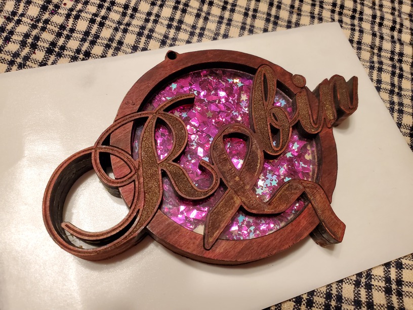
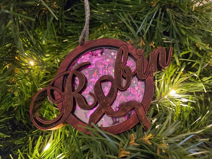
My cousin saw some of the things I’ve been making and mentioned that she always has an ornament made for her every year for surviving. So I asked her if she wanted one and what she would like, she said to come up with something and she would love it either way since it would mean more having been made by me. So I started out with a general idea of how I wanted it to look and wound up with this as my first attempt.
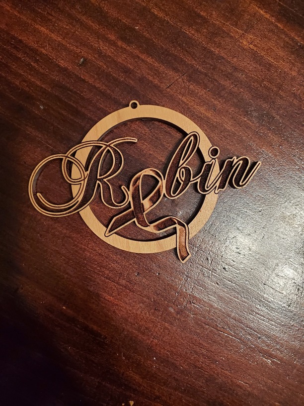
I knew I wanted the name to float free of the ring but I didn’t want detail to get lost or have a wide engraving section, so I added the score line around the letters passing in the ring. I also wanted the ribbon to have a flowing look to it so I used a gradient texture and saved it separately as a png for engraving. After I cut a sample in cherry PG, more wheels started turning.
I knew the thin parts on the end would be too weak (proved they were when heavy handedly removing the masking), so I thought about beefing up the outline. I didn’t like how it looked in the design thickened so I then thought about layering. From there I started to click that if I layered I could create an interesting background, or pour epoxy, or winner win er chicken dinner find a way to make a shaker ornament with it. Back to Illustrator I go breaking apart the design to get three layers exactly perfect. The next problem was figuring out how to make the window area without making the ornament too thick and without having acrylic show on the sides.
Ah ha! Scrap thin plexiglass (acrylic nature and not PVC) from the screen door repair caused by the dog breaking back into the house ![]() . I added an interior engraved ring on the second layer to allow the plexi to sit in just level enough to glue all three layers flush. Off to the local Hobby Lobby to buy the demon’s dust aka glitter. I searched for some ultra small ribbon confetti but turned up empty handed so I settled with what they labeled Unicorn Tears and just some pink flake.
. I added an interior engraved ring on the second layer to allow the plexi to sit in just level enough to glue all three layers flush. Off to the local Hobby Lobby to buy the demon’s dust aka glitter. I searched for some ultra small ribbon confetti but turned up empty handed so I settled with what they labeled Unicorn Tears and just some pink flake.
Turned out really well I believe and shakes nicely.
Ps thank you to whoever mentioned using a strand of garland and fairy lights, my photo looks amazing now! Way better than this…