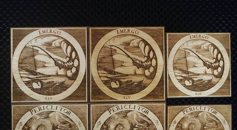
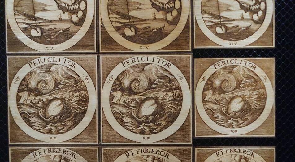
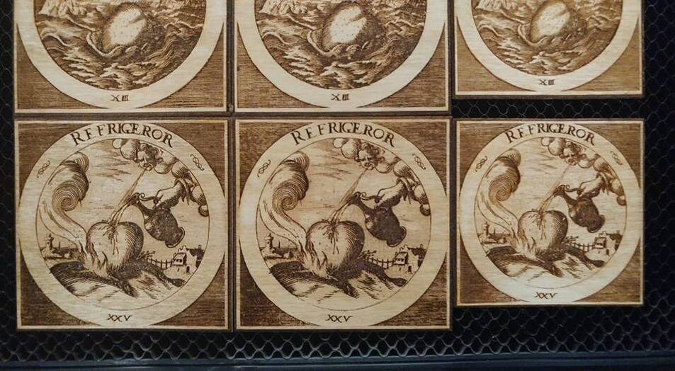
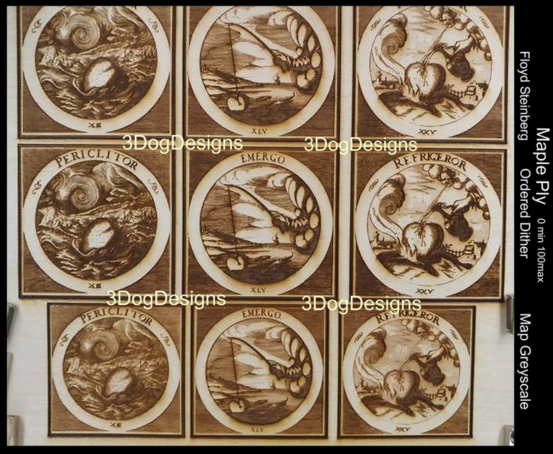
Thought I’d share a little comparison I did to see which settings to use on a project. The differences were subtle, but I think I like map to greyscale best. (My preference will likely change a few times though ![]() ) Here’s the same files on ply using Floyd Steinberg, ordered dither and map to grey. All 340 LPI and 0 min/100 max with no masking, one pass. (And yes, I was too cheap to use another piece pf ply so the last set is smaller lol.)
) Here’s the same files on ply using Floyd Steinberg, ordered dither and map to grey. All 340 LPI and 0 min/100 max with no masking, one pass. (And yes, I was too cheap to use another piece pf ply so the last set is smaller lol.)
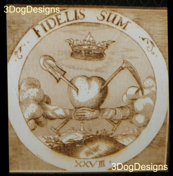
The last single pic is another in the series and I was testing a lighter version of the file. I kinda like it best and will likley do something in between the two.
Still on the GF bed and not cleaned up yet.
These are after being cleaned with alcohol. The columns are
vv Floyd Steinberg vv________________vv Ordered vv______________________vv Map grey