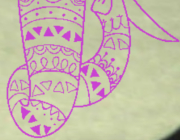
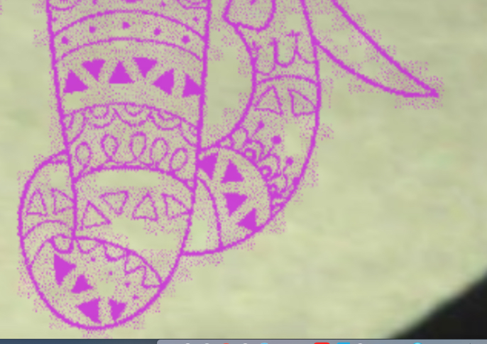
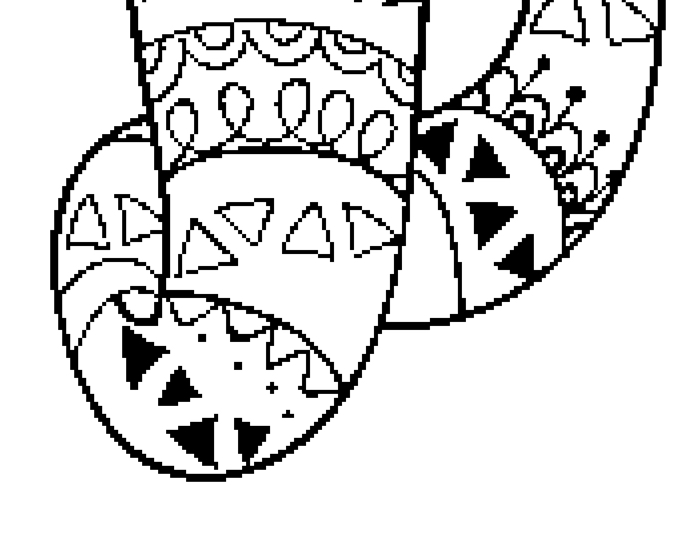
I have been trying to eliminate the noise on uploaded images (working through the tutorials in Gimp, Inkscape, etc…) I get them where they look quite clean, but when I upload them , they always upload as Draft Photo, and they still include a lot of extra grey. I have tried using the command keys (command, shift, up arrow) but it doesn’t seem to do anything. When I switch the settings to Draft Graphic, it looks much better, but then I get the warning message about the settings not being OK for medium maple plywood. I am a beginner and certainly don’t want to set fire to anything. I can’t find out why I can’t use the Draft Graphic setting on this material anywhere, so I would be quite grateful for any advice! I have added 3 pics - close up sections of the 3 files - the original Gimp file, the Draft photo setting showing the noise, and the Draft Graphic setting without all the noise.

Probably just compression artifacts in the jpeg…if you have the option of saving it as a PNG file with a transparent background in GIMP, that should eliminate a lot of that noise.
If not, and you need to completely remove the background, there’s a video here that discusses doing that in GIMP

And just FYI…the warning that shows up in when you send a file to print in the Glowforge interface is just a reminder to check the settings. If you use the defaults, you won’t see that, but you should be able to acknowledge the warning and continue with the print.
Unless you are using the trace function, those keys won’t do anything.
Yep, Jules is right. There are several message that will pop up not such much to keep you from doing something, but to double check and make sure you have the setting you really wanted. So don’t take them all to mean STOP!, take them more as “are you sure?”. Don’t be afraid to play around a little bit too. Fire is a real hazard, but if your paying attention you’ll be OK. Just don’t do something like full power, speed of 100, multiple passes and then walk away to go cook dinner. ![]() You may waste some material, but the more you practice and learn how your material will behave, the safer you’ll be.
You may waste some material, but the more you practice and learn how your material will behave, the safer you’ll be.
Thank you! I was wondering if it was the file type that was causing the issue. I appreciate your feedback (and your curating of all the tutorials!!) I am a pretty experimental person, but when it comes to fire, I am a little more cautious 
Best,
Sara
Thank you for this information!
Thank you for the encouragement to experiment. I figured it was something of a disclaimer and I have been looking diligently at all the files trying to make sense of the settings for each. Do you know of any post that clearly outlines what the difference between the photo and graphic and the SD and HD settings are? I have tried finding it, but did not have much luck.
Thank you!
Sara
![]() Me too. I’ve come close to a little bit too flamey a couple of times during early testing, but I was expecting it and watching for it.
Me too. I’ve come close to a little bit too flamey a couple of times during early testing, but I was expecting it and watching for it.
If you do see something start to catch, just open the lid for a fraction of a second and close it again. It kills the print, and is the quickest way to stop it. (If it keeps burning, unplug and start spritzing with water in a little misting bottle that you keep right next to the machine at all times.) ![]()
Thanks for the tips! Really appreciate them!
Sara
This is a good look at all the setting and what effect they have. Specifically about SD and HD; SD uses “vary power” which means the darker the color in the file, the deeper it will burn. (This happens to be my personal favorite setting.) HD uses “convert to dot” which is another way to say “dither”. The GF uses the dots to create the lighter and darker areas. (The denser/closer the dots, the darker the area.) Dithering is commonly used for photos which have more detail and higher range in tones.
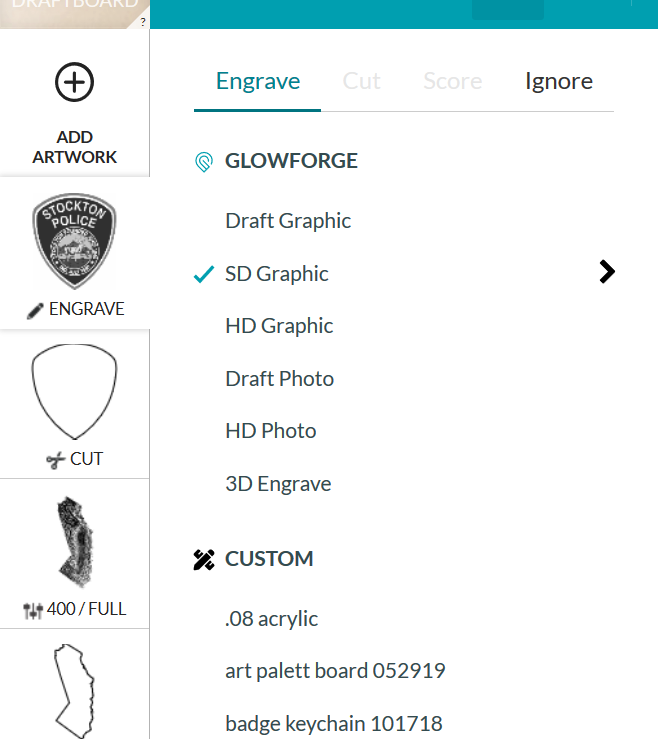
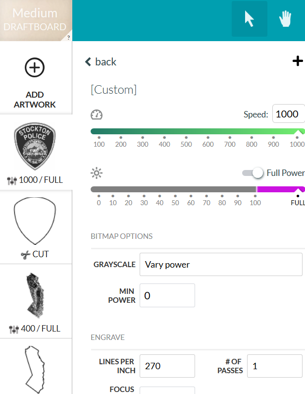
Just to make sure, do you know how to see what the actual numbers are for the different settings? If you left click on your file item, this window pops out. It will show you which setting you have selected. If you click on the little black arrow on the right, it will open up the setting window and you can see that they are and adjust them.
For example, when my machine is a bit dirty or I have a piece of proofgrade material that is slightly warped or something, I will add more power or cut back on the speed just a little to a cut to make sure it cuts all the way through.
This question is outside our team’s scope. I’ve moved it to the Everything Else so the discussion can continue there.
In Gimp you don’t get to transparent on the first layer so I go into layers and hit copy to layer, then I hit the outside white and get all that selected. Then if you hit Grow 5 pixels and shrink 5 pixels all the tiny bits will be swallowed up and the jaggies will be smoothed then you go to edit and hit clear.
Then you can export as a Png and the clear will be hidden, From that, I would go to Inkscape and use Trace Bitmap to turn it all to vectors and hide the bitmap. The jaggies in the bitmap will make way to many nodes bit in Node Mode you can delete the extras and have all smooth shapes that will now engrave much better than the bitmap.
Thank you!!
Sara