As you can see there is far more going on than specific "this shade of gray produces this"but far more subtle. This is the opposite end from what I posted earlier.
If you google images with “gray-scale depth maps” or such variations there is a lot of free content and programs like crazy bump, and even processes in Blender on 3d objects that can yield such results.
Kind of depends what one is going after. I’d rather jump off a cliff then try to nail discrete depths across the grayscale values, but that’s just me. Way too tedious for my liking.
But, no reason it couldn’t work fine just drawing with a limited color palette to arrange a hierarchy of engraves, rasterizing and then engraving.
The other way I could see it going, for someone who can think in terms of drawing/designing in depth, is to use such a palette for the gradient mesh tool, and it will creates the gradients for you between the points.
Anyone here able to determine if there is a color that the GFUI will NOT use? A color the machine will ignore. I’m looking to be able to keep reference art (lines mostly) that I don’t have to turn on and off when I save for the export to the GFUI.
THANK YOU!!
(BTW I am aware of guides - but I’m looking for more operability than those can provide)
If you make it the first color in the palette it will always be the first step in the operation stack that you ignore. I do that for internal documentation I want to save with the file (like material, thickness, etc).
Another document sums it up with: "P denotes power percentage and S denotes speed percentage. The Color Mapping option in your laser system is designed to allow you the flexibility of running multiple laser settings one after the other as one job file. Contact your laser manufacturer or reference your laser owner’s manual to understand Color Mapping. Adjust your laser’s settings to match the selected colors, and then mark the substrate. "
Is there a GF manual on “Color Mapping”? In Inkscape, I’m thinking I create 8 separate boxes (one for each of the P/S texts), and then what?!
Exactly. Then in the GFUI assign a different power/speed setting to each operation (you should have a separate operation for each color). Then hit Print.
Thanks, James. I created 8 separate text boxes (not 8 dfferent LAYERS, right???): “60P/100S,” highlighted it, and then clicked the bottom toolbar color black, “80P/100S” highlighted it, and then clicked Red, etc. all in one document in Inkscape, so that it looked like that chart. That’s it? Al I did was change the color of the font. Then I save my chart as svg? Open it in the GF app. Regarding “Then in the GFUI assign a different power/speed setting to each operation (you should have a separate operation for each color).”–>How do I separate each line to do a different laser setting?
Each color should come in as a different operation. To engrave they need to be filled shapes. So if you’re trying text you need to do a “text to path” in Inkscape before saving the SVG.
If you’re still having a problem upload your file here and we can fix it for you
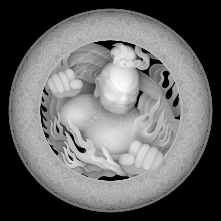
That is what is easily available on the web and It is probably from a 3D scan of a carving. I did not even download that one but it is a good example of why one needs to think in a more complex manner than a list of the 255 shades of gray to black to paste on each object.
Here are both the Trubetskoy and Wong swatch variants in .csv format. Unfortunately the .afpallet files only appear to work on Mac. Since I use these two swatch sets all the time, I wanted to set the up for my wife on her Windows machine as well.
Trubtskoy is nice when you have a file full of operations (up to 22) you want to separate. But, the Wong version is nice when you only need 9 colors or less.