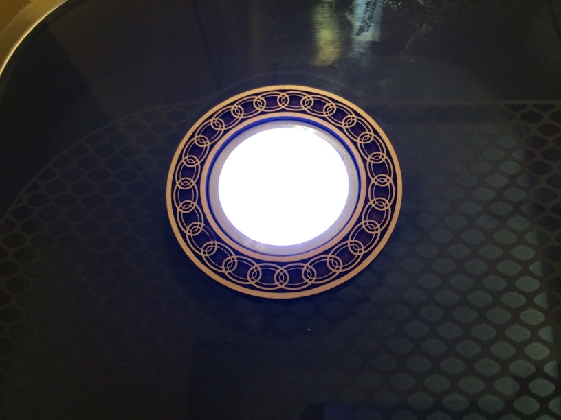
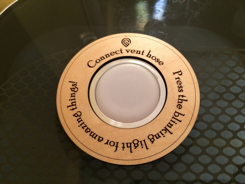
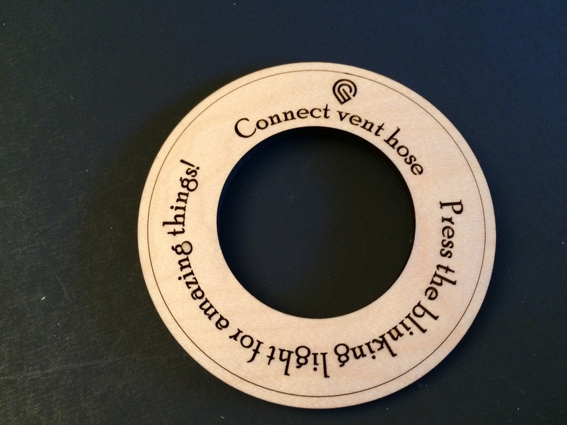
Twice I have forgotten to reconnect the vent hose. It’s been in the single digits and I don’t have a blast gate so I disconnect the hose. Not too bad, except once it was cutting leather and that’s unpleasant. I had been working on circles with @jules and it turns out that one of the rings we cut was exactly 1.6" in for the center hole so it fits perfectly around the print button on the Glowforge:
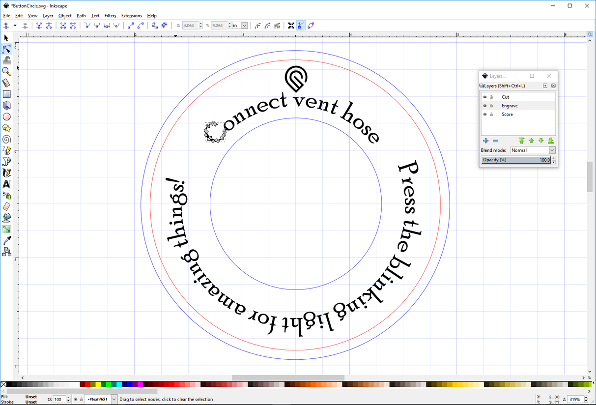
The design process gets a bit clearer for me with each print. On this particular design I first imported it having done nothing to the text I added in Inkscape. A message came up saying that the text was being ignored. So I went back in and decided to engrave the text rather than score it as I have been doing.
Normally I would either use the Hershey text extension or I would convert the text to paths and outline them, with no fill.
This time I did no outline and instead kept a black fill.
My designs usually have three layers, blue for cutting, red for scoring and black fill for engraving. That helps me choose.
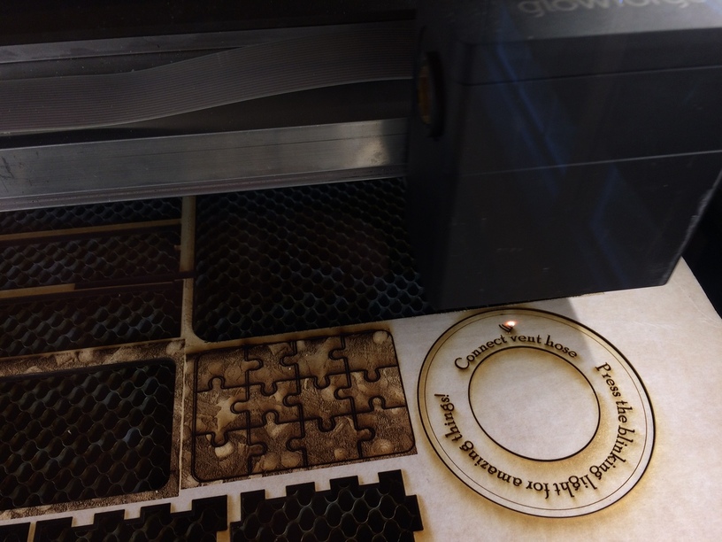
When it came time to print, a 13 minute job because of the engraving, I noted that each letter was being engraved separately, like this final separate engraving of the Glowforge . Very precise, if a little different.
I thought that the intact material over the top was masking and the little bits and pieces of masking that is left to weed out is frisket but I realize for painters and printers it has a technical meaning. It could also by analogy be called “flash”, what is left over from injection molding. There is another term here but it escapes me.
Frisket is/was also the material that hand letterpress printers used for covering the platen and secondarily for masking. Back then it was typically some kind of impregnated light kraft. (With a laser you could even get the heights just right – typically the padding opposite the corners of a large block of text should be a couple of mills thinner than in the center.)
Oh my… I forgot to open the damper on the exhaust hose a few times with my old laser. One of the reasons I sprung for the filter for the GF. Sometimes I get lost in my own head. Love the button surround!
Very cool project. The text looks good, however, maybe it is just a quirk of my mind, but, I’d find the bottom text a little more readable running the other direction.
That’s lovely, @marmak3261! You can engrave them all at once - in time we’ll do that automatically, but for now, @rita can probably give you the magic Inkscape incantations. In Illustrator, the trick is to make the letters a single compound path, if I recall.