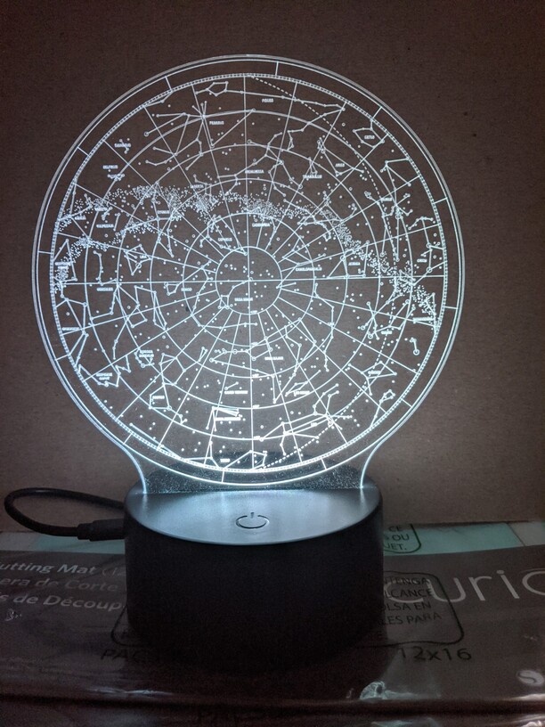
Today’s rite of passage was the ever-popular edge-lit acrylic sign. I decided to warm up with a little star map for my wife, using the cheap LED bases I bought from Amazon.
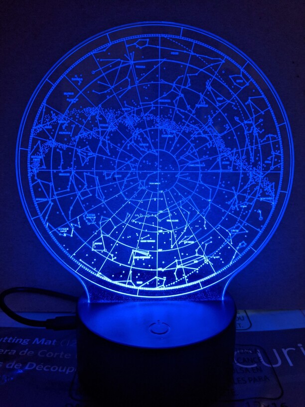
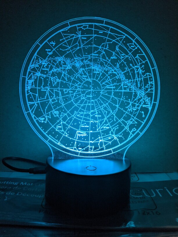
I’m not unhappy with the results, but I wasn’t expecting the lighting to be this inconsistent. Is this due to too much detail at the base scattering the light? Is it possible to compensate for this?
1/8" PG medium clear acrylic, scored with default settings.
Well executed, the curves on the base are a good proportion.
What diameter is the engraving?
Some people think if you apply a gradient to your rastered image and make it darker toward the top, it will be deeper and therefore can catch more consistent light. (you must use vary power or 3d engrave here). I find that one major thing to be sure of is that your acrylic is actually touching the LEDs. Like butted directly up against them . Even a small gap will make the engrave much dimmer, it’s remarkable.
I’ve never seen a great deal of difference between gradient versus flat depth engraves, but then I am not that active with edge lit acrylic projects, my only real effort was a clock.
I’m one of them, the middle picture demonstrates the light blocking effect well, as some colors show it more prominently. I don’t use a gradient (which is probably more effective), I just split the design into 3-4 different colors and increase the power for each color as the design ascends. It doesn’t take much. Also none of the designs I’ve done were that detailed.
Thank you! I will cut 1 in a few hours and post back here. It may not make much difference, but i will try to lower it a little closer to the base and see if that helps to cast the light better.
So I showed my husband your photos this morning as he walked by and he got very excited. "Wow! I want one! Is the file available?! And I said, “No, its in the MOAG category, sorry.” Then to my delight, you HAVE made the file available. Thank you so much - you saved me all that work!
I wonder if when not lit, could you make a difference between the different depths of engravings? I am planning on making a star map and have both files the gradient and non gradient. Just not sure how the gradient would look when not lit. Thank you for any tips/advice.
As I said I haven’t used a gradient, so I can’t speak to that method. I just broke the design into roughly 3 sections and increased power to each as they go up.
I can’t tell by looking, just a little more power for each different section I do is enough to go just a little deeper and expose the next section to the light and mitigate the shading from the lower level.
Such a slight difference would never be noticeable and would take an effort to measure.
