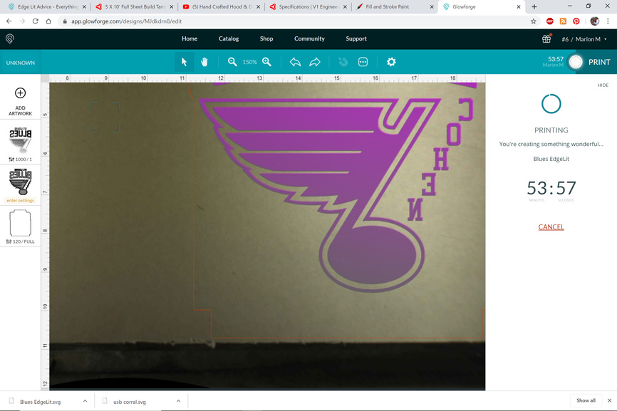
I made a file for my first edge lit piece. It will be a birthday present for my nephew. Anyone who has made these–what do you think of this file? I’m wondering if the inside of the note should be engraved or if I should just engrave it as an outline. And advice is greatly appreciated! 

5 Likes
I like it! You might have a problem with the note because that is a lot of engraving blocking the light from moving up the piece. I would say outline it.
Great, thanks! Do you think I should maybe just outline the “BLUES” as well, or stay with a full engrave for those letters?
1 Like
I think that should be ok because there are spaces in between the letters for the light to travel up. Ultimately this is a good one to test both ways. I know it wastes material, but it will help you in the future when you want to another one.
1 Like
Good idea, I think I will. Thank you!
1 Like
Post pictures of how it turned out!
1 Like
You should look at a gradual engrave depth, so that the higher parts are deeper and therefore don’t get blocked by engraved sections below.
There’s a fair amount of discussion on this here, but no definitive “rules” on how to perfect it.
4 Likes
Will do!
Ok, I’m going to search for posts on gradual engrave. I read about the defocus for engraving acrylic, but I haven’t read about gradual engrave. Thanks for the tip.
I’ll test it out for you tonight. I have tons of cheap good acrylic. Part of it will depend on how deep you engrave. The gradient from top to bottom could be a thing.
3 Likes
Awesome, thank you so much!!
1 Like
Ran a gradient from top to bottom and exported as a raster. I’ll post results in an hour. Trying to catch up on the Chiefs tonight having recorded the first half cause I had services.
I’ll go ahead and do a full percentage engrave too. Ok. Looking Again I see I forgot to kick power to 100%. Restart
2 Likes
Great! Thank you! I’m biting my nails with the chiefs game.
I need to learn about gradient. I’m familiar a gradient in photo shop, but I’m still learning my way around inkspace and trying to figure out what the best program is for this kind of designing.
1 Like
Ok. Restart. I haven’t done enough work lately. I’m rusty. Forgot to remove masking from face for this engrave. Variable power like this, needs no masking. Othewise I use it and burn through for easy cleanup. something like this isn’t hard to weed.
1 Like
I don’t think you even need to mess with a gradient but it does work well.

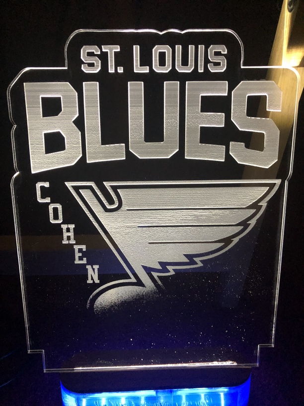
It worked ok, except I didn’t quite drag the gradient line all the way down through the end of the note, so it didn’t engrave. I should have done 5% as minumum and that would have done it.
I didn’t defocus the engrave. So a little more banding than I like. Also didn’t dust it off.
I can see why you wanted to test it out a bit. It’s a big piece.
I lowered the gradient line all the way past the note in this SVG. You will need to export the filled area as a bitmap and then bring it back in for the operation since it is still an SVG gradient.
1398/Full 270 lpi. I did 0% minimum, but you would at least want 5%.
8 Likes
Thank you so much!!!
Gradient engraving is definitely the way to go. I do these signs that have a lot of engraving to them, but they’re fully illuminated with the gradual nature of the engrave.
7 Likes
Can we take this Beyond the Manual so we can do the settings without any crabbing?
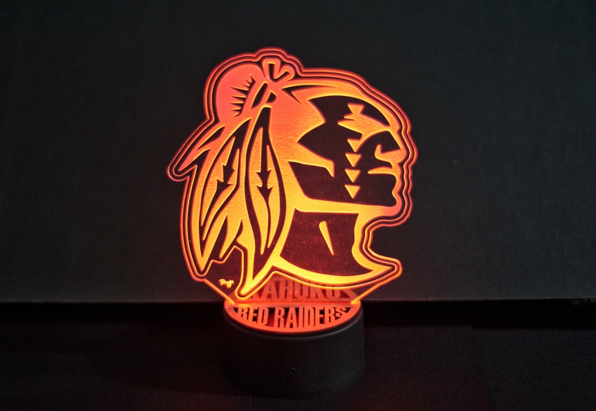
That looks nice. Defocused?
2 Likes
Beautiful!
1 Like
Yes-I switched it over. 
1 Like