I’ve engraved Times Roman lettering on basswood. The 24pt. capital “W” was converted to outlines via Illustrator CC2015. The “W” has thin and thick strokes. The thick strokes had depths that are double the depths of the thin strokes. How can I keep the depths the same?
With the caveat that I’m not “that kind” of designer…
The depth and consistency of your engrave is going to depend on how long the laser beam is on. With something that has a heavy side and a light side, like the font that you selected for the W, you’re going to get some variation.
Choose an engravers font or something that is more consistent thickness across the font than TNR.
For fun, if you want to make the the forum cringe go with Comic Sans or Papyrus (or the ever popular Comic Papyrus) and post a photo 
3 Likes
Strokes of variable width do not translate to differences in the GFUI, However, if Illustrator made the outlines of the lines, only then will the difference show. To get different depths of cut on the same layer (from the same color in the SVG) would be remarkable, as only variable engraves do that and then only with images,
Perhaps posting a picture would help
1 Like
I think what you may be seeing is that it takes a certain amount of energy to pierce the material. With small features and high speed, I can see this happening.
It won’t be supports advice, because it involves manual settings, but I would look at slowing down the speed and power accordingly. Or looking for a HD Proofgrade setting (which uses a lower speed).
The strokes will only be possible to score or cut.
To be able to engrave it, you should expand appearance. (Select the outlines and go to Object/Expand Appearance).
Also, if you added the stroke to make the written a bit thicker, just after expand appearance of the Stroke, don’t forget to convert the Text into outlines. after you do that, merge the text with the Expanded stroke you should get the text in one piece! so it will engrave all the same! 
Thanks for the replies ![]()
Here are a couple of pictures, using no. 11 Xacto blades as depth gauges. The relationships of Speed, Power, LPI are a little confusing. It seems that all three settings (less or more) can affect the image quality the same, ie. burn out the “e” or not connect the “e” so it looks like a “c” .
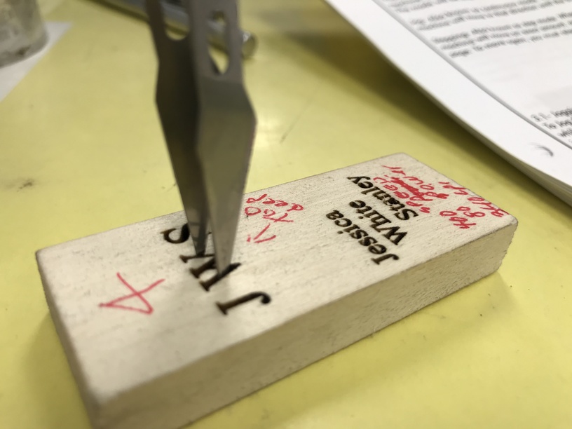
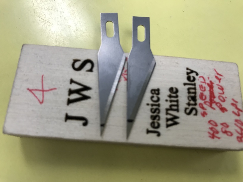
The basswood samples were practice pieces before I engraved the bamboo thumb drive. The thumb drive was successful except for the depth was a little deep. I liked the satin finish for engraving.
2 Likes
I think that is the problem. Particularly with a high power, slower speed, or high lpi the cut is multiplying the effect where it has room to do so, and small pieces are burned further like the a and e . If you can mentally imagine what is happening in high detail au the bottom of the engrave as the laser is blasting there is far more burning than just what the laser is hitting. In woods like Zebrawood or Mahogany that burn very easily several passes with a soaking in water limits that knock-on burning somewhat but even then not totally.
I would experiment with a lower lpi and very much lower power and or kicking the speed up a bit. The result would not be as deep but you are going deeper than the height of some of the parts, and the shallower the cut the less difference in depth you will see and the more vertical the walls, making the e and a have room enough for that floating bit to exist. if you look at the depth vs the size of the floating bit in the a any slanting of the sides would and does nearly wipe it out,
3 Likes
My experience is that if you’re going to engrave small text, it needs to be slow and lower power.
4 Likes
Hummm… I would say that it might be the variation of the hardness/softness of the wood maybe!
Some woods have knots and or are just irregular which result in depth variations! just a thought! 