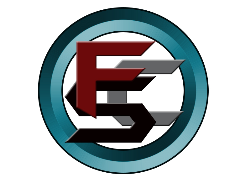
So this is my logo I want to engrave once I get my glowforge, any idea how well this will engrave with the colors over lapping and the two tone colors on the blue ring will show up? I keep trying to redesign a logo in solid black but doesn’t look near as cool lol. Plus don’t want to have a plain looking logo but I want to be able to put it on my designs with the glowforge.
1 Like
I don’t think you’re going to get a ton of variation in the existing logo. You basically have 60, 80 and 100% black when it converts to grayscale (with a bit more variation on the inner ring gradient).
But… you can have a laser logo and a web/print logo. It’s just a matter of what works for the media. I think what would be cool on this is to set up the background as a cut-out. Then alter the laser logo so that the C is the darkest, then the S is quite a bit lighter, and then the F is almost white. Then, run a vary power engrave and I think you’ll end up with a cool stacked effect.
3 Likes
You need to divide up the letters into segments. Don’t rely on the GF to understand overlapping objects.
So, the “F” would be easy. Just leave it as one object.
For the “S” cut out the parts that the “F” overlaps.
For the “C” cut out the parts that both of the other letters overlap.
Keep the colors separate like they are now. That way you can assign different intensities in the GF UI.
…
On second thought make the entire logo grey scale. Map the colors to something that looks good to you. When you do an engrave the values will be based on the grey values. So white would be no engraving while black would be the deepest.
2 Likes
I like the stacked idea, so something like this maybe?
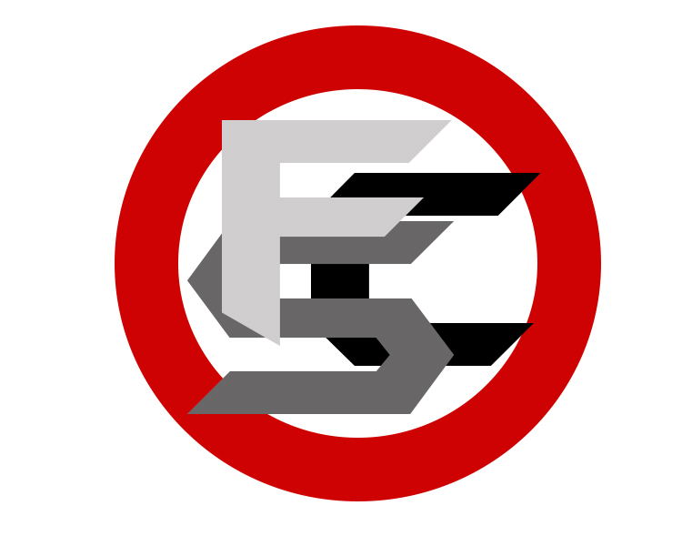
Can the glowforge easily tell to cut out the red part so that’s the main cut and all the white sections can fall out and the letters can engrave that is if I just wanted a “3d” type version of the logo, I know I would have to make the red bar here white with outline if I wanted to engrave the logo in.
I guess a lot of it would be seeing how the glowforge maps it all and playing with they settings once I get it, Just was getting ideas ahead of time. I like both of these ideas so far. Hopefully it maps in well.
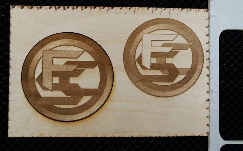
I think it’ll look fine. Like jbmanning5 said, you need more contrast though. I lightened the “F” in the first test, but the C and S were still too similar so I made a second adjustment. (I brought the JPG into Corel, masked the color/letter I wanted and filled it with the new color.) These were done down and dirty on low lpi and they still came out pretty good.
9 Likes
Thanks for doing that! That second one turned out nice, you wouldn’t happen to still have that edited file you could send me so I can print it when my glowforge comes?
You’re welcome  Sure, here ya go. It was just a real quick adjustment for testing and could be better with a bit more time and effort.
9 Likes
Nice tweaks and output!
3 Likes