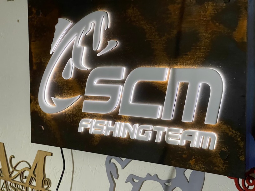
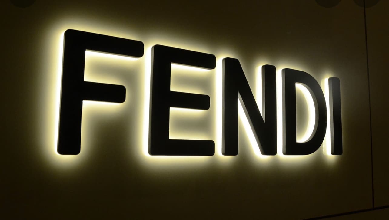
Looking for some honest feedback! It’s kinds embarrassing how many times I scrapped this project and started over. I was asked to make an LED sign for a local company in my area. They told me I could do it however I wanted, which I feel like I spend the most time on these type of projects. My goal was to make a wooden sign that looks like rusted metal. I wanted a nice even white glow to come from behind the letters. How does this look? What would you do different? Does this even look like metal? I’m asking for the feedback, please don’t sugarcoat your opinion…i can handle it!! ![]()
I hung this up on a French cleat in my garage…sorry for not staging my pictures.
17 Likes
The finish looks good on the board, but why are your letters “floating” in front of it letting light around the edges, vs. being actually inlaid into the surface? That’s the only criticism I’d have…
2 Likes
Thank you for the feedback.
That was the first way I built it and it came on nice, but basic. I’m kinda a sucker for the 3Dish look… Don’t judge me  I wanted the effect like the picture I have attached.
I used 3 pieces of acrylics for each letter. A clear in the back and I froated. I put a 1/16” black acrylic in the middle, which I thought would direct the light back to the board. Then I added the white which I made it 1/32 bigger. I figured it would help create that glow effect! I’m assuming I need a cnc to achieve the look in the picture. (I’m looking for any justifiable reason to buy a cnc  What are your thoughts?
6 Likes
Yes I like that look as well. As only one of your original pics came thru, if that is the effect you are getting “in-person” then go with it!
Perhaps re-upload the remaining pics?
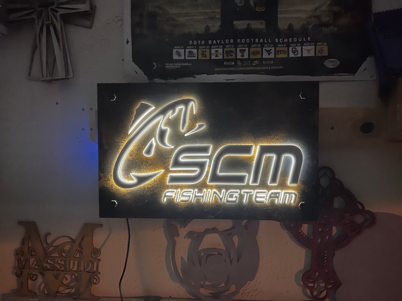
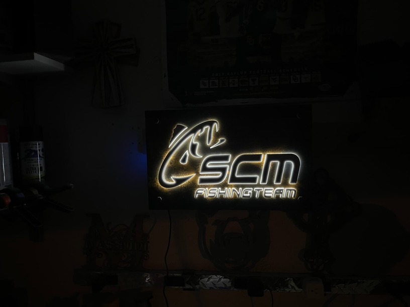
You would typically get that 3D effect with solid letters being lit from inside but it can also be done from behind. It works best in low-light situations - is that where this sign will be located?
Thank you for letting me know about the pics. I think I fixed it!
I’m not sure, the person buying it is gifting it to the customer. They didn’t given me anything to go off of except the logo.
Oh yeah, that looks really good in the right lighting. Nice job!
2 Likes
I really like the 3D look! Your painting of the background really does look like rusted metal. Another way to achieve the rusty metal look is to use oxidizing iron paint from Modern Masters. It contains iron powder that you can rust with acids to get a cool effect. Although I’m not sure it would look better than what you have done. Just another option. I like their cool copper paint that you can treat with patina to get that turquoise-y crusty look.
3 Likes
I think it looks great!
Jonathan
1 Like
The wood-that-looks-like-metal is great if the pictures look as good in person.
I like the look you got from the multilayer acrylic. I would take a guess that the sample picture has more glow only because of a thicker translucent layer.
I think yours looks great but I’d be curious to see it with thicker clear/translucent layer. My other thought it a mirrored acrylic in place of the black, with the mirror facing the light. Ooooo yeah! If I had the material around I’d give it a try myself!
4 Likes
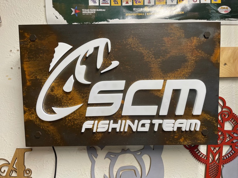
My only thought on this would be why are the letters so clean when the background is rusty? Maybe a bit of weathering? I like the light only coming from the edges, but I really think especially with that feature, just a little weathering on the fronts of the lettering and logo would add to the look…
Thank you for sharing and your feedback ! I will check me out for sure! I used oxidizing paint by a company called Dixie Bell - Dixie Belle Mud (Brown) - Furniture/Cabinet Chalk Paint | Dixie Belle Paint Company™
I was happy with the results until I applied the finish. For whatever reason, it darkened the paint. Overall I’m happy with it, I need to practice using it.
Thanks you!
Thank you for the feedback. I had to sand the sides of the 1/4” acrylic to make the light have a even glow, if I didnt the was bouncing all over the place. I agree, a Translucent sheet might’ve worked better.
Are you thinking that if the acrylic was thicker it would stick out More which would generate more light? Or does the thickness of the acrylic actually matter?
I built a butt-joint box that the front board is attached to. I installed some reflective vinyl to help bounce as much light to the letters as I could. I should have tested this first to see if it even helped.
That’s such a good call out. That makes complete sense and for whetver reason never thought about it!!
Thank you for the feedback!
I think it looks great and you nailed the surrounding lighting effect. You’re overthinking!
Bet they’ll be thrilled.
1 Like
I was just thinking more light with the thicker acrylic. Sounds like you covered all of the other bases
I’m going To keep testing and will share any results with ya, sir!
1 Like
Thank you so much!
The only thing I might suggest is running a piece of steel wool over the background to give some tiny little scratches in and among the bigger painted scratches - but seriously, that looks really cool! They will be thrilled exactly as is.
1 Like