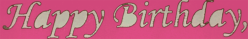
I’m looking for a font that preserves the negative spaces when its outlines are cut out of a piece of material. For example, compare the top of the B to the bottom of the B in “Birthday” when using Monotype Corsiva – I’d want something similar for the a, d & p’s as well.
Generally, you can find those by looking up Stencil fonts on any free font site. It’s also possible to create your own by modifying the fonts after converting the letters to curves by removing a small bridge into the centers.
Not easy, depending on the quantity of text, but possible.
As is the norm, @Jules has gotten here before me. Stencil fonts work but obviously don’t look right for a lot of things.
There are fonts that swirl in such a way as to not have the dropout but I can’t name any right off. Faced with this I’d either add small bridges or go Googling for a font that works.
If you have a vector editing program like Illustrator or Inkscape, you can modify any font using voids or bridges. AI tutorial here quickly covers a little of that.