Can someone explain something about fonts to me? For example, if I choose a simple Arial Bold font in design program (in my case, Inkscape ) then engrave on GF is all wiggly looking. But if I choose a font from the GUI it’s perfect. Nice straight lines, etc.
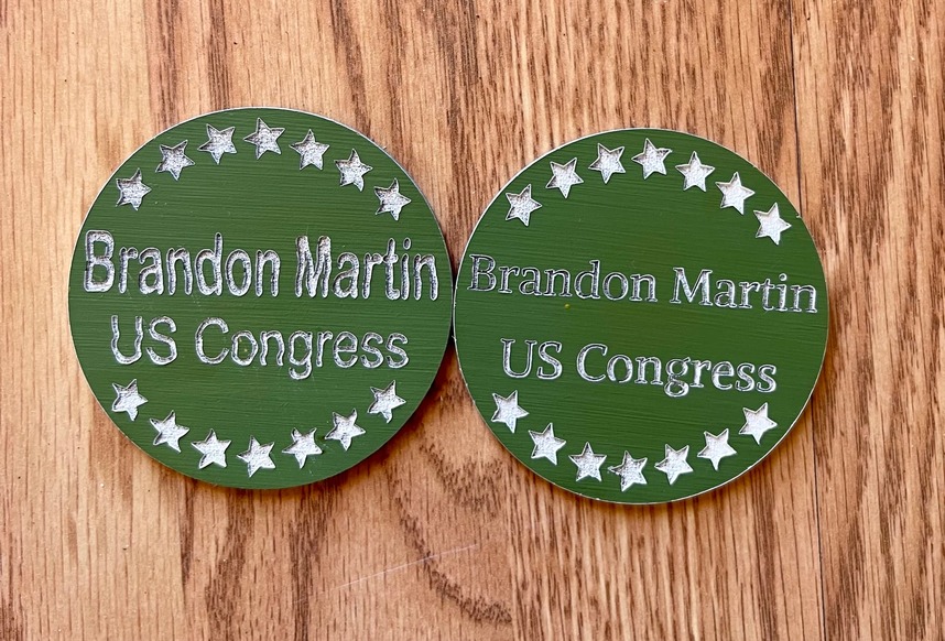
Here are trash pieces.
On left is using the basic Arial Bold in Inkscape. Converted to oath.
On right is using font in GUI.
All optics were cleaned. No cracks in wheels and no loose belts, etc.
you can see wavy lines on the one on left.
EDIT Here is the SVG for the buttons I was asked to make. I’m using Inkscape but I think I have way too many nodes for each letter. But if anyone wants to look at it, you can. Thanks.
Your designs should look the same when engraved as they do in your design program. It shouldn’t matter where you wrote the text. Is this “wiggly look” happening on your computer screen, or on your physical material? If on the material, can you share a photo?
As others have stated, this is not logical. Can you print the same words created in Inkscape next to those words created in the interface and share the photo? Make sure that you use the same engrave settings for each.
The distortion appears in the stars too, not just the text, so where you created the text isn’t the cause. Read the “print is distorted” page linked above, as that tells you how to fix this problem. It’s either belts or wheels.
The secondo case (gfui) is definitely vector, What Is the result in inkscape? If vector how many nodes? I have seen some stuff go overboard in the number of nodes along a straight line. I suspect the even the location on the material might have made a difference. but it does defy logic.
When you checked the belts, did you also check the one under the laser arm? That’s the one that is likely loose if there is a problem. Use a flat mirror underneath. Check the pulleys on either side. Also check for a cracked or broken wheel on the carriage plate.
(Although I kind of like the wavy effect…it’s attention grabbing.)
If all of that checks out, try a different font from the design program and slow down the speed a little on the engrave.
Oh, that is an excellent thought. Totally makes sense. I’m going to check that out. Inkscape definitely is not a great program but till I get an updated laptop it will have to do. Thanks😊