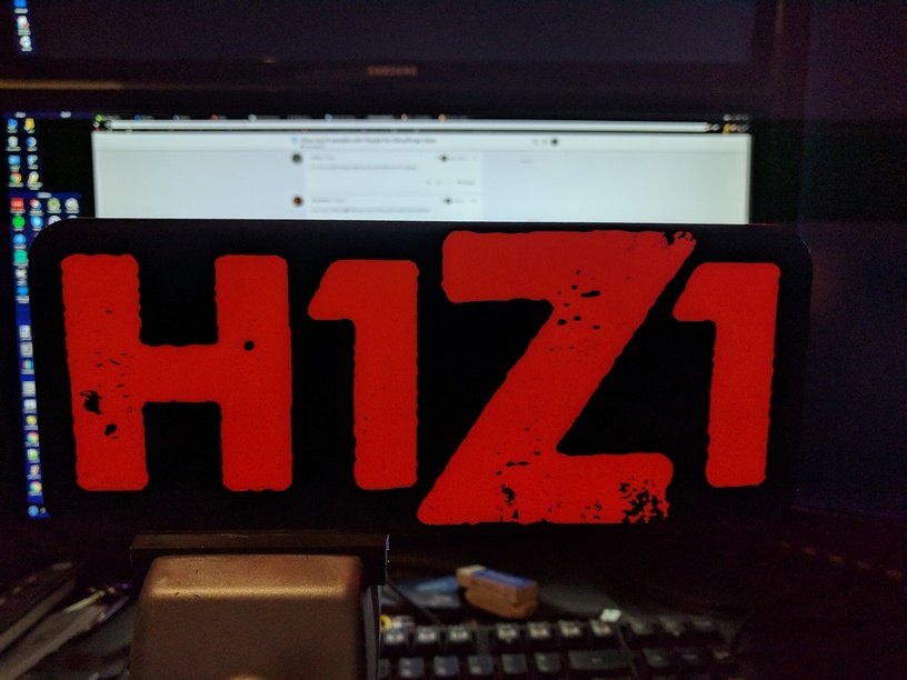
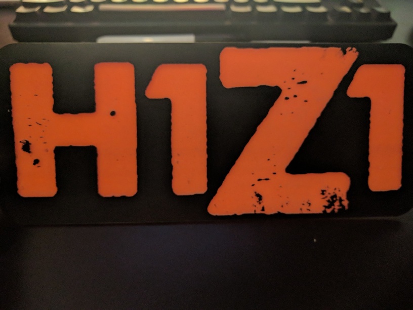
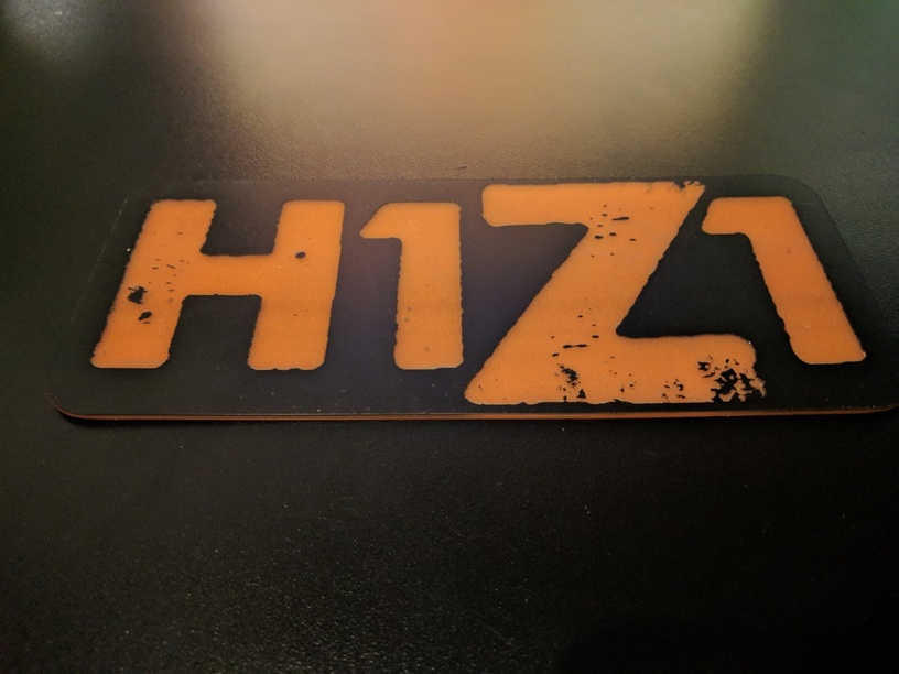
This photo makes it look more red than it is, phone camera not dealing well with the contrast. With brighter back lighting it looks neon. Without back lighting it looks like an orange sherbet color. Also, the splotches in the Z and H are part of the art, it’s intentional. Same with the rough edges of all the letters.
The game is one that the company I work for makes. This will be hanging in my office door glass.