Posting this here because I am too new to have posting privileges in Tips & Tricks.
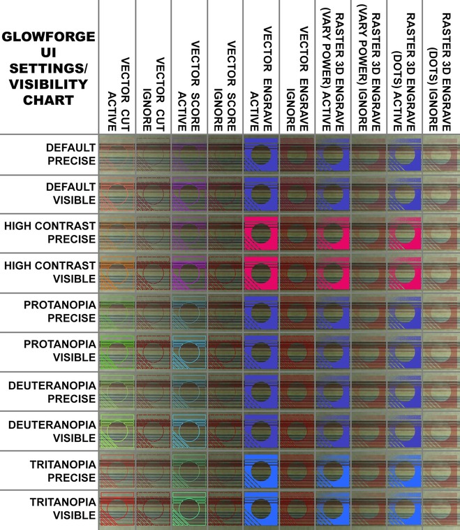
I’m not sure if this has been covered before, but today I noticed that when steps/groups in the Glowforge UI are set to “ignore”, their appearance in that state is determined by their setting before being ignored (cut/score/vector engrave/raster engrave). These variations are compounded when you take into account the 10 different possible visibility settings available (precise and visible each of: default, high contrast, protanopia, deuteranopia, and tritanopia).
Because of all these possible appearances that could be useful when placing items (even if changing to a setting you don’t intend to use just during placement), I decided to make a chart. This shows 100 possible combinations of various types: active/ignored versions of vector cut, vector score, vector engrave, 3D engrave on vary power, and 3D engrave on dots. Since raster engravings are based on a grayscale bitmap, their visibility is based on the depth of black, so I filled those items with a diagonal white-to-black gradient before rasterizing. Convert to pattern wasn’t very distinct from convert to dots, so I left it off. I also originally did my raster images with both transparent and white backgrounds, but I determined that the GFUI always converts white to transparent, so I left the white ones off as well.
I decided to superimpose the variations over a collection of lines drawn on the Proofgrade Draftboard’s stock mask for the benefit of those who may use marking to help them in placement. I used Sharpie markers, and the colors of the lines are the following, in order: black, brown, red, orange, yellow, green, blue, purple, silver, and gold.
I forgot to clean my lens before doing this, but it has been cleaned in the last week. The image is fairly blurry, as almost all are a bit via the GF’s camera. I figured this captured the most realistic operating conditions. Personally, I was surprised at what marker colors showed best under various settings.
The final image is quite large. I’m going to try to post it here in full-definition, but if it has problems, I will edit this post to include a Flickr link to a full-def version, provided that is allowed. (Edit: worked great! Nice programming, GF folks!)
I’m also attaching the SVG I used for this test in case anyone else wants to play around with it. It’s just a single row; I took screenshots of it for each visibility setting.
Hope y’all find this helpful. I know I’ll be referring to it often.
GFUI Visibility Test.zip (194.4 KB)
EDIT:

