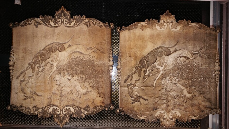
One of these engravings are going to a dog club auction. So far opinions are split so we agreed we would let public opinion decide.
Which one do you like best?
(OK, now that I’ve posted them, I realize these aren’t really THAT different and I’m being kinda nit-picky trying to decide. Oh well… )
Love em both but I’m going with the crowd as well—left border, right interior. But if I had to choose one over the other it would be the right one—I like the stronger contrast.
I would go along with the rest, my first impression was that the interior of the left was sufficient but the stronger border looked very much better, but close up the darker border is coarser and parts of the interior seem to be missing, so that throws it to the right as the winner. If you could manage the barest stain or increase in definition of the border without ruining it, it would be perfect.
Have to agree with everyone. Right with left border. Detail stands out better on the right, draws the eye. But the border isn’t as nice as the left. The darker engraves on the left border are way nicer.
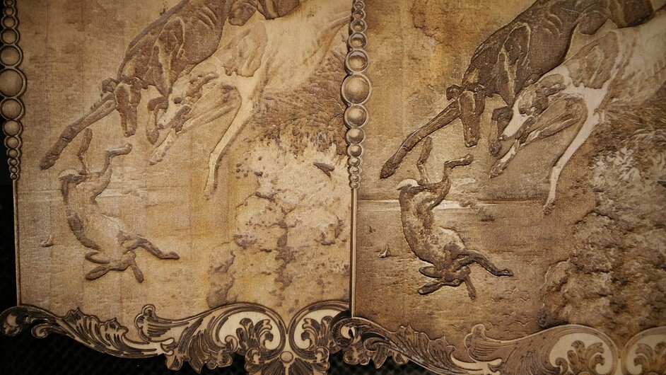
If we are being nitpicky, I prefer the dogs and rabbit of the one on the right. And the background and seagull of the one on the left. And the flourishes of the one on the left.
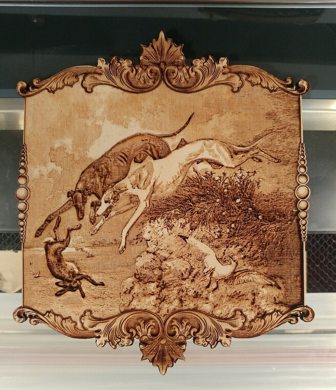
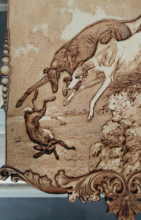
Y’all are killing me LOL. That was exactly my dilemma. I liked the darker one better, but I didn’t like the frame as much. Instead of just leaving well enough alone, I spent a few hours mashing the two together. I just couldn’t get the score on the border to look clean enough for my taste, so I tried engraving the details instead.
I used Birch ply for this one instead of Basswood and it look like a burnt mess when it was done. I stuck it under the water faucet and scrub the heck out of it. I clamped it to a couple of hefty rulers to help keep it flat and then stuck it in my dehydrator for a few hours. The dehydrator worked better than expected