Almost every time someone sends me a logo, whether it be a PNG or JPG and I image trace, or an AI file, the logo looks all messed up when I open it in Illustrator and has a million nodes and paths.
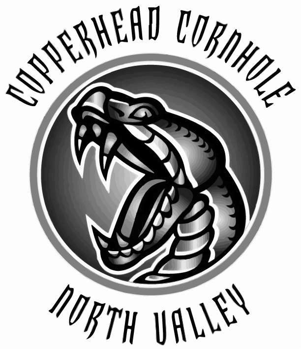
The snake I am wanting to engrave on acrylic so that I can put in an LED base to light up. I tried doing that with a raster image in the past and it didn’t light up as well and only partially burned the masking leaving it sticky in spots. That image I was able to image trace and turn into a black and white vector image, the quality was maintained and it lit up nicely. When I try to image trace this one, the quality is significantly decreased.
Even when I rasterize it, the smooth circle is no longer smooth and the quality of the letters decreases.
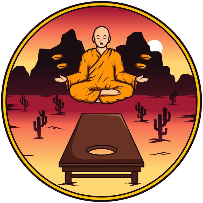
The Desert Monks I am wanting to turn into a 3 layer wooden sign.
I am thinking I need these to be vector, but don’t think I can do that without losing quality. Should I be requiring that I am provided a vector file? I do tell everyone that is what I need but I think the problem is most people don’t know what that means.
You could always hire a graphic artist to convert the file for you and pass the charges onto the customer. I would think someone knowledgeable on https://www.fiverr.com/ would do it.
getting good b/w traces in AI is much easier with good b/w start image. On your first snake logo you chose 2 color (b/w) on an image with jpg compression so trace is having a hard time trying to figure out which pixels on that gray outer ring should be black and which white. The solution to this is to edit the contrast and curves first in Photoshop to get a nice, clean b/w image to trace. With all those gradients going on you may need to use dodge/burn, too.
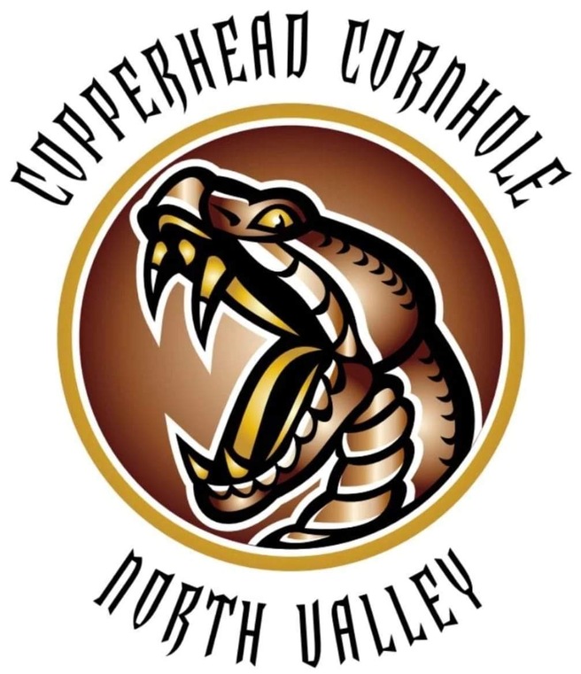
on your second snake logo with all the crazy lines you’ve selected too many colors (not b/w) which is why you’re getting all those rings and excessive lines where the gradients were. The solution is the same, edit in Photoshop first.
However, for all the images you posted it looks like they were created as vector art to begin with. Ask for the AI or EPS (or even PDF) files instead of jpg or PNG and safe yourself all this tracing hassle.
The DESERTMONKS.ai file is a nicely layered original AI file. You should be able to make that into anything you want with just a little editing.
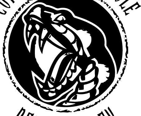
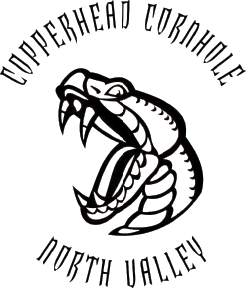
For the snake, if you take the second image into Photoshop, use the magic wand to select the black and pop that onto a new layer you get something like this:
I didn’t do any editing other than what I mentioned above. It would look pretty good engraved just like that (even without all the refinements like gradients, etc.). Add back in a circle and then a cut line around the edge and you’ve got coasters
It all depends on what you want to do with each of the images. As noted, tracing isn’t always the answer.
Definitely get the original of the floating monk picture if you want to do something with that. It’ll save you a lot of grief.
Based on the way the desert monks file is setup, I would guess that the artist (like many digital artists) is used to designing for digital delivery, or digital print, and not for machine use. There are lots of layered elements that have not been trimmed down, so while they look good onscreen there are a multitude of hidden, overlapping toolpaths that would cause issues if sent to the glowforge, or to a vinyl cutter.
Each cactus, for example, is a separate element from the shadow below it, and those shadows are actually 3-4 individual elements each as well. Those each need to be united into single elements. The gradient layers extend into (behind) the mountains, as does the moon.
Rasterizing would save the hassle of all the vector work, but a clean vector version would allow to do more with it… a two-layer piece, with the engraved desert behind the monk/circle/name would look pretty cool!