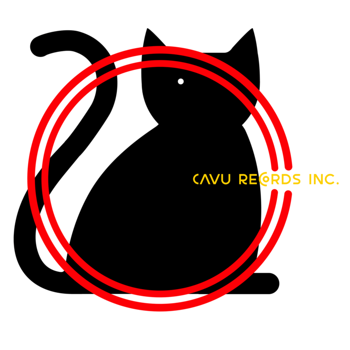
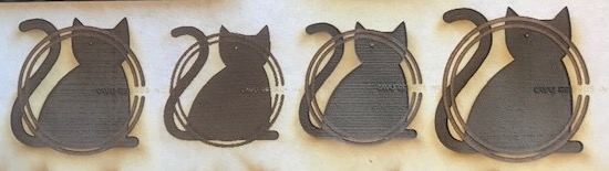
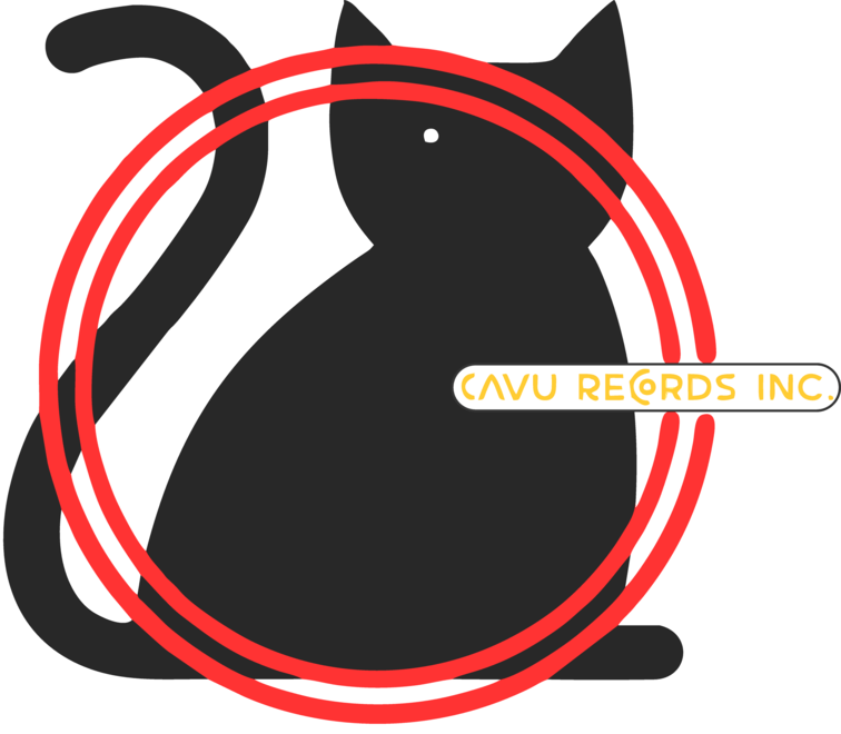
I have a simple png logo but I cannot figure out how to get it to engrave properly. The text isn’t coming out dark enough and I’d like to increase the contrast between the circles and the the cat if possible. I’m limited in my editing skills (Illustrrator and Photoshop). any suggestions would be greatly appreciated. The engraving on the far right seems to look the best to me, but I’m not sure how to darken the text.
Two colors are available with a laser… burned and unburned. If you burn it more, you will get it slightly darker, but that tends to be char and it will flake off easily.
What works is a process called dithering…it fools the eye into thinking there are shades of gray available. The Glowforge dithers automatically for you if you choose one of the Photo Engrave settings, which means you have to turn your graphic into a bitmap first.
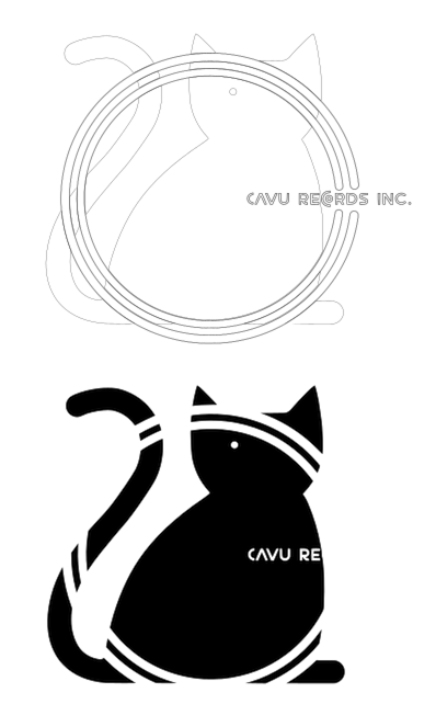
What I’d do with that logo is turn the circles into a medium orange color, the cat into a medium dark gray, the text solid black, then rasterize it and use one of the Photo Engrave settings. It needs more contrast.
Alternatively and, especially for the text, reverse the overlap areas out of the body of the cat.
Frequently, professional logos are designed with a variant intended for reproduction in black and white. If such a variant is available, it might work better for this.
Shaded graphics are not generally suitable for laser engraving onto wood. Photos work if you use dithering, as stated above, because the eye smooths out the detail and recognizes the shapes.
Without giving it much thought, you could outline the red arcs and text, and use score for those. Obviously white-out the area where they overlap the cat. A score around the cat would finish it off - it would look like a cartoon style graphic.
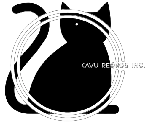
Back from dinner and looking at that again, you could also do a lighter engrave (dither) inside the arcs, that would be more true to the original design.
It can be dicey to alter a logo in any way as this can dilute the trademark. Adding an outline around the text could be problematic. Better to outline the text itself, as effguy suggested.
Best bet is to get a monochrome version of the design. The original logo designer was supposed to have already solved this problem.