A big thing in early childhood education is using manipulatives to increase understanding of mathematical concepts. For example, four quarter-circle-sections going together to make one whole circle, or three rows of five blocks to teach multiplication. Real, hands-on stuff can make concepts click in a way that abstraction doesn’t.
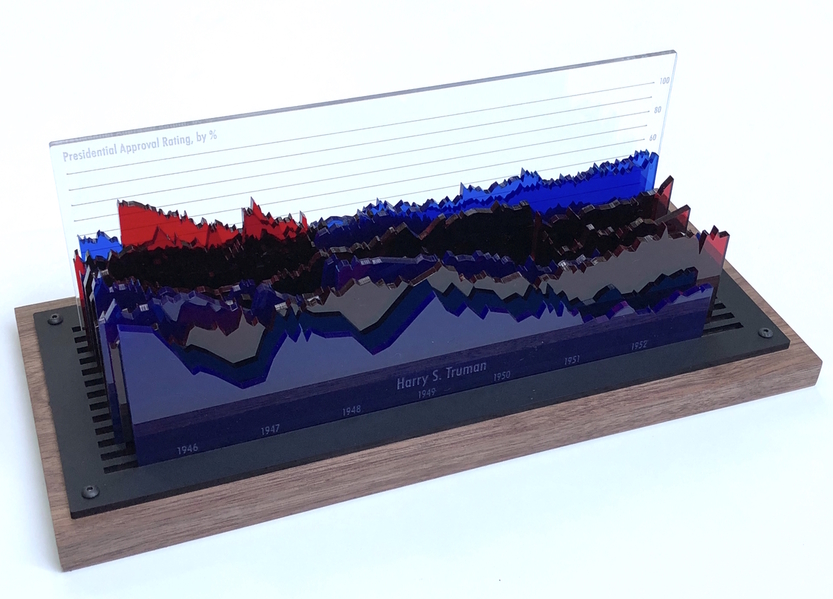
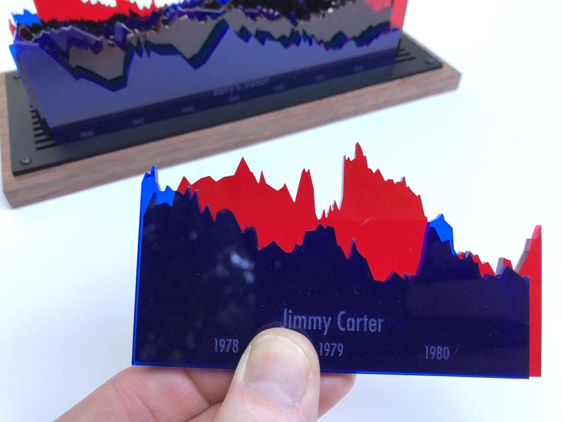
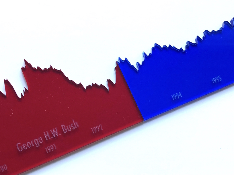
I’m a bit of a political junkie, and wanted to make some manipulatives of my own, but at a slightly higher level. I pulled up presidential approval ratings back to Truman, charted them, then cut them out of red and blue acrylic according to party. I also made a base (matte black acrylic attached to walnut) and a scale.
Everything is removable and everything is to the same scale, so comparisons are easy. It’s one thing to see graphics on a chart, but another entirely to hold the data, feel it, put two pieces together to compare and slide them along each other, move everything around and just see what comes out.
What other data sets might be cool to play with in a hands-on way? I’d love to hear your ideas.
Note: I didn’t include Trump, because I only wanted complete terms. That also seemed less likely to start any fights when I shared it, so please don’t get political and get this locked!
That’s awesome! My brother is a PolSci professor – I think you’ve just inspired his upcoming birthday present in the form of physically representing some of his model results.
That is a really unique and well executed idea. As a history buff, I can think of a few areas where something like this would be fun to make. So many potential projects, so little time…
Too late! You already did that with your choices. Amazing how one side gets blocked for being political, and several other posts that are even more political do not.
The first thing hubby and I discussed when looking at this was the events that were happening at the time of the high and low points for each President. Not sure how if could be done with so many years being represented by your charts, but it’d be cool to see how these compare to prosperity, war, recession and other major events.
If space was no issue, one long linear US history timeline with slots in front for the each Presidential overlay. Or break it up even further; one linear cutout of military action/inaction, one economic, one of political scandals maybe, one of historic political events/decisions (development of National Parks, social programs enacted etc), and ?? Then you could see how they all interacted.
World population vs co2 levels vs temperature vs oil consumption should make pretty instructional graphs.
World population versus a timeline scale where major wars are marked.
Defense spending of the G8 countries as a percentage of GDP.
(In fact and number of stats about the G8’s, population, birthrate, infant mortality, per capita GDP, Life expectancy, medical expense per capita, literacy, and so on. Each country gets a color. You can compare the countries to each other or the stats from the one country to each other to find patterns)
The possibilities are quite endless, and I was mostly sticking to geopolitical data.
I had some of the same talks with my two boys (8 & 10) once I finished and they were playing with it! They had so many questions.
“What happened here? Why is it so sharp?” (9/11).
“Why is this one so short?” (Kennedy)
“Why are these so jagged?” (More frequent polling in modern times vs mid-century)
Lots of cool discussions kicked off and interest stimulated in ways I know it wouldn’t have been if I’d put the same data in paper graphs in front of them.
There are many places where other data could be noted. Starting with Truman instead of Roosevelt is telling. As is comparing Papa Bush to Carter and Clinton.
The popularity game has been increasingly weaponized in ways one would need to be old enough to remember when it wasn’the case.
Even opposition to the Fraud has been made a sectarian claim. There are places where good data about real things world wide and just the largest countries of China, India, and the US broken down by states. Gapminder.org has been a very good source .
So has amazingly the CIA fact book that was a good up to date reference and graphs that has been around for years.
There is a “State of Working America” Web sight that has traced the income gains and losses going back to 1900 that will be taken as political but the graph allows one to look at the specifics of different start and end years. I am on the Tablet at the moment so putting up links is not reasonably possible, but Google can be a friend here.