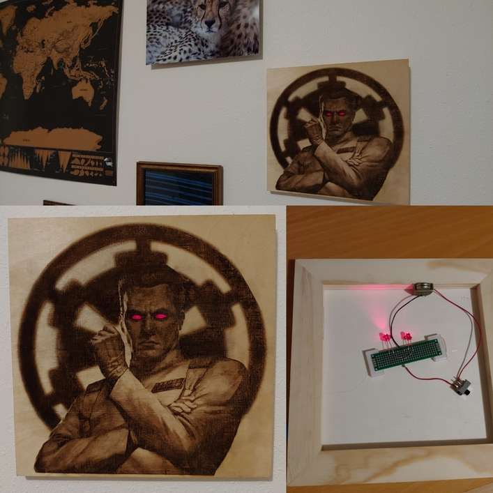
My partner’s company is doing a holiday gift exchange. My partner got someone who is super into Star Wars, and specifically called out the Thrawn books as his favorite. She asked if we could make him something with my glowforge. I immediately had a vision. I probably put 30, 35 hours into this project, which was wayyyyy too many, but it’s finally done
This took six test prints to dial in the photo engrave settings, then almost 8 hours of print time for the final version (it was too complex to do at once, so I had to split the file into 3 parts and use snapmarks to align it), an hour of 3d printing components for the back electronics, many hours of finding and soldering components, then a few dots of hot glue to finish it all up.
But I couldn’t be happier with the final product. It’s my most technically complex project yet.
The snapmarks were a LIFE SAVER when I realized I couldn’t upload the whole image and I’d have to chop it up. There would have been no other way to align it.
I taped two small pieces of scrap in the top corners and scored the snapmark logos there. Then I could remove them easily at the end of the job without needing the snapmark on the final product somewhere.
There was what looked like a single line that didn’t print between each section. You can tell if you zoom in. One missing row is about 50% down, then another about 75% down. I don’t know if that’s a snapmark issue or an issue with how I cropped and separated the image. It’s noticeable up close, but not too noticeable from farther away.
This was done with the HD Graphic settings for proofgrade maple ply (then I changed the focus height). I used this instead of Draft or HD Photo because those settings wouldn’t seem to load. Whenever I selected them then hit the side arrow to change the focus height, they all just showed 1000 speed/full power.
I had to do a TONNNNN of photo editing on the source picture to get it to work this well. Huge shoutout to this tutorial Glowforge made (you can find it in the Support section). I had played with contrast and curves before, but the gamma settings and exposure were new to me. One other critical tool that wasn’t in that guide - the Burn and Dodge tools to lighten up certain areas. I spent a lot of time dodging Thrawn’s face, the awards and shoulder pads on his uniform, his raised hand, and some of the shadows in his uniform. This really helped the Glowforge go easier on those sections so more detail would shine through.
The red acrylic is transparent, and it looked weird to see the LEDs behind the eyes. So I ended up leaving the masking paper on the back of the acrylic eyes. That diffused the light, getting that awesome glow effect, and also meant you couldn’t see the LEDs.
There’s a new Thrawn book out… it’s called “Thrawn”, and is a origin story. Your friend probably already knows about it but if not, I bet he would be interested.
It looks great! Fantastic detail and your effort with the burn and dodge mask paid off.
I do have a silly question though since I’m waiting for my Pro to arrive and haven’t produced anything yet. You said the image was too large and you had to split it up. Do you mean your raster file or the actual dimensions? I’d assume the raster as the dimensions should be within the laser head travel.
This is very cool! I’ve had the same problems with the horizontal lines when using snapmarks, I’ve tried everything I can think of to avoid them with no success. (See line in center of attached photo.) Let me know if you figure it out!
I worked on the file in Photoshop, then put it in an SVG with the snapmark images. When I uploaded the SVG file, the Glowforge UI got stuck on the “processing” step for maybe 2 hours. So when I say “large” I think I mean “complex” (though part of that complexity is trying to do a 10x10" photo engrave. My 4x4" test prints worked fine).
Yours would be a little more difficult since it does span the whole thing…I would try to take it around the outline of the man, since a break there would look the least intrusive. (And you could actually use it as a design element by having just a little separation between him and the background.)
But it looks great, so whatever you did, it worked. I just like to think out of the box sometimes.
Very impressive! And thanks for pointing out the Glowforge tutorials. I got my machine long before they were there so I had no idea of the existence of this resource. I guess I should check the online help more often.
I have done one project like that… Doesn’t look like that.
But somebody said, “Hey could you make a…”
And my mind filled with an idea. I spent dozens of hours and days on it.
I’m ridiculously pleased with it.
I only got a couple pictures because pohotos simply can’t do it justice, and I passed it on to the client, knowing full well that the most he could give me would be $20-30.
I almost don’t want that money, because setting THAT price would cheapen the gobsmacking artistry of the piece. Better an undisclosed value as a gift.
… then again, buying more materials is always a consideration.
Yours is fantastic. You should be proud… it’s a one-of-a-kind bit of absolute fan Art. And I mean Art.