I love that the software in the cloud means that improvements can magically happen. That’s awesome.
I’m a little worried about repeatability, though. If I have something that does what I want on Monday, is there potential to run into issues trying to do exactly the same thing on Tuesday? I’m sure that most of the time the new version would be great, but in “edge cases” could I select the previous version of the software so that I know it’s identical?
The latter is a feature requested by a lot of us but I don’t believe made it to the Hopper (ideas they think are good and may or may not ever get developed).
The former happens occasionally - usually you’ll have to play with settings again to dial it back in.
I’m sorry to necro this post a month later, but i was wondering if you could share some settings info or what you did to get such a crisp image on the wood? I’m wanting to do something like this for a christmas present, and I’d love a little help or a push in the right direction! Thanks!
You know, I didn’t log the settings. Sorry. but I did this in ‘photo’ - ‘manual’ and played with the pattern density sliders.
The best advice comes from the top.
"Photo The key to great photo engravings is your photo editor. You want lots of contrast and liberal use of the “sharpen” effect! If you’re printing on clear or translucent acrylic, you may want to mirror the image (so you can view it from the opposite side) and invert the colors for the best effect.
Once you’ve done that, though, the “photo” setting will get you the rest of the way there. It’s terrific for making family photos permanent, especially on Proofgrade hardwoods, plywoods, and Draftboard".
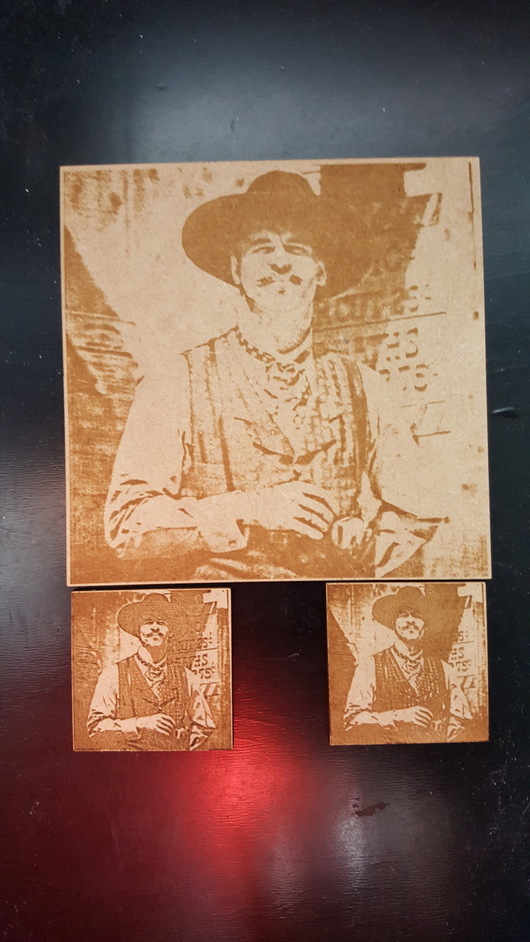
Your settings will really depend on the image and material. The lighting, background and what looks best to you. I just happened to nail this one first try, but I have had to run up to 9 tests to get what I was after on others. Proofgrade maple ply is my go-to.
Start with the “photo” setting and run that default to get a starting point. If that doesn’t please you, for more adjustability click manual which will be populated with the default settings, and you can explore the “pattern density” sliders. Between those you should find what you are looking for.
In your file preparation, remember high contrast, and as Dan has said before, “sharpen to the point of comedy”.
I like to run them on the intended material. I use small scrap and do them only a few inches big.
The problem with that is scaling up can make a slight difference, in that the details get better.
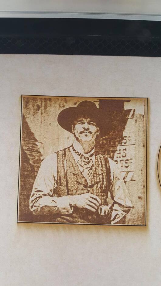
I thought the big one looked good, until I cam back to this thread to check yours and yours is still WAY cleaner and darker without it getting deep. I need to stumble on your settings eventually, lol.
Not bad!
A little washed out on the big one, but the lower left is closing in! You can see his dimples
The settings effect also changes with scale. It’s a Treasure Hunt!
yeah, the big one was picked because I didn’t realize how much of it changed once you clean it up a bit. Here is the pic of the big one before wiping off all the tape residue.
I actually really like the white the tape adds to the image, so I might have to resist taking the tape off next time, and just seal the tape in with it.


 but I did this in ‘photo’ - ‘manual’ and played with the pattern density sliders.