So after I made the mistake I remembered somebody else did as well. I wanna say it was @marmak3261, but I could be misremembering that. So I’m just kinda posting this here as a refresher on picking the right font for the job.
I’m working a little project where I’m sandwiching clear acrylic between black acrylic and I’m cutting words out from the black, and engraving them on the clear. The idea being it’ll look very cool and readable while it’s unlit, and super-mondo-awesome when it’s lit.
So I just cut (wasted) my only sheet of black acrylic. As it began to cut, and I thought about what was happening, I smiled and said to my son “Wanna know how I just failed?” He said “What do you mean, it’s looking great so far. I can read everything.” I said “That’s 'cause all the little cut pieces are still in place.” I explained that anything with an inner section will simply disappear. Letters like “a” “e” and “o” will generally look about the same. In case you haven’t it thought it through, there’s nothing holding the top part of an “e” together, for example. To make this work you really need a stencil style font.
So I haven’t decided how I’m going to fix this. I can’t use a very different font (like a stencil style) because it would be wrong for the piece. So I think I’m simply going to draw little connectors or lines through each letter that needs it, and re-run the job (after I order more black).
Anyway, thought I’d share my fail in hope to help others.
How are you accomplishing the final sandwich? You can support the black floaters in the letters with adhesive onto the clear acrylic, if that doesn’t mess with the effect through the clear…
If only I was working with words so big. We’re talking about an 18 point font at 100% of its size.
And let me say… Aside from my mistake, the Glowforge cut those letters perfectly. I have a hundred little tiny black specks I had to weed out, but now that I’ve done that, I may actually proceed with the job. I wanted to make a back for it as well with different words, but now I’m out of black, so I’ll have to order more. But meanwhile I can get the same effect and see how well it works.
I still feel like there’s some way to get a similar effect with the underlying concept…
So ignoring the idea of salvaging the current iteration what about:
Black spray paint on one side of clear acrylic for the middle layer, and etch the words like expected so you have frosted clear acrylic adjacent to the black floaters that you’re missing. Then you can still cut the black acrylic without concern for the floaters (except for their true thickness) and at least get the effect you’re looking for from square on (and something a bit confusing from an angle?). And, actually that would be possible with the black you’ve already cut, aligned with the frosted + black surface middle layer… does that make sense? I don’t know if it would really look any good though…
I think I see what you’re getting at. That’d be more work than this is worth. I’d sooner be inclined to…
I’m going to continue to play with what I’ve got. I’m still planning on making a better version though. I don’t think it’ll take much to add little lines into the letters that need them. The silver lining is I now have this as a template on what needs to be fixed.
Well, good cautionary tale, Tom. I learned the same way, but without wasting good material. Before I had ANY Glowforge, Jim Hatch helped me learn this very lesson by having me design something, which he so graciously cut for me on his laser, then mailed to me. And that lesson for me was about the very same thing…connecting/anchoring ‘loose’ pieces to other parts. There are definitely some fonts that do not lend themselves well to this process…and some fonts that end up looking absolutely awful when they have this done to them. Thanks for your insight and reminders…I look forward to seeing your resolution.
It’s funny the things you don’t think about sometimes. I was about 5 minutes into the job when I really started thinking it all though. My son convinced me not to abort. And I’m glad he did. This thing might work as-is. I’m about to cut the clear part now. I’m thinking it might create the illusion of completeness. We shall see.
What about black-on-clear acrylic from Innovative Plastics Inc? It’s clear with a coating of black that you engrave away. You can engrave that instead of regular clear acrylic but maintain your letter centers, sandwich that between the layers of black and you’re good to go.
So it’s funny you say that. I was just thinking that that’s actually what I want. When I put the pieces together (with tape just to see it), I realized I don’t like the black being so thick (~1/8"). So actually I was planning on buying exactly that this morning. Then, as you said, I’d get my “cut” through the black, and my engrave on the clear.
But on further thought I realized that won’t exactly work for me in this case… The shape of the black and the clear are different. The black is my desired shape, while the shape of the clear is there solely for light transmission. So I think, in this case, I’m going to look for some thin black. Maybe something 1/16" or thinner.
I can tell it’s going to be a pain to weld the pieces together perfectly. My plan is to use a light shining from underneath a glass table so I can see when it’s lined up perfectly.
This definitely belongs in the “derp, what the heck was I thinking?” category, but don’t feel bad because I think everyone makes that mistake once. I’ve made a lot of vinyl lately for my kids school and after wasting a pretty large sheet I am now quite careful about my font choices.
I do this all the time (though not for lasers… yet) and it works really well. You can also edit the font if you have a lot of writing to change. I’m sure there’s a boatload of copyright issues that go along with this if you’re planning to use it commercially, and I have no idea what those issues are. So… edit away at your own risk.
I’ve tried a bunch of different font software and, not going to lie, most of it is just awful. But for just tweaking existing fonts, it’s not quite so bad. There’s probably a way to avoid font-specific software entirely and just use illustrator or something, but I don’t have illustrator so I don’t really know.
Recently, I’ve been playing around with this site. Super cheap compared to actual font software. Especially fun for handdrawn fonts and when you don’t feel like messing with vector things because blurgh. I’ve done both scans and just digital and the results have been pretty good.
Where it falls flat is allowing you to adjust the kerning between specific letters. In that it doesn’t. It does allow you to adjust overall character spacing and to create ligatures between certain letters (for otf. I don’t think ttf ones can do that), and you can add custom ones, so you can sort of work around the kerning thing if you’re really determined. Or you can just tweak the kerning manually for your project. But that’s all very not-so-great.
And that’s a very long, slightly off-topic story about my ongoing fight with fonts.
Yeah… I thought about editing the font itself. But I don’t know that I’ll ever use it again for lasering purposes. Although, maybe as I use each font I should edit it to be cut-compatible and ultimately I’ll have a set of cutable fonts. I couldn’t care less about copyright. But I do hate the idea of altering the creator’s intention and design. If I were the creator/artist I’d be pretty angry with anybody who messed with it for any reason. I’m going to do it anyway, but I’ll feel a bit badly about having to. Heck, I felt bad last week when I needed to thicken a font with an offset.
I have font editing software. I forget what I have. Haven’t used it in a few years. But it got the job done. I think for this one I’ll just draw the lines in AI. Heck, if I do them by hand it’ll add an element of personality to it.
I have to edit font and logos all the time for stencils…you get the hang of it after awhile…
Most annoying thing is explaining to the client 5 times that in order to have an e on a stencil…you have to have the bridge that holds the “hole” in place…lmao
Just a thought: Get the black-on-clear. Engrave the black just enough to cut through to the clear. Then engrave from the back for the light transmission.
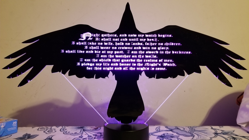
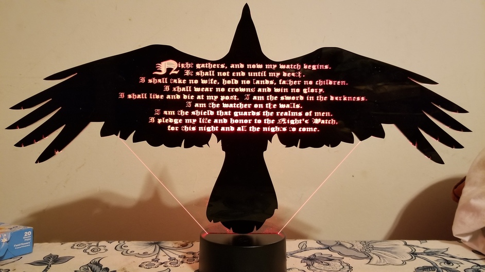
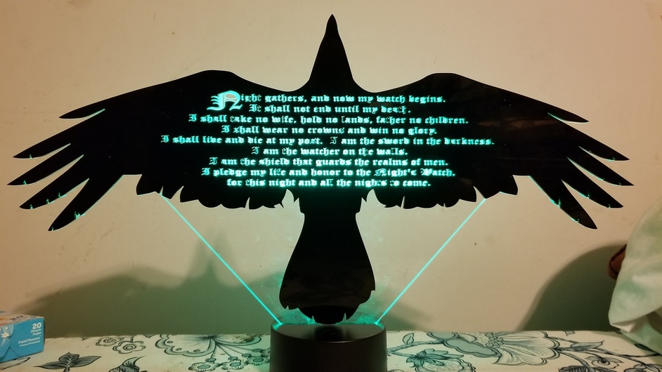
This is halfway done. I ran out of black acrylic. (Ordering more tonight.) But I plan on making a black back to this as well so it can be view from either side. The back will simply say “And now his watch has ended.”
But I’ve decided that ~1/8" is too thick for the black. I’m ordering some 1/16". I think it’ll look and work much better.
 black acrylic. As it began to cut, and I thought about what was happening, I smiled and said to my son “Wanna know how I just failed?” He said “What do you mean, it’s looking great so far. I can read everything.” I said “That’s 'cause all the little cut pieces are still in place.” I explained that anything with an inner section will simply disappear. Letters like “a” “e” and “o” will generally look about the same. In case you haven’t it thought it through, there’s nothing holding the top part of an “e” together, for example. To make this work you really need a stencil style font.