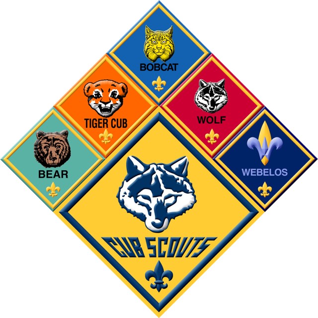
I’m having a heck of a time engraving this fairly simple graphic. It’s charring and there’s no contrast in color when I make it. I’ve run PG settings which was garbage. I then ran it down at 600 speed and 20 power and it’s still turning out really dark. Here’s my image
You could recreate it in either, or play with contrast in an app like PhotoShop or similar, but I don’t give that much hope given the range of shades.
It would probably be far quicker and easier to source the original graphics elements, and recreate the whole thing from scratch in whichever app you prefer.
If I had to produce that, that’s how I’d approach it.
That image at least has decent resolution. What size are you shooting for?
Remove the color fills and get good contrast for each icon. Recreating the basic shapes is simple, and you have a nice fdl to copy and use on each panel.
Perhaps others have ideas, for me, that would take a bit of work - depending on the size, as that would dictate how much manual cleanup would be needed. An hour or two for something about “coaster” sized.
Yeah, the problem with the image is the colors area actually very close to the same tone and the differences would be pretty subtle when lasered. Like elfguys suggested, your choice is to recreate (or download them for cheap from Etsy) a vector file and then adjust the colors in them so they all look different, or try and adjust the tones in the bitmap version.
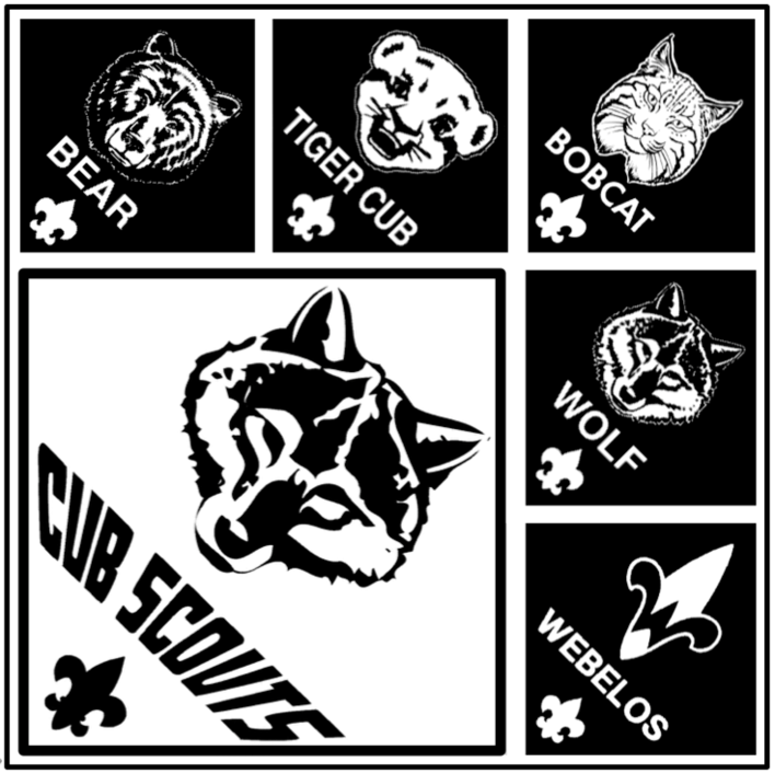
I did a quick example to show how adjusting the bitmap might work to give things some contrast between each diamond. It just might be something you have to play with and test a few times to see what works best. (This probably needs some more work, but it gives you an idea what might work.)
Here’s some Etsy links if it’s easier to buy them.
FWIW, I found a higher resolution PNG that was better to work with.
I would use Gimp to re-order all the colors. If you really want them then they can be applied later. If you are looking for a full 3d carve then there is a lot of work needed so the highest points are nearly white and the lowest are black. That is the only time you would want to use the variable power, it will not do any good for different shades.
If you want different shades then use the dot pattern system at very high LPI. Under that all the dots are the same depth but are farther apart in light areas and closer in dark areas with LPI setting the size of the dots.
The third alternative is to use different woods and cut out each shape and inlay them together.
Thanks for the answer @eflyguy, that’s right. I’m going to close this thread - if the problem reoccurs, go ahead and post a new topic. Thanks for letting us know about this!