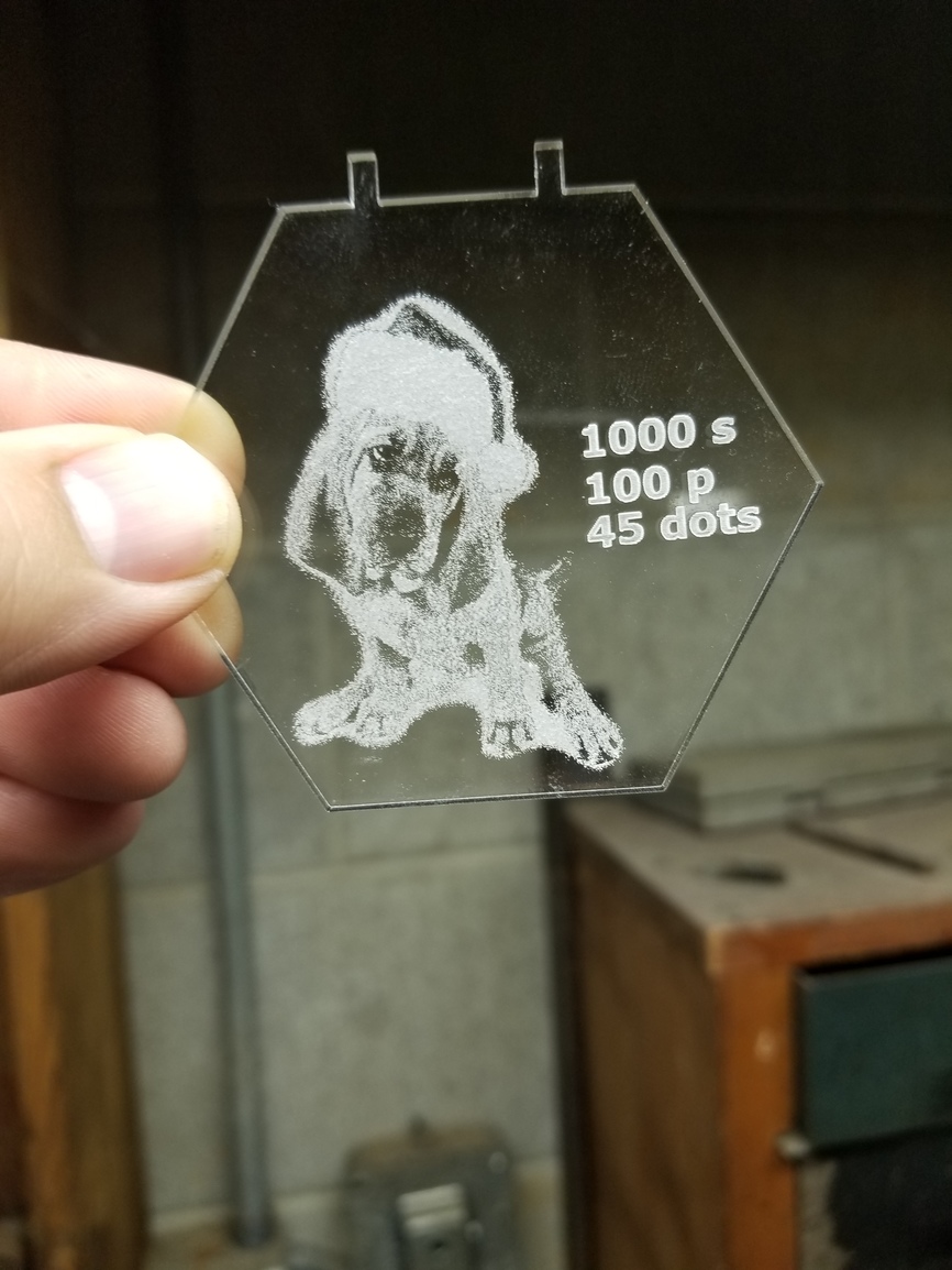
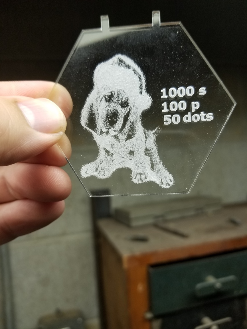
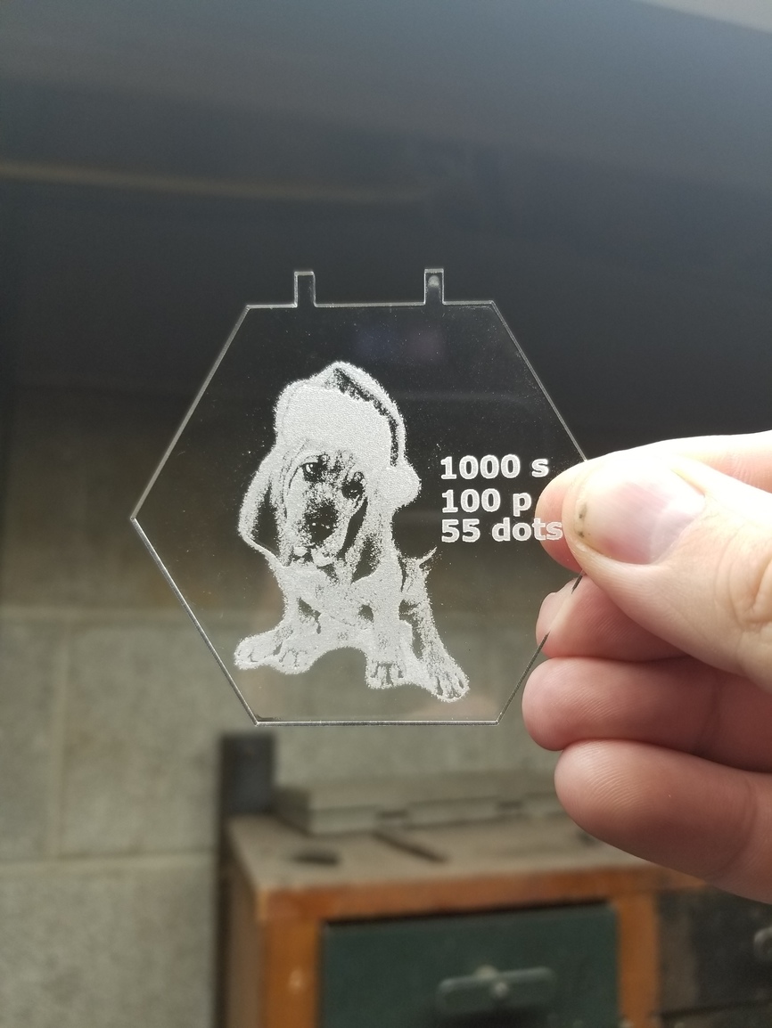
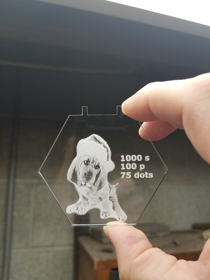
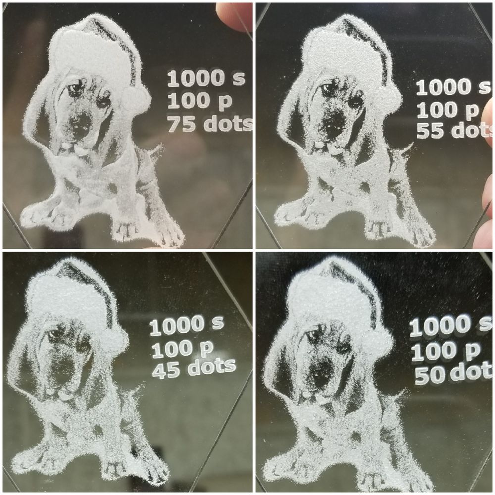
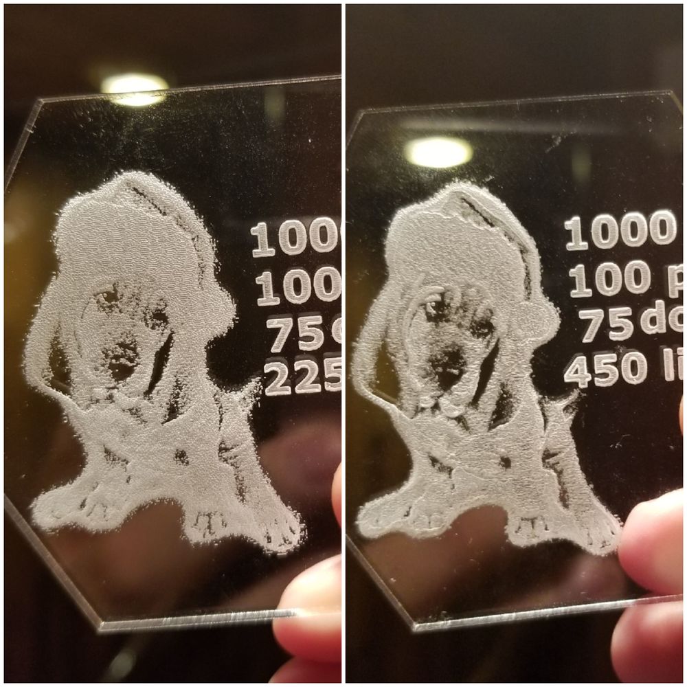
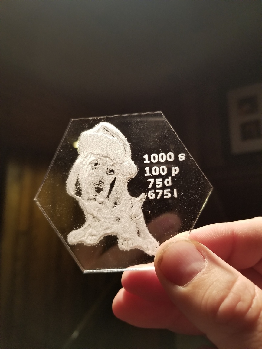
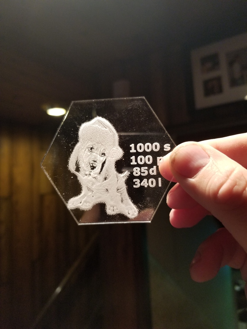
Testing the dots. All were done at 340 lines per inch.
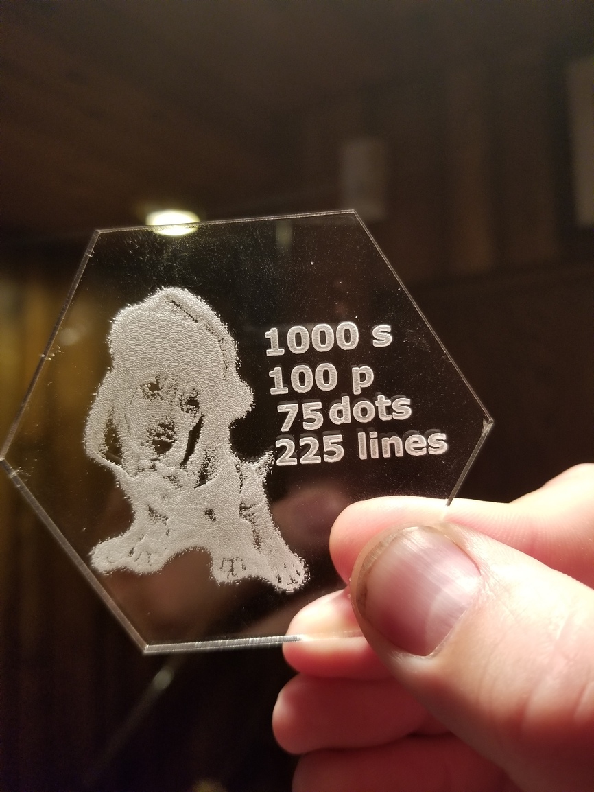
This was the image to start with
Then I had to invert it for acrylic
Then the results of the different dot settings. I didn’t even notice the numbers because they get covered up by the cursor (@dan you may want to look into that.)
I like 75 best
36 Likes
Agreed 75 looks much better
4 Likes
Jules
August 31, 2018, 1:21am
3
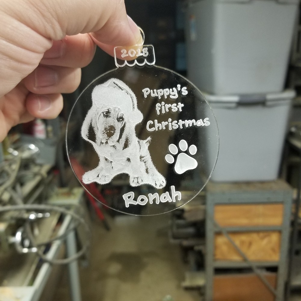
Me 2! What a cute Christmas pup!
4 Likes
Thanks for sharing your tests!
2 Likes
Beautiful job on your puppy. It was great to see the differences that the dots made. Thanks for posting.
2 Likes
All the detail in the nose goes away at lower levels
2 Likes
Great test. Thanks for sharing! Cute dog.
2 Likes
Agreed. 75 looks best to me from this angle.
2 Likes
Now I guess I could do 75 with more and less lines per inch.
3 Likes
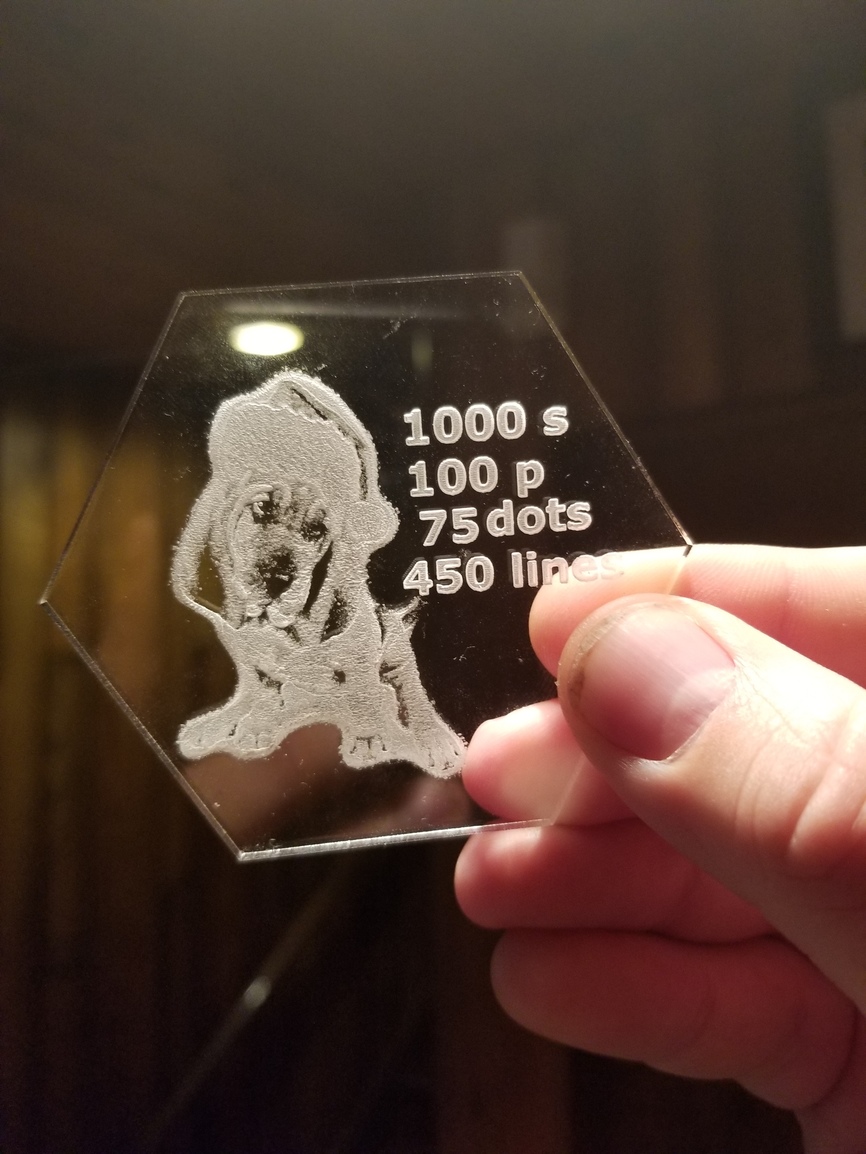
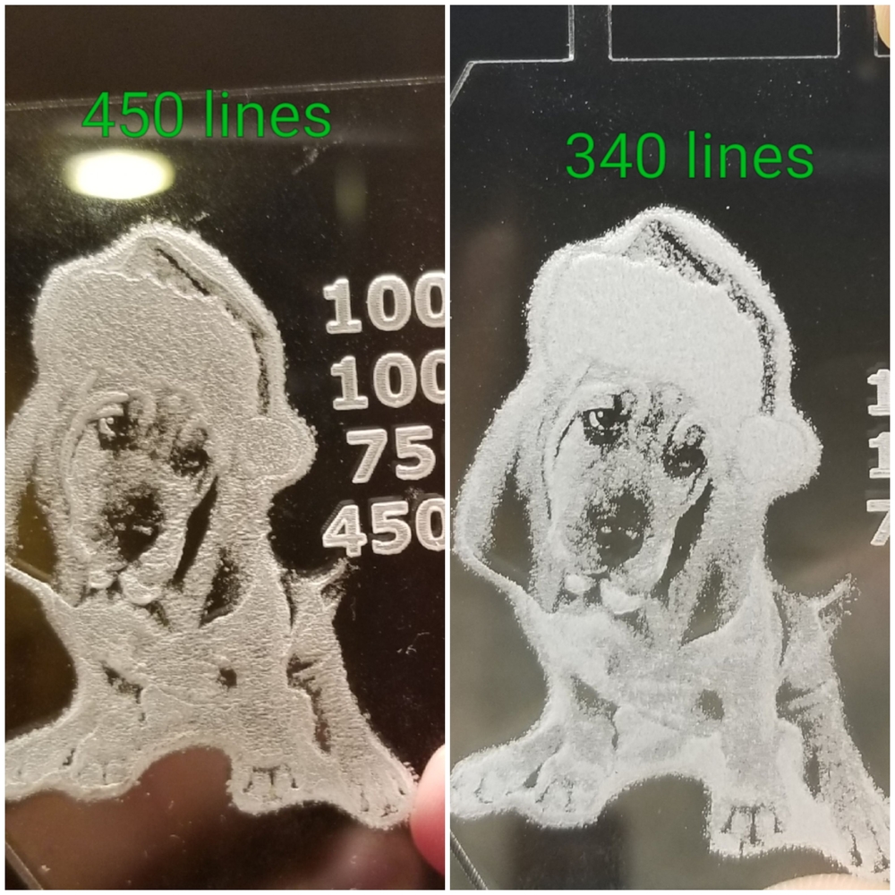
I accidentally had it a little smaller. But 450 lines looks better than 225. I’m going to do 2 more bigger and at 6xx lines.
6 Likes
2 more…honestly,
Was my favorite.
4 Likes
Bigjohn
September 1, 2018, 5:30pm
13
Wow thanks for that! How thick is that acrylic? 1/8?
1 Like
Medium proofgrade
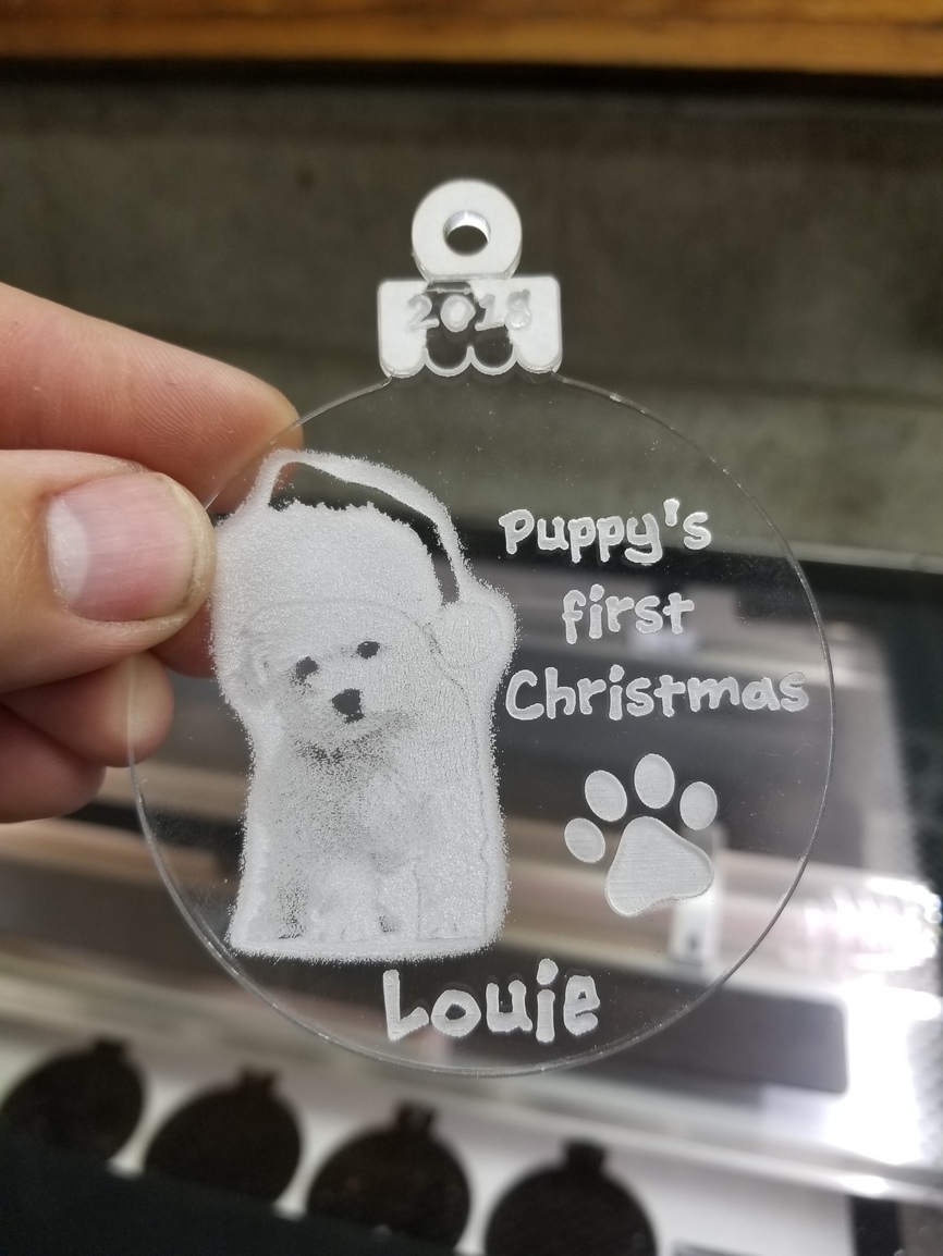
Heres another dog at my favorite settings, but I think the contrast needs to be increased
It is a white dog… so probably hard to do perfect anyways.
7 Likes
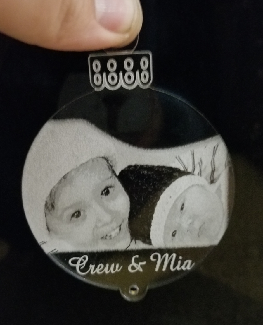
This one is spectacular. It is very clear too.
3 Likes
Jules
September 1, 2018, 9:11pm
17
Yeah, i like that one too…very crisp!
2 Likes
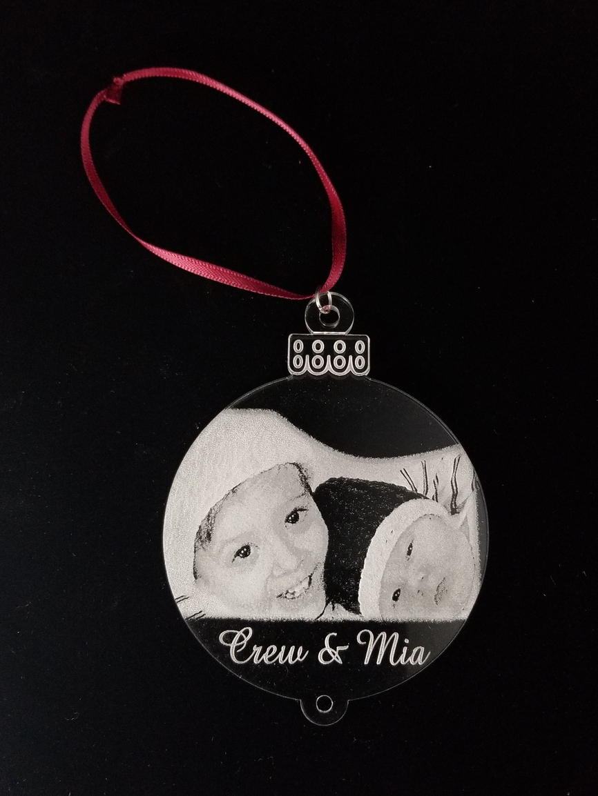
Plus it has my 2 kids… although it’s a few years ago.
2 Likes
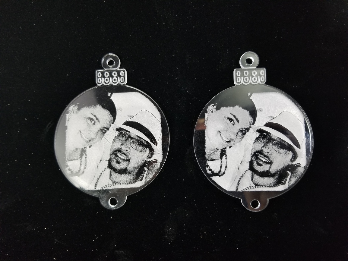
Final test… which looks better. Left or right?
Left looks better
Right looks better
1 Like
Sad part (or good for glowforge) is that is the standard draft photo settings on the left. Now when I tested that for the first one, it came out a blob.