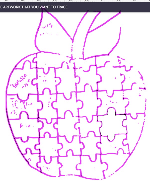
I expected better on scanning a very darkly drawn image. This was after several shift-arrow key presses to increase contrast (actually many). I mean it’s drawn in black sharpie… Not sure how much higher contrast you expect drawings to get?
2 Likes
That is interesting. I did the exact same thing on a sketch like that and it turned out perfectly. The scan picked up a few things that it shouldn’t have, it didn’t miss anything.
However, it did misinterpret some of the dark areas, adding a non-filled area in the middle of what I thought was a complete fill. I wonder if that is what is happening here.
Wonder if it has to do with the new “faster camera” settings they just released?
Don’t forget you can also use control-shift-arrow. I haven’t used the scan feature very much but it definitely seems to take some finagling to get the results you’re looking for on hand-drawn stuff.l
1 Like
Hmmmmmm. Is the room lighting interfering in any way?
This is so flipping annoying. I know there are keyboard shortcuts that work in the app, but there should be a way to do the same things without the shortcuts, in case someone doesn’t know all of them. Longcuts? There needs to be longcuts as well as shortcuts.
2 Likes
Probably a longshot, but is your machine in a sunbeam? I realized that ambient light was overexposing the contents at one point and shading the lid helped the camera see better.
I’ve had similar results it depends on where you put the artwork in the bed before the scan
Nope windowless room in the basement, climate controlled
Oh, I worked on that jpeg a little bit this morning…as much as I had time for…it took quite a bit of Photoshop cleanup, but you might have better results with this PNG:
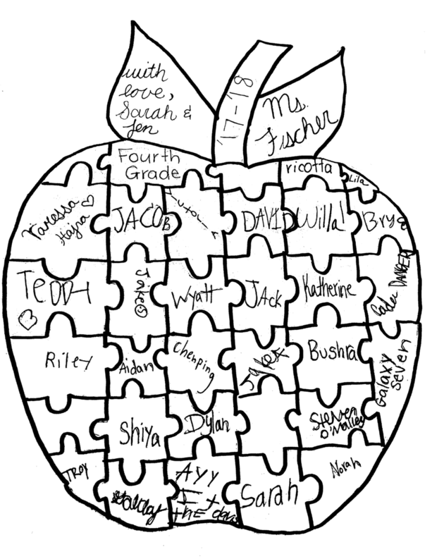
It’s got better contrast, the drawings have been thickened, and a lot (not all) of the noise was removed.
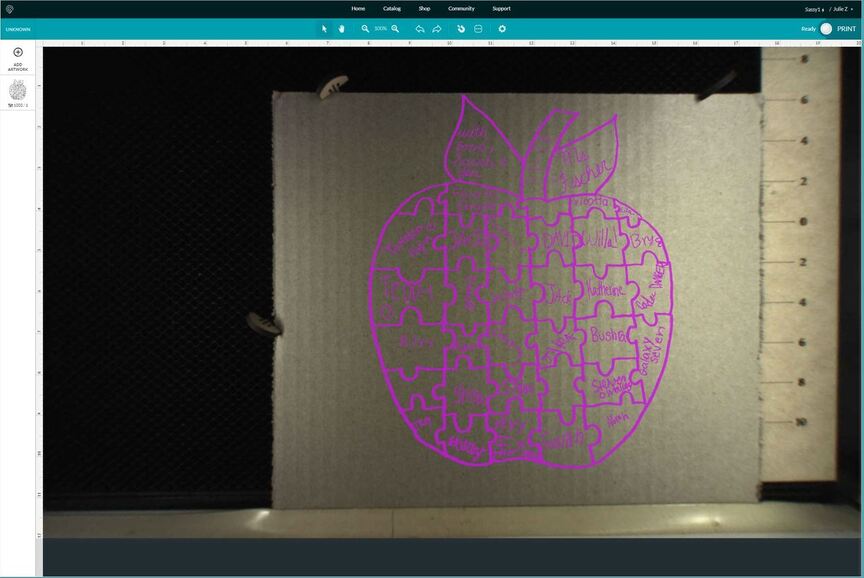
The engrave results don’t look too bad:
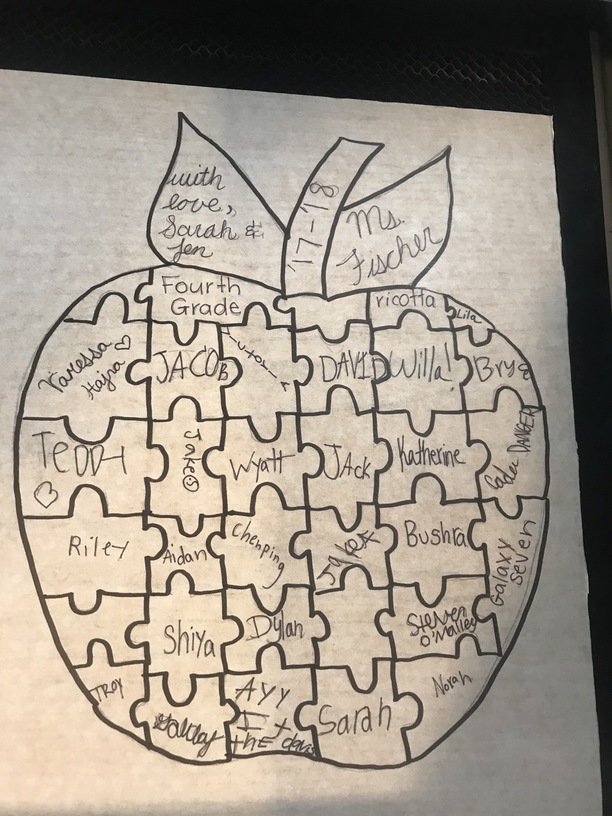
You could get a much better result if you take a straight on photograph of the drawing so that it doesn’t have all that shadow on the right side, erase all of the stray pencil marks, and thicken the ink tracings over the names.
It’s just a pretty rough image to scan and hope for nice clean lines…it would require cleanup even with a better scan - the paper looks a little grayish.
@jules - you’re incredible - thank you!
@henryhbk I’m sorry you didn’t get the results you want. I extracted the logs, and it looks like you got a much better result in a later trace. If so, I expect that the difference is related to the size and location of the square that you drew to select the apple.
Would you let us know if you still have a challenge with this print?
It’s been a little while since I’ve seen any replies on this thread so I’m going to close it. If you still need help with this please either start a new thread or email support@glowforge.com.