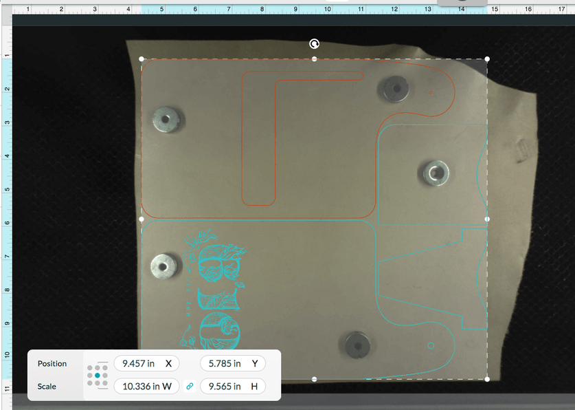
I like the new Position & Scale panel in the interface. But, I wonder if it could be scaled down or perhaps moved into the info panel on the right of the screen?
It pretty much blocks a good portion of the workspace and is distracting. I’m having to constantly use the hand tool to slide the screen around to view under it.
Yep. That’s what I do. A little irritating. I’m starting to make that the first thing I do in a design before I start moving things or defining operations.
Might want to put in a suggestion to make them adjustable.
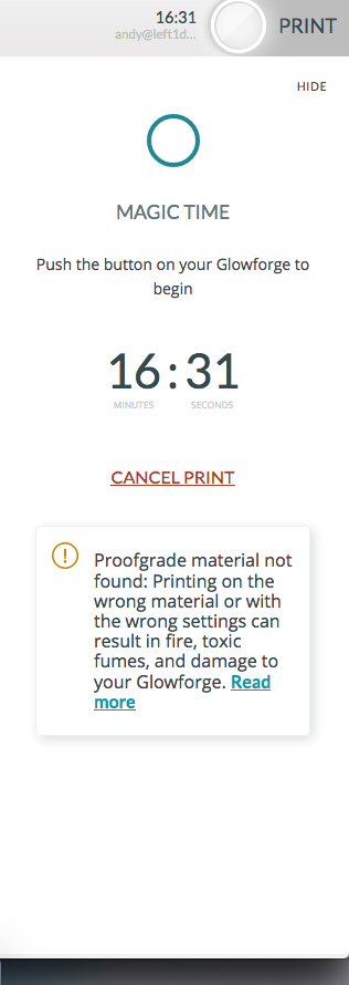
I think the purpose was to default to something people on a phone or tablet could use, which will be huge for a 32 inch screen.