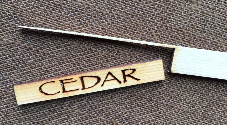
I still can’t spend a lot of time on the computer on account of my hand, but I just had to try it. It took 3 tries to get the engrave settings to not cut all the way through (these skewers are .1" thick and .35" high), and I could still increase the speed a bit to make the engrave shallower. I think it looks nice in the Papyrus font, don’t you?
Wow! With all that is going on in the world, I had no idea how incredibly critical font choice was for a film until I read some of the comments to that blog…
How could I have been so unaware? How could I have actually liked the use of this particular font in this film? But then again, I suppose it should be no surprise – I’ve actually been known, under cover of darkness and deep in the shadows, to use Comic Sans on occasion, and even Morpheus in my personal art studio logo…
Luckily I’ve been able to keep the shame from my family. LOL
I think movies should concentrate first on subtitles that are not the same color as the background and the font second. Have they ever considered a subtitle option in the letterbox?? Radical innovator I am.
 ) Very cool. Hope your hand gets better soon.