I sit directly next to my GF while it’s running, it’s so loud it’s extremely difficult to miss when it stops.
How do I get the annoying “print done” pane that now fills the right 20% of the screen after a job completes to disappear automatically?
Yes, I can click on the “Dismiss” link and it goes away, but that’s one more click … every time I run a job… Or I can just ignore it and let it use valuable screen real estate, equally annoying.
I’m hoping there’s an option somewhere I can disable the annoying feature.
The next thing I want to do is modify & export the shape in my editor. Then in Glowforge delete the shape, reload the modified version, reposition, and cut it again.
In my experence any ammount of clicking in the Glowforge UI retains the “Print Done”, unless you click the “dismiss”, “hide”, or leave the job.
Since you’re not supposed to run the GF unattended and because the hardware is so loud, I don’t understand the value of forcing a completion dialog box that requires a click. An arguement could made that hearing impared users might like this feature, so to that end it should be retained but with an option to turn it off.
I kinda agreee here. The whole right side of the UI is take up, to display less than 10 words. What ever happened to simple popup notifications? Windows10 and tablets are killing user interface programming skills developed over decades…
To me, it seems like the use case for this feature would be people whose computers and GFs are in different locations and, are not monitoring their GFs during jobs. Since this is something I think they want to discourage, it doesn’t seem like the best UI choice.
I see where you’re coming from - you’d like for them to change it to save you space and time, totally agree with you. It’s almost non-essential other than a large confirmation window, it serves no purpose. Before, it showed a “live preview” with the timer, so at least it was semi functional, although redundant. I rather enjoyed the preview window because I used it as a failsafe when knowing whether I turned a layer off or on, but there was probably a group of people who didn’t like it at all. My understanding is that the creation of the preview took a lot of resources of the computer it was on, and contributed to the long wait times and when preparing the print, so giving us the few extra seconds to wait less was deemed more important.
Back to what you’re saying, though, my computer and machine sit across the room from one another, so if I’m at my computer, I’m not at my machine and vice versa. I don’t mind the large dialogue because I’m one of the ones who will watch as it runs jobs that I’m not entirely comfortable with the safety of what I’m cutting. This means when I look back at my computer, I’m grateful for the large counting down numbers so that I know I only have a couple of minutes left of watching until I can do something else.
For those like yourself, it’s an inconvenience, but for those like me it’s a good thing. I was miffed when they took the preview away, but plenty of people probably enjoyed it, so in the end, we just have to deal with what they decide to give us. Now if you want to start a petition for the space they decided to use on our upload design screen, then I’ll definitely be on the bandwagon with you!
While there is no real wrong way to use the interface, this is isn’t how the GFUI was designed. Their use case is to bring a new file in from the catalog each time, and the benefit is that it retains your layout and settings. Complaining because you’re using it differently than designed is your prerogative. You do you.
The panel is handy using the compact filter for me since I can no longer hear the “shave and a haircut” clicking at the end of a job.
I’m only addressing the large “print done” pane that fills the right 20% of the screen after the job is complete and the requirement to click a button to close it. Aside from being annoying it could be seen as encouraging users to leave their machine run unattended.
You’re talking about the time left counter while the job is running. I like this counter. The large numbers make it easy to read when I’m standing at the laser cutter.
For the record I was indifferent to the preview window.
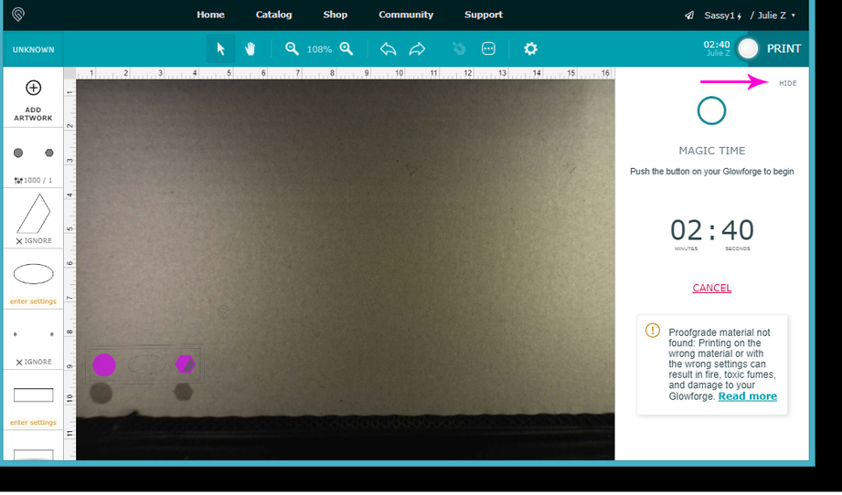
If you want to hide the panel, click on Hide after you have reached the Print Ready screen, but before you hit the Print button on the machine to start the print. It goes away. (Along with your ability to Cancel the print except by walking over and lifting the lid on the machine, so make sure that’s what you want to do.)
We’re talking about two different things, you’re pointing out the time left screen that has a “hide” button. I agree with this pane being displayed while printing.
I’m talking abou after the job is completed the UI shows a pane in that area saying “print done” and requires the user to click a button to make the pane close.
I understand that the “hide” button or “dismiss” button can be clicked to make these go away. After having to click them after each job to make a slight modification it’s just tedious, and the pane offers no real value.
I’m looking for a way to make the “print done” pane auto close after the job is complete, or as soon as the user does something in the interface.
Did you know that you can close that first panel and make your modification to the screen while the job is running without impacting the job that is currently processing? So you don’t even need to wait for the Job Done panel to pop up if you are in that much of a hurry to modify the design.
You can just have the next one ready to go…boom! (It’s a much larger time savings than clicking on a button. Try it and see.)
I was going to mention this, but I wasn’t sure if the job done dialogue still appeared after. OP makes it sound as though it does appear even when minimized or closed, I haven’t paid enough attention, especially since the update, to know whether it does or not.
It does, but it is just a flag to people that their job is done, and useful if you happen to be working on something else while the job is running. Yes, we do have to click it to close it.
The modification I want to make can only be made after having the completed part in hand and tested it for strength, fit, finish, etc.
Once testing is complete I head back to CAD where I modify the part, export the part to file, delete the part from the GF UI, load the new file into GF UI, move the part around on screen to get it aligned on the material, then print, rinse and repeat until I’m satisfied with the part.
I agree that clicking the “dismiss” or “hide” button is a small thing to do but it’s one more thing on top of a long sequence of clicking.
Thanks for the suggestions, everyone! I’ll make sure the team gets them. It’s been a little while since I’ve seen any replies on this thread so I’m going to close it.