Ouch! Thats mean! Beware of the font police! 
1 Like
Yeah…no.
But I like @PlGHEADED 's idea about a custom board! I have already been toying with ideas for custom Tablero boards for some of my SCA friends. So maybe I’ll add a custom Scrabble board to my game board hopper 
(sans comic sans)
1 Like
I may have to do that for my artist Daughter. ![]()
2 Likes
You can open the PDF directly in Inkscape or Illustrator and modify it.
4 Likes
Yes. I did that and it works great. Thanks.
2 Likes
You really want to screw with someone, use several different fonts for the tiles.
On purpose.
Yes. I am a horrible person.
9 Likes
To really mess with a typography nerd, use half Helvetica and half Arial. ![]()
5 Likes
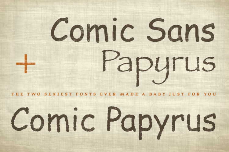
And Papyrus. Gotta have Papyrus 
5 Likes
May as well throw some Haettenschweiler and Brush Script in there too.
1 Like
I’m staying out of this font war. It got a little heated last time! 
5 Likes
Wow! I love Comic Papyrus!  - Rich
2 Likes
Lest we get too far out afield: the font does need to be placed in a rectangle taller than wide. Theoretically they could be square tiles, but then that gets a bit challenging with orientations as you line them up. So the W and the M could looked squished. A serif or decorative font would be interesting, but only with readability and ease of placement, manipulation considered. I have never really thought about letters in this way, so figuring out what looks good on a square (my alphabet block project) and a rectangle (my Scrabble inlay project) takes some thought.
5 Likes
Epic!
Any thoughts about adding Chiller to the mix. Would really make a design statement.
2 Likes
Ahhhhhh… forgot about Chiller! Good suggestion!
1 Like
@tim1724 twitch*
@cmreeder Actually I have plans of doing this for my kiddo (I’m the resident type designer)… alphabet blocks with either 6 different fonts, or 6 different hand lettered styles. Then they are a matching game too! 
@Brandon_R This made me laugh for several minutes. I can’t wait to show my husband!
:update: His response: “can’t unsee! can’t unsee!!”
2 Likes
Yeah, I had to squish the M and the W quite a bit to make them fit in the tiles above.
1 Like