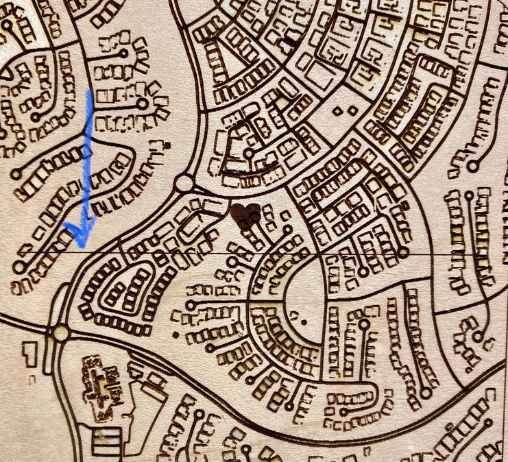
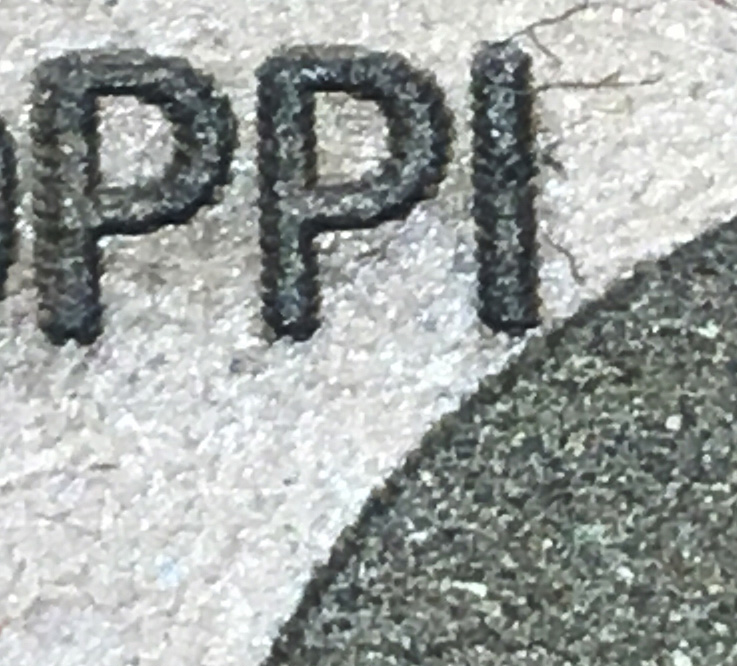
I have been engraving multiple maps, and once in a while a random line will appear across the design. I triple-checked the svg (done in Inkscape) and there is NO SUCH LINE in the design.
EDITED to add that it only happens randomly with the same file (it will print fine one time, and not another). So this leads me to believe it is not related to the svg(?)
Can anyone tell me why this may be happening and how to prevent it from happening again? Very disheartening/frustrating as it ruins the entire engraving.
Personally, I always rasterize engraves as a first resort. It avoids later having to do it as a last resort. In Illustrator you can do it as a filter and not have to think about it. I wonder if Inkscape has a similar feature.
Odd that it occurs sometimes and not others. I’m guessing that’s a processing thing on the GF side. But as others have said… Rasterize it and it won’t happen again.
I had this happen before i reset my design and downloaded it again and deleted previous image. worked fine sometime files contain small things like this. try deleting this image and download it again
Inkscape has the feature, however, it is the nature of pixels as a stack of squares that any line is jaggy except as either a vertical or horizontal and even then only if the line is exactly between two stacks. A vector has no such issues and in fine detail will have a standard slope and more precision than pixels will.
It is the nature of engraving that it is produced by the laser moving in parallel lines, otherwise known as raster. All engrave operations are converted to pixels, whether you do it yourself or whether you depend on the Glowforge servers in the cloud to rasterize the vector for you. The latter has a number of issues, as demonstrated in this thread and in the video linked above, whereas rasterizing it yourself has no such issues and has a standard representation that is no longer subject to arbitrary interpretation of overlapping shapes, winding rules, clipping masks, stroke widths, pattern fills, etc.
This. Just like regular printing - vectors are converted into rasters when sent to the printer.
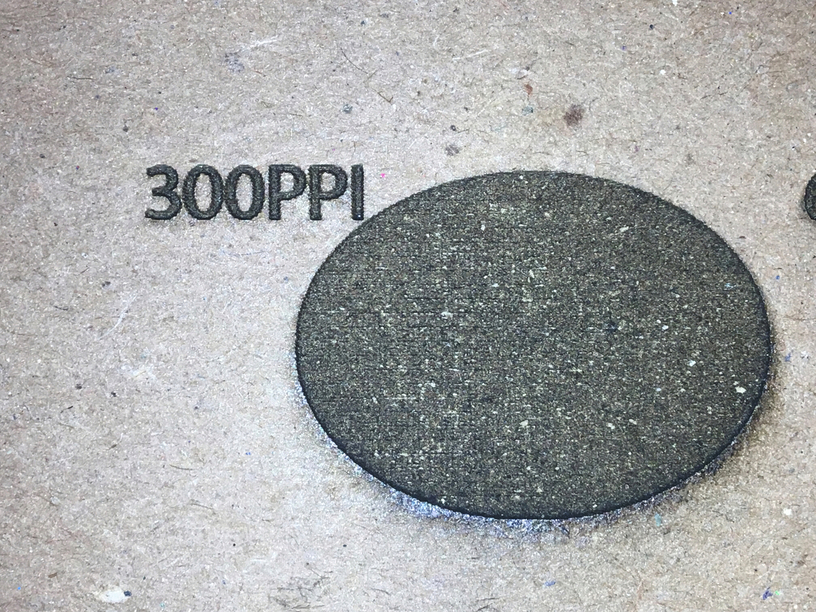
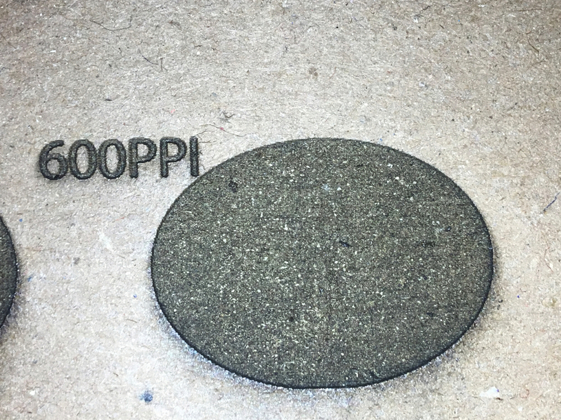
You’ll want to make sure that you are rasterizing at high PPI - 300, or even preferably 600 (which engraves a bit cleaner).
I’ve ran tests showing the quality differences between different PPIs at a single LPI. What I didn’t do, and should have, is used the vector as a control to compare it to. Someone should do that
When I engrave from a bitmap, I like to make sure the source DPI is at least the same or higher than the setting LPI, but I have engraved from lower resolution and the GF cloud smoothed it out just fine. It is effectively doing the dreaded “convert to bitmap” in the cloud.
I don’t know if I’d call it “diminishing returns” but most wood gains little benefit from higher LPI. I tend to just go with SD Graphic defaults for the material closest to what I’m using.
Acrylic is much more “true” (?) to the LPI, and it can be seen, but then we’ve got the defocus trick to smooth it out.
I’ve never rasterized a vector design, I have in fact spent a lot of time cleaning up traced bitmaps to create vectors. That’s just how I roll. Pretty much the only time I engrave raster is when I’m doing 3d/depth map type stuff, or lit acrylic where I need a slight gradient to even out the illumination.
Way back in the day on some chipboard. I did 300 speed, 9 power, 270 lines per inch for all engraves.
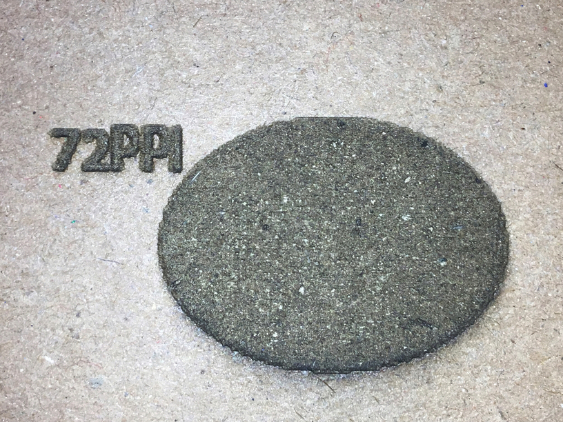
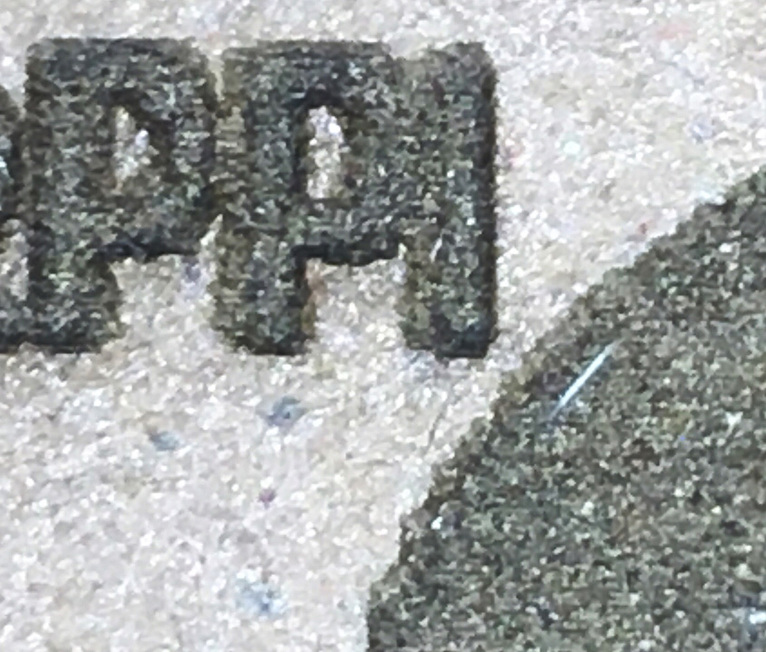
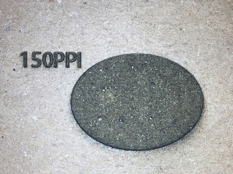
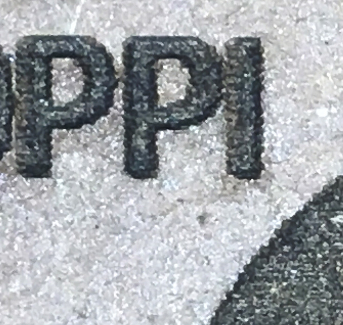
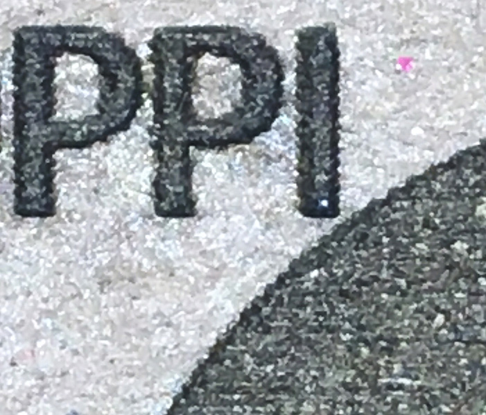
Of note, I would say, is what happens to the text on the low resolution (72 and 150 ppi) engraves. It starts to run together and isn’t nearly as defined as the 300 and 600ppi images. I don’t remember what font sizes those were - fairly small but not crazy small.
That is exactly what I have seen. If I matched the DPI and the LPI there might be less difference but 300DPI and 340LPI is going to have issues, and I am running 450 at a minimum.