We had a bunch of people take early retirement this year. I had someone ask me for advice on how to give a little “oomph” to the cover they were doing, since it was basically a quote by itself.
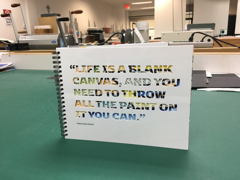
Shockingly, my first instinct was the laser cutter. So we took the quote, set it up in a nicer stencil font (Kobenhavn Stencil) and cut out of 1/16" acrylic. i did have to do a little manual editing for some of the stencil tabs to make them a little sturdier. The image showing through was a painting Mike did (he does a lot of drawing/painting when he traveled, which was constantly, and post on instagram) of the fields outside of Omaha that you see when you fly in.
Mike is the retiree. we used a lot of his paintings throughout the book. That was my inspiration when my boss was asking for ideas. I saw the big quote on the front and i saw his paintings throughout. that wheat / corn fields painting jumped out at me as something that would look really good behind a die cut of some sort. and, since he’s in nebraska and most of who’d see the book would be there, it’s pretty obvious what the painting is even through the die cut. and yet still a little abstract.
I love it! The painting coming through looks so cool. As far as fonts, that’s a great choice. Another one I’ve been wanting to try is Neoneon, I bet that would look great too.


 and go re-cut.