Last question of the day I hope. SVGs work fine but when I upload PNGs they all look spotty. I’m not entirely sure what to do about it. I’ve tried going back over my illustration with another color on top to make sure it wasn’t translucent but it’s still engraving the way it shows on the screen. Any ideas on what I’m doing wrong?

1 Like
“spotty” probably means it’s trying to dither the grey color. Can you post a closeup of your finished engraving?
What do you mean spotty? Can I just not see it in the image on my phone?
Ahh you mean just spotty in the UI. You can make the image solid black and it should engrave solid.
It defaults to engrave using dots - if you change your style to vary power it will become smooth in the preview - BUT you might want to engrave using dots because IRL that can be a better view overall
Time to run some tests 
1 Like
I think what you are seeing is the background being dithered (turned to dots). Deirdrebeth is right, change it to vary power and if it goes away, that’s what is happening. Try saving the PNG with a transparent background and that should clear it up. (Sorry f you’ve already tried that.)
1 Like
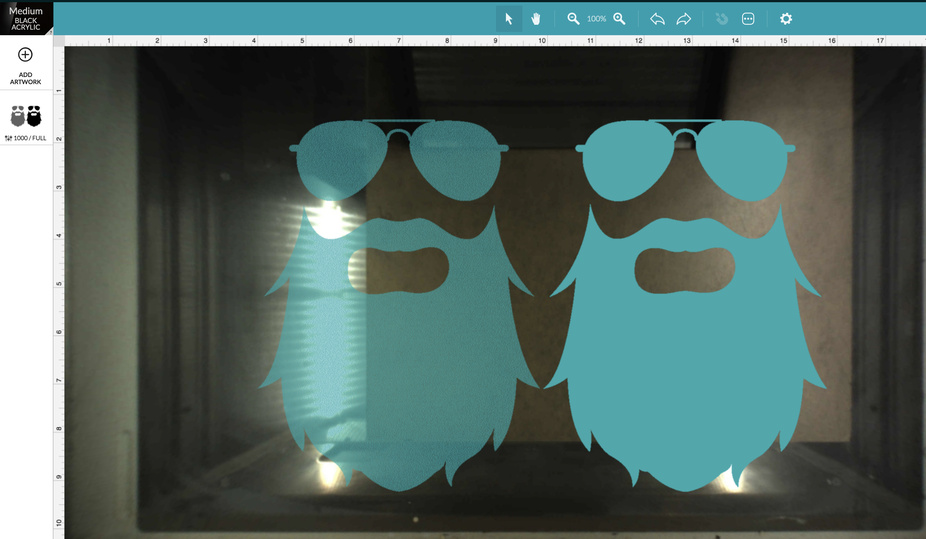
Here’s Grey vs Black in a PNG file, and a screenshot of the affect in the GF app.
Grey (any level from 0 to 254) is going to be translated as having some amount of transparency by the GF app. If the grayscale options are set to dots or patterns, you’re going to end up with dithering patterns. If grayscale options are set to Vary Power, you’ll have a smooth solid engrave but the depth of the engrave will be based on the darkness of the artwork.

4 Likes
I’ve never done it - but you have the files right there and my laptop is 6’ away. What happens if you up the minimum dot density all the way - will it go to 100?
1 Like
It goes to 99, and looks like it’s pretty much solid.
2 Likes
Thank you everyone! I was able to play with it last night some more but GF wouldn’t let me reply anymore. Apparently there’s a limit and I wasn’t aware. The only issue I have when making it more solid is that some parts come out slightly darker than others. I thought maybe it was the image but I tried it with just black lines and I’m getting the same issue. I’m not sure if that’s normal or if it’s my settings but I’m going to keep messing with it.
1 Like
I think the problem is easily solved by keeping the vector lines and not making a PNG. You can engrave the vectored area much like a “vary power” just at the most extreme and the edges will be sharper than is possible with any pixel graphic.
I see it is a common misconception that to engrave you need a pixel graphic, but a closed vector can be anything! It will first show in the GFUI as a cut but it is a simple matter to to go to score or engrave or ignore. Images can only be engrave or ignore, but vectors can be anything.
1 Like
I changed it back to a vector file but am getting areas where it looks darker. Probably a question for another thread but I’m not too sure if this is normal or if there’s a way to prevent it. The rest of it looks great but it’s really patchy. I tried another vector at the same setting with the same results. I cleaned them with a brush after but it didn’t help even it out. ![]()
1 Like
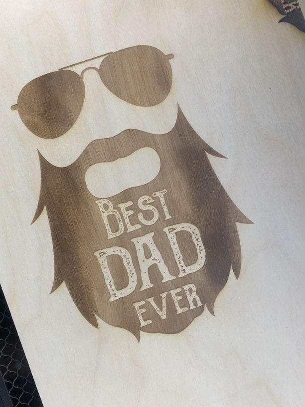
First question, are the spots in the lettering intentional? Like crumbs in a beard?
As for the color variation in the engraved area, that could be the wood or it could be that the fill wasn’t a solid color, but a gradient.
1 Like
I’m assuming it’s the plywood I’m using because it’s happening with all my vectors and I just fill them with pure black. I’m much more proficient in photoshop hence the PNG files but I know my way around illustrator and they were all originally saved as vectors to being with. It’s happening in different spots each time so I don’t think it’s the images. I just thought maybe my settings were causing it to be patchy but I guess that doesn’t make much sense. I did up the dots to 50 and it looks much better. The lettering has holes in it intentionally lol.
2 Likes
What you have there is a factor of the wood itself (may have been part of the problem before) this is not unusual as every bit of grain is different, If you want a pure black the best way is to mask the surface and you can even cut the vector and remove only the part that you want to be black. I did this on a design that was engraved but the large background was a mess,
I covered the whole thing and managed to align it pretty good (extremely good for the issues then) and turned the engrave to a score. then I had just the bad background exposed and cleaned up a few bits with a razor, and then had some black spray rubber that covered the exposed part, let dry, and had a much better result…
2 Likes
Could be inherent to the material. Also could be the focus (either warped material or material that isn’t a consistent thickness). A slightly out of focus engrave is one trick to getting a darker engrave without going deeper.
3 Likes
You’re just limited because you’re new. It’s to avoid people joining a forum just to spam it.
2 Likes
Oh that is a cool trick. In order to do that would I put in the numbers manually? Currently I’ve been doing .13 or using the auto focus.
Beautiful!
1 Like
There are two places to put focal distance one for overall and one for the individual cut. the one you change is in the individual cut
The way it works is:
Set Focus - uses auto focus for a specific area of the material
Or,
Set the material height - this uses autofocus at some part of the design.
Or, set the material height and then set the focal height field to a different value than the material height, which overrides the auto focus and uses the focal height value.
Also, if you use set focus, it locks the material height and focal height fields to auto, I believe. So you have to refresh the bed image to override the set focus.
1 Like