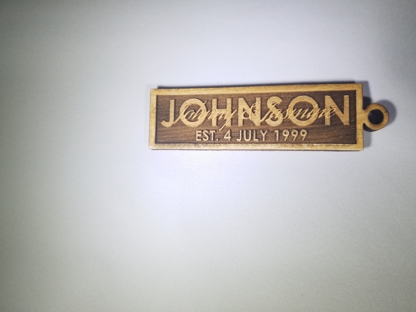
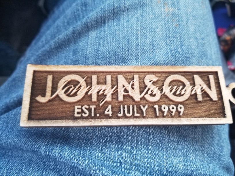
I still have to mess with the settings a little bit. I would like more definition between the last name and the 1st names. It actually had a little bit more before I scrubbed it. I did not use masking which will help a ton for the next one.
27 Likes
Clever, different depths text stacking. Not seen that one yet.
1 Like
Very nice! (If you want to make the first names stand out just run a separate light score around the names. Should make them pop.) 
4 Likes
Great idea
1 Like
You have the Johnson in such a heavy font and the first names in a much more delicate font. unless you made a veneer in something dark like Walnut they are likely to be difficult to read. However rethinking the fonts with the bolder font to the first names, but of a more balances weight might look a lot better. (you might still want to add the veneer)
1 Like
That’s very common. It will be much better with the Johnson a little darker/deeper.
I think the heavy / delicate font combo is perfect; putting the heavier one in front would throw it off, and giving them both similar weights would diminish the artistic appeal. The key to combining different fonts is to make them VERY different fonts – too similar and it looks like a mistake instead of art. 
@Jules suggestion to run a score around the one in front sounds like the key, to me.
4 Likes
Me too! Along with making the last name slightly lower.
Also the last name is kind of generic. Maybe change it to Johnsohn. Better symmetry too.
8 Likes
One problem, particularly with oak, is that it engraves differently depending on the exact location in the wood . This wavy effect is not bad on the background, but could fight with the last name as the pattern starts to interfere and blend to the background.
1 Like
![]()
![]()
That’s the point… and it’s my last name too.
1 Like
This is solid maple.
Beautiful!
1 Like
While you’re at it, maybe you should round up to 2000. 1999 is so last century.
4 Likes
![]()
![]()
![]()
![]()
![]()
They didn’t have marriage prior to 2000, did they ![]()
1 Like
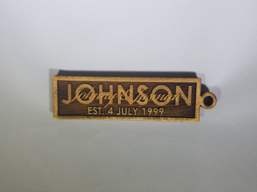
Looks great–better as suggested w/ score line to make the script text pop–and the style of fonts look nice this way.
And of course, name spelling and dates that actually are correct for the recipients!
1 Like
So is 2000.
2001 was the start of the current century. (It’s that whole year 0 thing ![]() )
)
3 Likes
Forget century, it’s old vs. new millenium!
2 Likes
Couldn’t you pre-stain, or pre-paint the surface? Both would basically be just be surface level coloring. Then your 3D engrave would remove most of it.