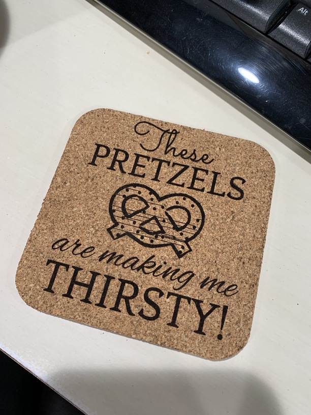
Hey all! I was testing a print on a cork coaster with a Seinfeld reference for my husband, and the pretzel ended up with some line streaks on the engrave. I used one of the standard pretzel files from the Glowforge app directly, and couldn’t find any issues with the design itself that might have caused it. I’ve noticed on some Illustrator files of my own that if a line/anchor isn’t closed it might not print/engrave quite right, but that didn’t seem to be the case here.
Any ideas or suggestions on what may have caused this or how I can avoid it in the future? Thanks in advance!
That is the primary cause when that happens though sometimes hard to see. If you care to post the image we can take a look. or if you look there are dozens of similar pretzels in the GFUI menu to use instead.
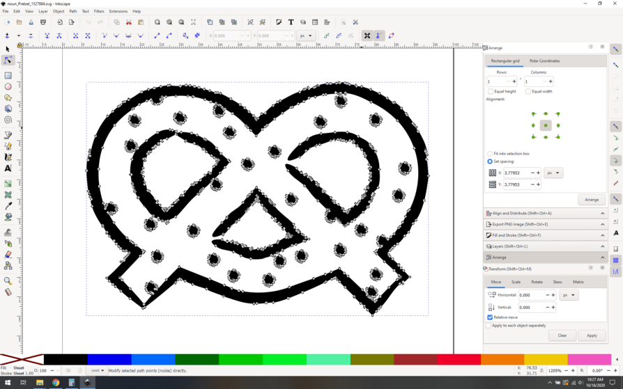
That is a lot of artifacts. You could chase down the nodes and probably repair it, but for something with this many issues I’d probably just rasterize it at a nice high dpi (600 or so) and move on. Chasing node issues gets old quickly.
And I know you say it doesn’t look like node issues, but this definitely looks like what happens when you have node issues, so I’m thinking it’s just a well-hidden problem.
Awesome thanks! I’m super new here, and I just assumed all the Glowforge stock files directly from the app were safe to use. Good to know that they need to tested!
The free designs section has pages of pretzels and while probably not the same fonts there are likely similar so the whole thing could be done there in minutes. A very good example of a reason to use the free design section rather than chase down all the nodes.
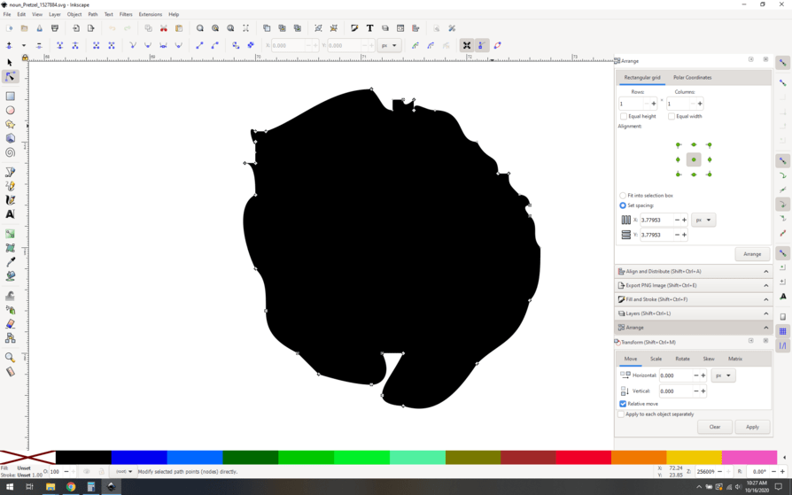
In Inkscape, the Break Apart/ Combine option will fix most of them quickly, and the few left easily fixed.
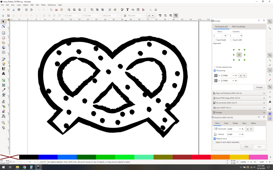
Yeah so Glowforge’s image library is backed by the noun project, and they have 2 million plus images. There are bound to be some issues. Let’s see if I can find it on their site.
Yeah here we go:
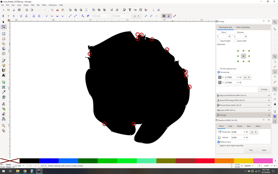
So right off the bat this is “junky”, made to look rough and hand drawn. That means probably lots of nodes and potentially lots of problems, let’s dig in. I’m using inkscape, but the principles hold for illustrator.
I open it up, and sure enough the edges of all the shapes are rough, presumably to look like chalk or charcoal.
Looking at the nodes, my instinct was right, there are a lot of them (2000+). This isn’t necessarily a problem in and of itself, high node counts can be fine. It’s the details that matter.
You might not immediately see node problems here, but with some experience you can see that there are all sorts of things that need investigating. I’d be suspicious of all of the circled spots.