It’s the category where we can talk about settings. Given that we are toying with the captured rage of a powerful fire demon, there are a number of legal considerations when saying “Put these settings into your machine.” rather than having to make a disclaimer on each post, Glowforge limits these discussions to Beyond the Manual. It’s a smart way to say use with caution.
4 Likes
Also accessed here:

2 Likes
Thank you!
1 Like
Stunning results for a first try. I’ve got to try this technique. Thanks for sharing.
2 Likes
Did you use a certain kind of paint
1 Like
Welcome to the forum.
If you read the entire thread, you will discover that the OP mentions Rustoleum from Home Depot.
5 Likes
Would it more sense to first paint a black layer then apply the color on top?
that way you don’t have to invert the mask and since you are not revealing the color from underneath, it will stay vibrant, and black will naturally stay black.
You (in theory) should get a much more vibrant and colorful image like that.
1 Like
Not a bad idea. I kind of like the look of the muted colors for some things. I would be interested to see if having bits of color in the black vs bits of black in the color will look.
Right now I am still experimenting at this point but it’s been so much fun to play with.
2 Likes
I’m going to try your idea…I’ve been ‘fiddling’ around with this for the past two days.
Spent yesterday and today fiddling with this technique. Thanks for the inspiration. ![]()
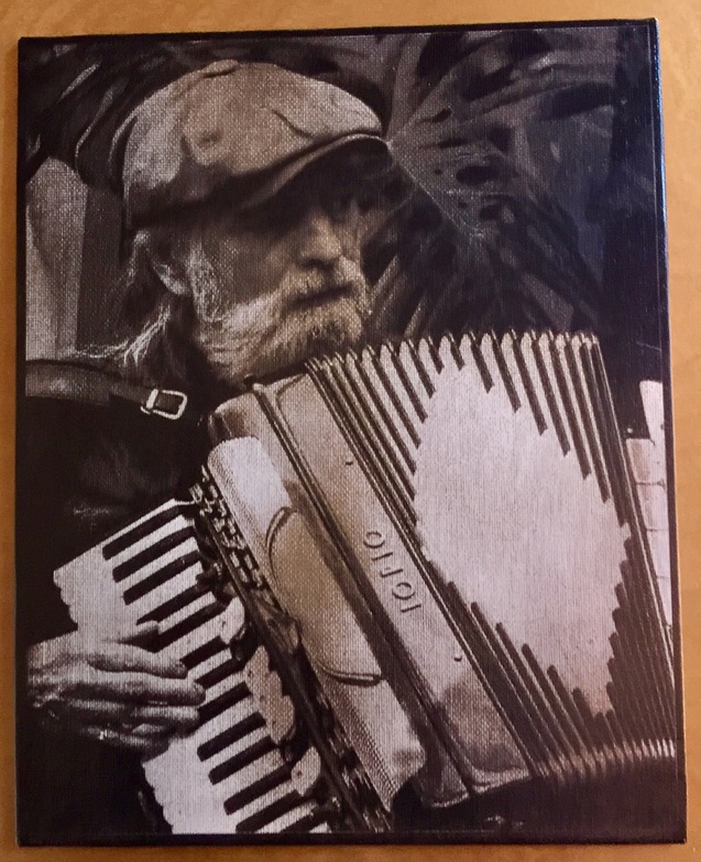
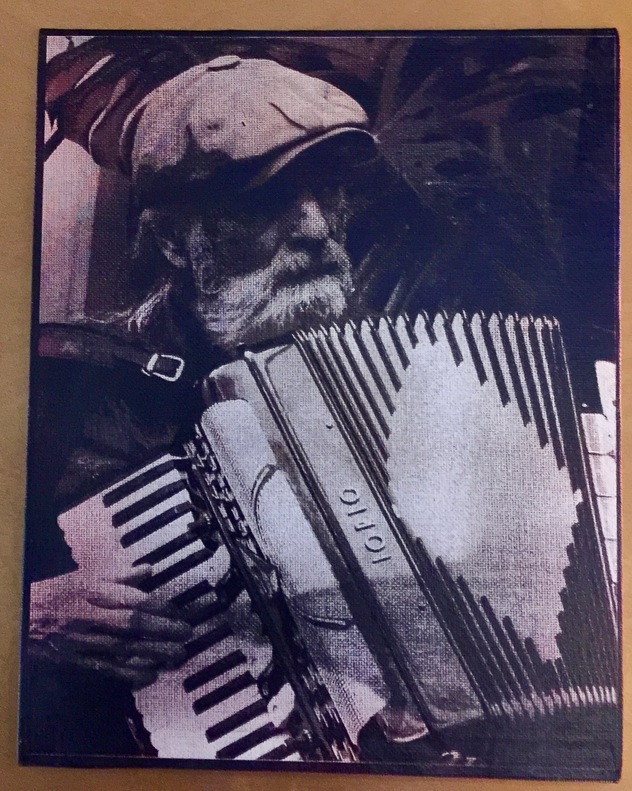
![]() The photo of the accordianist was taken by my friend/ex sister in law of a friend of hers and I thought it was an exceptional photo. I changed it to B&W, then inverted it. First one is black with metallic gold underneath. Another of the same image is muted red. I don’t care for it as much…and also, for whatever reason, the actual brightness of the image is much less, even though I used the same settings. These are 8x10 boards.
The photo of the accordianist was taken by my friend/ex sister in law of a friend of hers and I thought it was an exceptional photo. I changed it to B&W, then inverted it. First one is black with metallic gold underneath. Another of the same image is muted red. I don’t care for it as much…and also, for whatever reason, the actual brightness of the image is much less, even though I used the same settings. These are 8x10 boards.
Metallic gold with black on top
This is the darker one with red underneath.
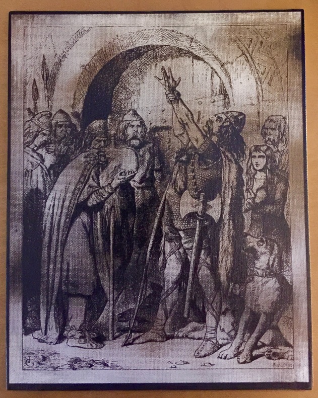
This is an old book illustration I found online
This is so much fun…I will be continuing with some experimentation. My grandson want to do some, too.
15 Likes
Thanks!
Noticed that medium blue covered with a light tan seems to make faces pop out nicely. Gives a nice 3 tone with the dark burn thru parts. Yellow looked good also but does not merge well in places where it does not get burned into (too bright).
Just tumbling alone this rabbit hole with MDF, but the same results probably with any medium.
4 Likes
I like that one too. Looks almost like an old sepia print. Going to be interesting to see what non-laser people make of it since it’s a medium they’ve not seen before. Family will probably be trying to figure out which great-great whatever on whose side of the family it is and how the picture was taken & printed ![]()
2 Likes
I have found that the thickness of the coat of paint can make a big difference. I have also been nudging up my power in some of my newer work. I found I was running things a second time more often than not. It’s fine as long as you don’t move things, but given that an 8 by 10 takes about an hour to engrave, I would rather get it right the first time. ![]()
I really like the photos. They have a great sepia tone look.
2 Likes
That’s what I thought, too.
1 Like
I actually tried one by nudging the power down…thinking more of the color might show through, but that didn’t work well. I’m going to experiment more with the order of the paint layers.
If the black paint is on top, more power should mean taking more of that off (i.e. brighter image). I was using clear coats over the colors and then black on top. That hopefully keeps me from blasting away my color.
3 Likes
That’s the way I was thinking of it, too…that higher power would take away not only the black but some of the color, as well…getting right down to the white canvas. All three images though were done with the identical settings, so it must have been the thickness of the paint that made two of them darker than the other. I will try the clear coat idea, too.
3 Likes
Your metallic gold and black print looks fantastic. That is a real neat process . 
4 Likes
Did you ever post the settings in beyond the manual?