Oh! And I use the settings 1000/100/340/0.313.
And color doesn’t matter. Ideally, I’d just like to retain the black handwriting.
Oh! And I use the settings 1000/100/340/0.313.
And color doesn’t matter. Ideally, I’d just like to retain the black handwriting.
I hope those were the answers you were looking for? I sometimes don’t know the terminology. Getting there tho, thanks to you all!!!
Yes, that helped quite a bit. I’m going to have a quick go of it, just to see how practical it is. BRB
One last question adn then I’ll post the results: What resolution will you use? At 340, the handwriting section of the Gingerbread is either 9" x 12.6 or 7" x 9.8". (I don’t remember trhe GF presets for engraving…) *a few minutes later, I remark: * I’m not even sure why I asked this question; I have 3 projects in mind. Go ahead and answer it anyway.
For engraving handwriting you should use the “vary power” setting, not “use dots”. I’ve digitized my signature and found the results were much more accurate/lifelike.
Oh my gosh. Thank you SO much!!! 
Oooh. Lordy. I just don’t even know how to answer that. I have been using those settings for every board I’ve engraved so far and they’ve turned out wonderfully IMO? My resolution is now set to 100% because I couldn’t get rid of the error msg before. Does that answer it? lol! 
One other option you have…I think I remember seeing you post somewhere else that you are starting your GF business, so this option can come in handy if you will be doing a lot of handwriting projects (I apologize if I got you mixed up with someone else).
You can make a font of your own handwriting and then you can just type the words in that you want. Again, this is more useful if you will be doing this over and over again with different words but the same handwriting style. There are a number of websites that let you do this, and it’s pretty simple really. There are free ones, but the paid sites are typically $5-$20 to do it. Basically, you print out a template, write each letter clearly (using a thicker pen will be good for an engravable font), then you upload to the site and voila. Sometimes a bit of cleanup in Photoshop or Gimp before uploading can help.
Below is an example of a font of my handwriting I made-it’s a font, so I can type whatever letters I want in. I actually made it probably a decade+ ago while in graphics classes for landscape architecture. I was working on my Master’s so I was totally over having to hand print all of my assignments-when one professor assigned a research paper and told us we had to hand print the entire thing to practice our drafting, I made the font  (and I did fool him and get an A
  )
)
I have tried to use the vary power thing but it said those settings were not ideal for the project I was working on. I could try it again with this one, I suppose?
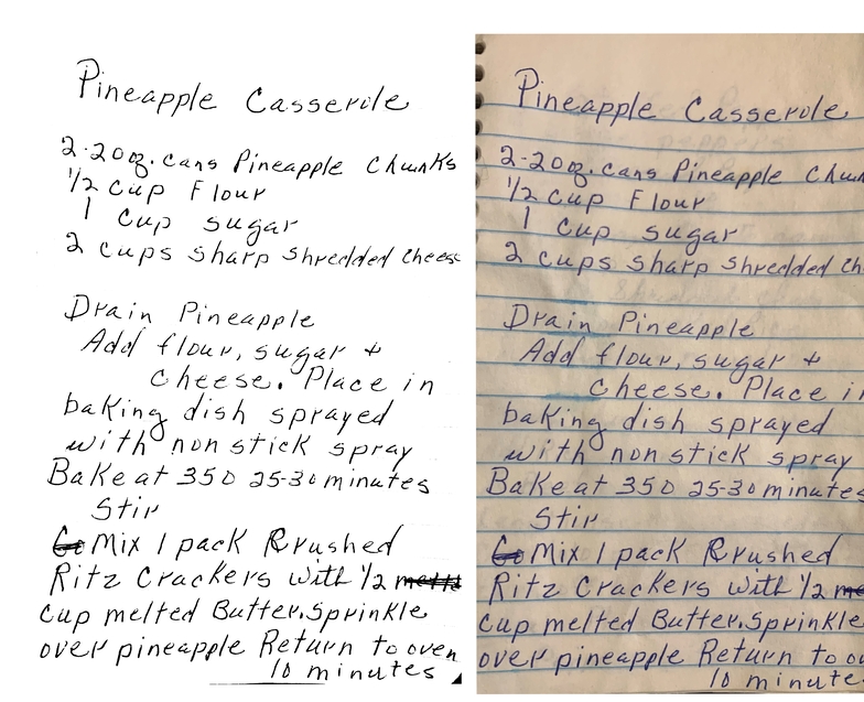
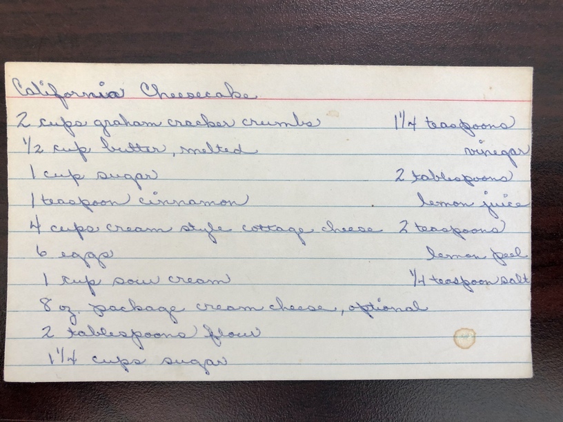
This is good information; but in this case,sarahpassotphotograp needs these samples of relatives’ handwriting, reproduced as though directly from the written page.
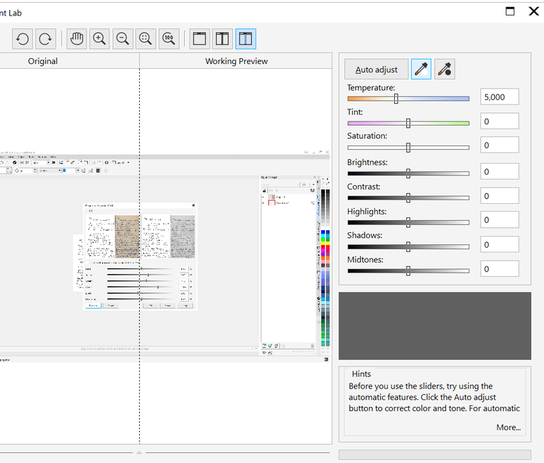
I find the easiest way to get rid of lines on a colored image is to convert it to greyscale and basically deselect the color you want to get rid of. I did a quick example to show what I mean and it took me about 5 minutes to get this far. Obviously it was quick because I have practice, but just wanted to show that it’s not that complicated once you get the workflow down.
First I did some image adjustments and used the color-picker to turn the yellow background white-ish. You want the writing as dark and the background as light as you can.
Then you can convert it to greyscale and remove the unwanted colors.
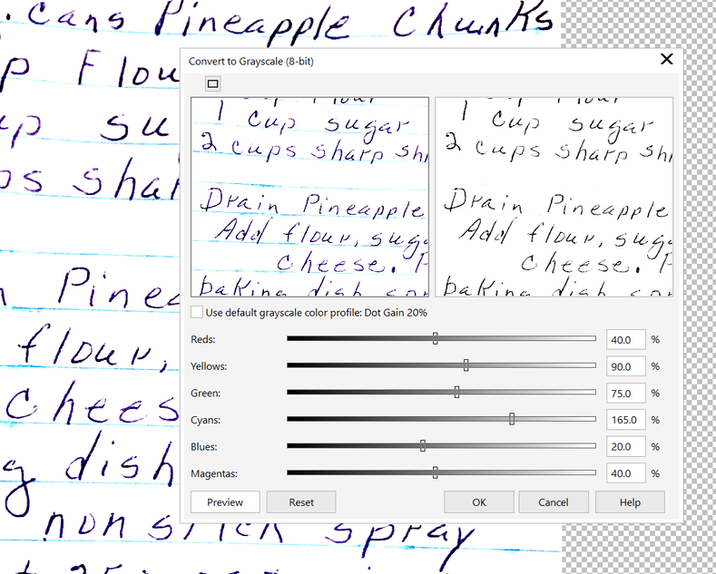
This is what the greyscale control looks like in Corel Photopaint just so you can see what I’m talking about. For your image, I moved the CYANS slider all the way the right so anything cyan was turned white.
Once you do that and the lines are mostly gone, you can use a brush tool to remove any stray lines that were missed and you can get the image as close to black and white as you can.
If you’re struggling and need these cleaned up for a pending project, I’ll be happy to do it for you, but I’m tied up at the moment. But if you want me to give it a shot and can wait a bit, let me know. (Or maybe someone else is working on it for you which is great! I just didn’t read all the responses carefully, so wasn’t sure.)
Oh my gosh!! That’s exactly what I was hoping to achieve!! Thank you SO much!!! I can’t wait to try it out! Thank you so much for the detailed description too!!!
No, you are fine. Keep the settings if they are working for you; I didn’t fully read your answer. The “340” in the info you sent is the ‘lines per inch’, which I can use to determine dpi. The “surface area” of the Gingerbread recipie has an aspect ratio of 1.4 (taller than wide) no matter what size or resolution.
All of the recipies will probably have a similar aspect ratio due to having come out of the same notebook (I hope I’m not talking out my ear, I haven’t looked at them all).
You’re not talking out your ear, I just find it hard to understand all this tech talk - I need to take a course or something if I’m gonna get good at this. Somebody was nice enough to make a beautiful rendition of EXACTLTY what I was looking for of one of the recipes AND with detailed instructions!!! I just love the helping nature of this community! I can only strive to become good enough to help back one day. Thanks again so much for your help!!!
You’re so welcome, glad I could help. Good luck and just keep playing with it. 
I sure will!! Thanks again!!
How did it turn out? I am doing a similar project for my 8th grade design and modeling class. A student asked if I could etch her gmas recipe.
Honestly, I haven’t had time to play with it yet. There needs to be more hours in a day!!
Did you try editing your image and how did it come out?
yes!
This topic was automatically closed 32 days after the last reply. New replies are no longer allowed.