Vector engrave not all engraving

I have a vector engrave of a family crest set up. it’s 3 operations. 95% of it is one large engrave, followed by a couple of tiny scores and a cut.

i loaded the file, waited for it all to draw, hit the button.

partway through, i realized it was skipping a couple of small areas on the outside of the design. they’re not any thinner than the rest of the outside.

you can see here the red lines are drawn on the preview where it says the areas have been engraved. it’s all fill, no lines (except for the tiny scores where the teeth/tongue/claws are).

this is what the AI file looks like.

and here’s the final engrave, where you can see three places that the engrave didn’t happen (or on the right side, sometimes didn’t, sometimes was light).

again, if you look at the original, the engrave areas that didn’t happen were the same width other engrave areas were, but nothing engraved there.

ideas? did i miss something?

this engrave happened about 10pm eastern time tonight. speed 700, power 30, 450lpi.

1 Like

i just noticed, there’s also an extra wide engrave on the bottom left of the shield (the edges of the shield are all the same consistent width) and on the left edge of the leaves just to the right of the circle on the shield.

it’s possible there was a very tiny bow in the material, since i couldn’t put something dead in the middle to hold it down, but it was very small and would have been slightly higher across the top of the lion’s head. but not in any place that should have caused the engraving to vary the way it has, since those variations are not along any specific plane that a height variation would have occurred.

I can see another spot on the lower right - where the scroll wraps around. And another above center and slightly to the left.

Putting material variation aside - Was it masked? I could see where a bubble in the masking could do this.

Also, the claws are filled. The tongue is filled.

yes, i see that one, too. there are some other variations that don’t bother me as much because some variation makes it look more naturally engraved, but i don’t like the dropouts or the heavy overengraves.

no, it wasn’t masked at all.

and the claws/tongue/eyes were all a score, so they look heavier/filled. i do have some adapting of the file/settings to do after this test, but i’d like to fix the engraving inconsistencies before a burn another piece of test walnut.

1 Like

run your burn on some inexpensive plywood, or proofgrade MDF (Draft Board) - increase the power or lower the speed in small increments until it looks the way you want it…

I’d try that once on something that you know is fairly uniform, (like Proofgrade), to rule out file issues - and if it burns correctly, you know that all you are seeing in the first one is natural variations in the wood, or some kind of contamination on it. I can see a slight difference in texture/color at the areas where it didn’t engrave…looks almost wet or damp, which would keep it from burning the same as the rest of the wood.

Maybe it wasn’t completely dry there, or there’s a hard spot.

i don’t think i can set engraving settings for plywood or draftboard and then use those on walnut. they’re not really comparable on the hardness scale.

i’ll try another small portion test of those areas on a piece of PG. fwiw, i think those areas you’re pointing out are mostly where there’s char from the cut. but even if there were variations in the wood (or moisture, which i didn’t see), there should at least be some mark from the laser at the engraving point, just not as deep. the three places i have circled there’s literally no mark at all, as if the laser dropped out.

Checking proof grade settings: (On my basic)
draftboard SD engrave 1000/full 270 lpi.
Maple plywood SD engrave 1000/full 270.
Walnut hardwood SD engrave 1000/full 270.

I’m so sorry your print didn’t turn out the way you expected. I extracted the logs from your Glowforge to investigate, and it looks like that the file used to print does not match the .png you posted of the image as it looks in Adobe Illustrator. Specifically, the file matches the print results in your photos, including the small skipped areas.

Could you please let me know how you are preparing the file for the Glowforge app (saving as an SVG from Illustrator before uploading, copying from Illustrator and pasting, or something else)?

2 Likes

thanks for checking, @vee. i copy/pasted the illustrator file into the GFUI.

i’m confused when you say what’s in the logs doesn’t match what’s in the file. if you look at the red lines on the preview when i was 1:36 from being complete, you can see the red line at the bottom of the scroll beneath the “wells”. so it existed in the preview. and i see other missing areas in that preview as well.

image

i’d be fine with you posting the SVG from my log here so i can see what looks different inside the file used to print vs the preview here vs the actual AI file.

2 Likes

I’ve sent you an email with the file.

2 Likes

thanks, @pip. i’ll take a look and compare tonight.

1 Like

so i took a look at the two files. i’m not sure why the GFUI interprets the pasted illustrator file the way it does.

Here’s a side-by-side.

if anyone has thoughts and wants to look at the actual file, here’s the illustrator file the screenshot above comes from. it has the SVG from the GFUI on the first artboard and the AI file i pasted into the GFUI on the second artboard. it’s interpreting a lot of areas of the file very differently than the original i copy/pasted in. there are places in the SVG that have thicker black areas and other places that have thinner black areas than the original. much of the original is a fairly consistent width, especially around the shield and the banner at the bottom. but the SVG is very inconsistent with those areas.

GF vs Illy.ai (1.3 MB)

adding in the actual file (black as yellow, green as red, about 50% transparent) overlaid on top of the SVG file so you can even more clearly see the differences.

1 Like

I don’t have AI so I don’t get to play, but I had fun using my crosseyed “spot the differences” technique* to find the places where they don’t match.

(*Defocus your eyes like you’re looking at one of those stereogram posters, until a third image forms in the middle; then you just look for the shimmery places to find where they’re different.)

2 Likes

Cool, turns out Inkscape can load AI files! And WHOA, there are a bazillion nodes along each of those curves! I don’t know anything about the software algorithms, but that’s gotta be hellacious on them.

57%20PM

1 Like

Yeah, my source file was messy. It’s possible that overwhelmed the GFUI? Maybe I need to take my own advice and render it

I’m betting that’s what happened. I’d probably get all OCD and redraw it, even though rastering it would probably work just as well. :wink:

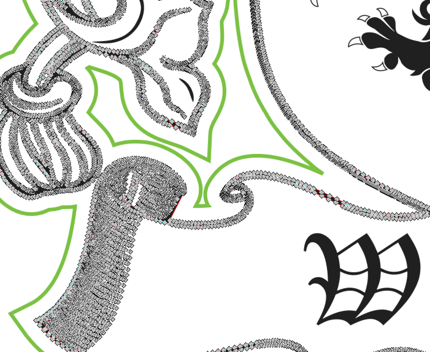
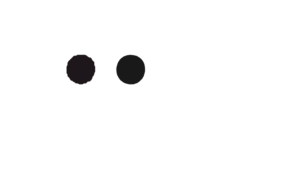
The copy and paste is way rougher, as you may have noticed. I copied over a couple of the filled circle (from the helmet) into a new document. If you didn’t notice, just zoom way into those and take a look.

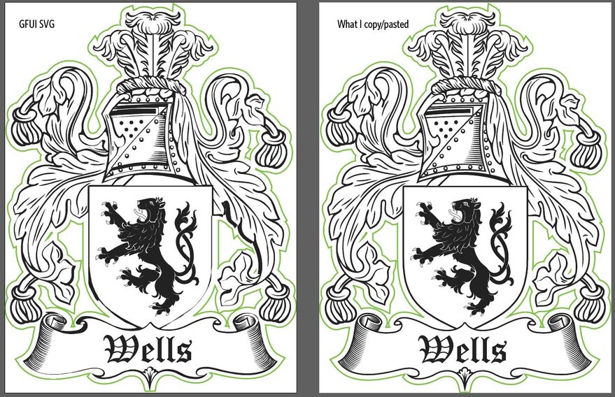
Here’s a comparison. The GFUI version is on the left, original design element on the right.

They have the same number of points.

But, these things are very small (approx .043-.044"), and have a large number of points for such a small area (66 points).

Looking at the SVG code, I wonder if it might be a precision thing as far as placement.

Here is the code for the GFUI version:
< polygon fill="#222222" points="577.9,432.4 578,432.5 578,432.7 578.1,432.8 578.2,432.9 578.3,433.1 578.4,433.2 578.5,433.2
578.6,433.3 578.8,433.4 578.9,433.5 579.1,433.5 579.3,433.6 579.4,433.6 579.5,433.6 579.6,433.6 579.8,433.5 580,433.5
580.1,433.4 580.2,433.3 580.4,433.3 580.5,433.2 580.6,433.1 580.7,432.9 580.7,432.8 580.8,432.7 580.9,432.5 580.9,432.4
581,432.2 581,432.1 581,432 581,431.8 581,431.7 580.9,431.5 580.9,431.4 580.9,431.2 580.8,431.1 580.7,431 580.6,430.8
580.5,430.7 580.4,430.7 580.2,430.6 580.1,430.5 579.9,430.4 579.8,430.4 579.6,430.4 579.4,430.4 579.4,430.4 579.2,430.4
579.1,430.4 578.9,430.5 578.7,430.5 578.6,430.6 578.5,430.7 578.4,430.8 578.3,430.9 578.2,431 578.1,431.1 578,431.3 578,431.4
578,431.5 577.9,431.7 577.9,431.8 577.9,432 577.9,432.1 577.9,432.2 "/ >

And here is the code the original AI version:
< polygon fill="#1B2A1D" points="858.7474,432.7518 858.7896,432.9001 858.8531,433.0274 858.9166,433.1544 859.0014,433.2816
859.0861,433.4086 859.1922,433.5147 859.3191,433.5994 859.4464,433.7051 859.5734,433.7689 859.7429,433.8324 859.9124,433.8747
860.1032,433.9172 860.2515,433.9172 860.2727,433.9172 860.4632,433.9172 860.6327,433.8959 860.781,433.8324 860.9295,433.7899
861.0565,433.7051 861.1838,433.6207 861.2895,433.5147 861.3955,433.4086 861.5015,433.3026 861.565,433.1756 861.6498,433.0486
861.692,432.9001 861.7346,432.7518 861.7768,432.6036 861.798,432.4553 861.798,432.3071 861.798,432.1588 861.7768,432.0103
861.7558,431.8621 861.7133,431.7138 861.6711,431.5868 861.5863,431.4383 861.5225,431.3325 861.4168,431.2053 861.3108,431.0995
861.2048,431.0148 861.0565,430.93 860.9295,430.8453 860.76,430.8027 860.5905,430.7605 860.3997,430.7392 860.2515,430.7228
860.2092,430.718 860.0397,430.7392 859.8702,430.7605 859.7007,430.824 859.5524,430.8662 859.4252,430.951 859.2982,431.0358
859.1922,431.1205 859.0861,431.2265 859.0014,431.3535 858.9166,431.4808 858.8531,431.6078 858.8109,431.7351 858.7684,431.8833
858.7261,432.0316 858.7049,432.1588 858.7049,432.3071 858.7049,432.4553 858.7261,432.6036 "/ >

Notice anything different? Like decimal places?

I save my SVGs out to 4 decimal places, so I’m not sure how that impacted the original AI results? It’s too late for me to think hard. But, the copy/paste version is definitely only saved to a single decimal place.

Are you designing in inches or mm?
You normally save PDF, right?
What are your SVG save settings at for the decimal places field (the AI copy feature relies on the SVG code that is copied)?

When I copy and paste an element (you can copy straight from Illustrator and paste it into a text document), I am getting 4 decimal places on the text/code that pastes in.

1 Like