Alright, so I’ve been wanting to really get behind photo engraving so that I can sell/gift them. I’ve done a couple examples here: My beautiful, laser engraved wife and here The Mountains are Calling, and I Must Engrave
What I’ve found is that in order to get the best results, a few things need to be paid attention to. Firstly, not all photos will engrave equally. What I mean by this is that the more light in a photo there is, the more you can pull out of the photo. Because photos are best when in greyscale/BW, when converting it, blacks will go blacker, and whites will go grey. This isn’t necessarily a bad thing, but the next step should be to get brighter whites, and greyer blacks. This can be achieved a few ways:
-
I use Photoshop, so I will use what I’ve learned and know from there. I use a free program that goes by the name of The Nik Collection to convert my images to B/W. I use the Silver Efex Pro filter, and from there scroll through the different options until I find one that I like; it’s also here that I will increase the structure/brightness/contrast for the first time. Disclaimer: As others have stated in their posts, this is now an unsupported program meaning that as your editing program updates, this may leave The Nik Collection no longer functional. I’m not intending to update my Photoshop as it is completely functional, but this is just a heads up for those who may follow suit in downloading this software

-
The next thing I do is fine tune the brightness/contrast and exposure a little further with Photoshop’s adjustment layers. The closer to white you can get, the better as I’ve found that if there is even a slight color in your whites the glowforge will register an engrave there. Blacks will get hit with full power, so keep in mind that if there are some details in a blackish area, it’s best to try and brighten them up a bit. Once I feel like I have found a good balance, I’ll continue to the next step.
-
I will Mask the darkest sections by using my pen tool or wand tool (here’s a good video explaining the best ways to get the specific sections that you want tutorial) and then click on the “create new fill or adjustment layer” icon below the layers panel. If you have something selected on your image, and then add this layer, it will only apply to what you’ve selected. If you select the Brush tool, and click the new layer mask, you’re able to brush away whatever adjustment you’re adding. For example, if you wanted to brighten the overall image, but touch up an area or two, you can use a black Brush with the opacity percentage changed (100% equal to completely removing the layer effect 1% equal to nearly unnoticeable removal etc)
-
The other two tools I love are the Dodge/Burn tool. Dodge will brighten images, while burn will…well, burn them or darken them. This is essentially the same as the above two steps but just another form. Much like the Brush tool, you can sweep over whatever part of you image you would like to alter, and when you change the Exposure %, it’s similar to the Opacity % of the Brush tool. These tools are extremely helpful if you’re wanting to hit a general area without being too specific in what you’re adjusting such as highlights in hair, flowers, or to darken overly bright sections like reflections or other such things.
With all of that said, these are all things I have utilized with this latest project, and while I knew most of these tools and have used them separately in the past, using them in conjunction to one another took my image to the next level. In following Step 4 of my Glowforge Rules I decided it best to do a test of what I thought would like nice on some draftboard. The issue with draftboard is that it doesn’t exactly show highlights as nicely as other woods, and so it’s only nice to see the general direction of what your image is going to look like on a nicer wood, in my case, Medium Maple Plywood. My next couple of tests were on the Medium Maple Hardwood, with the final three being on the Ply. The following image is from top left to bottom left, then top right to bottom right on my process. All tests were scaled down to 2 inches:
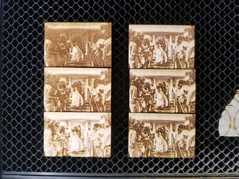
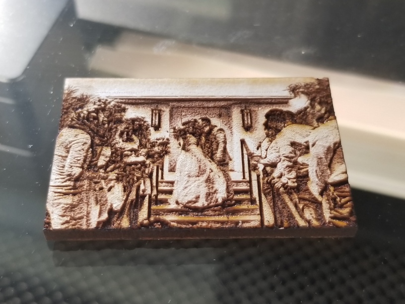
With each iteration, I felt as though I was getting closer and closer to what I wanted, and by the the 5th print, I knew that my next one would be exactly what I wanted it to be. Number 3 was really appealing, but a tad too light; it did have all the details that I wanted, though. Number 4 and 5 were done at the same time, same image, but 4 was a regular engrave, and 5 was the Photo settings.
Image 3
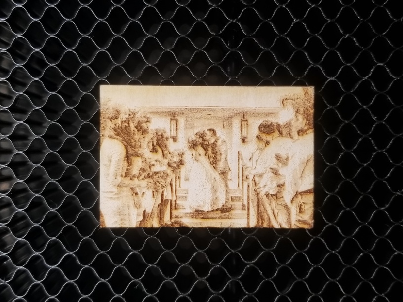
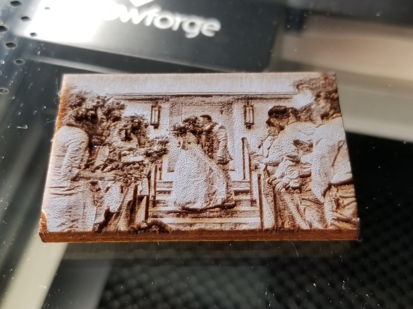
Image 5
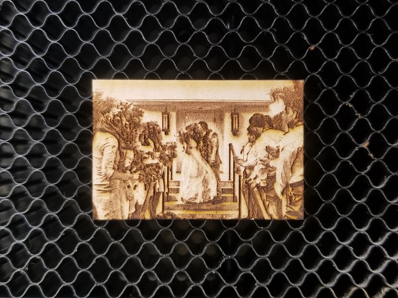
Side by side comparison
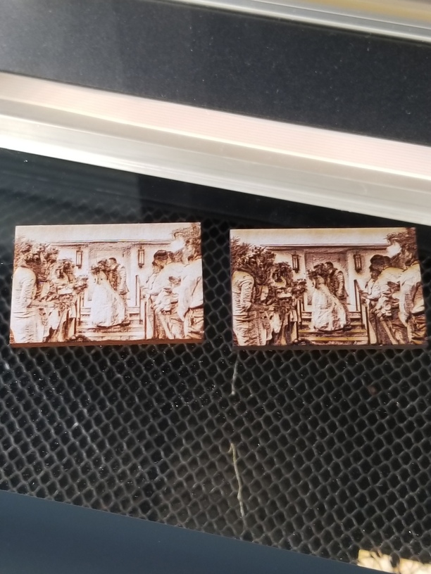
I knew that once I increased the image size, the darker colors of the image 5 would be more accurate, as the details would no longer be smooshed together, and that the lighter colors of image 3 would be even lighter once I increased it as well (experience form another project I recently did). I went back into Photoshop one last time, used my Dodge/Burn tools, increased my contrast a tad bit more, and sent it to print. After determining that the results were sufficient, I went to print the big one
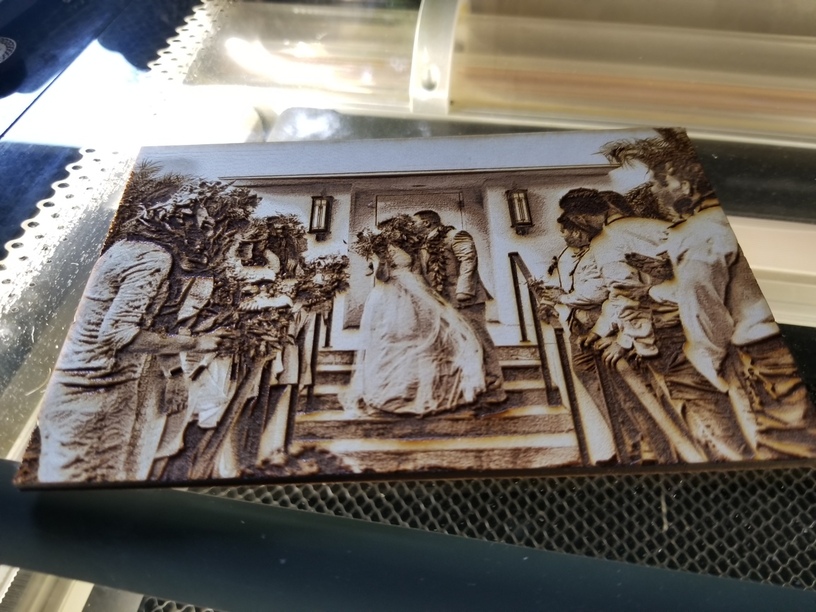
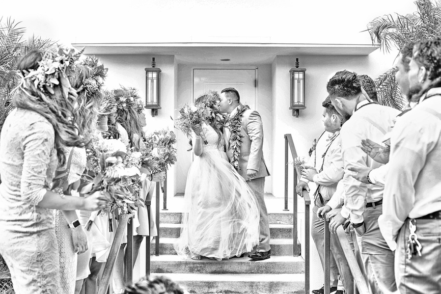
Boy, was this a killer project! I was just star struck ![]() by the results. This turned out better than I could have imagined, and makes me ever more excited to get my business rolling. I of course had to add the date and location of their marriage on the back, and decided that my logo should also be put to use, just in case somebody else sees it and they were wondering who did it
by the results. This turned out better than I could have imagined, and makes me ever more excited to get my business rolling. I of course had to add the date and location of their marriage on the back, and decided that my logo should also be put to use, just in case somebody else sees it and they were wondering who did it ![]()
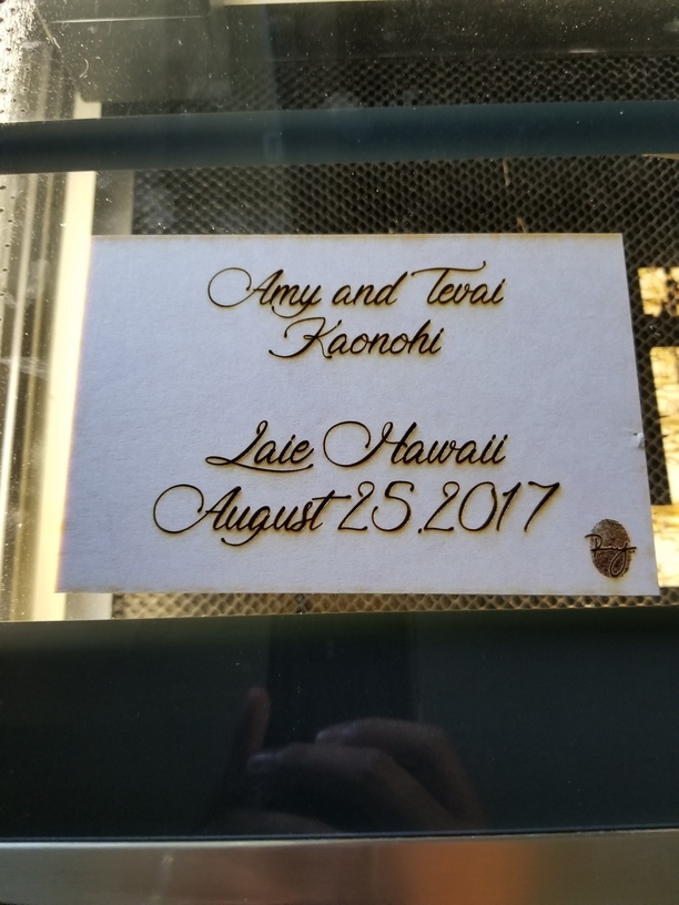
Also to add, I do not remove the masking when engraving these. I know others have mentioned that they do, but I enjoy the added detail that the smoke and residue leaves on the finished print. What I’ll do to preserve it after it’s finished is spray it with an acrylic sealer paint, and this helps with the longevity of the details. Keep in mind that if you use the sealer, it will leave a matte coat, so the more you spray over it, the more this becomes visible. I haven’t tried a regular clear coat, but I’m willing to bet that that would make all of the details pop! I’ll have to get some for later and test it out on one of the small test prints ![]()
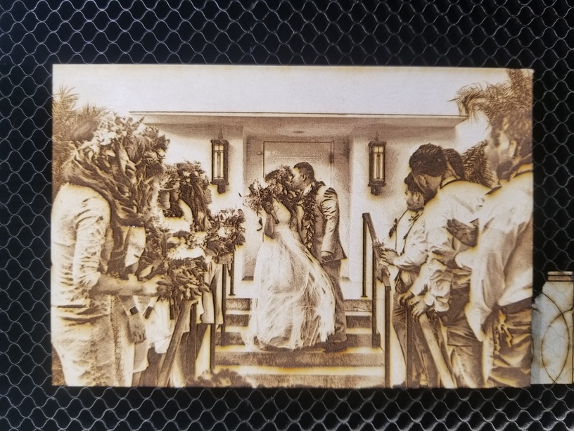
If I had to pass on any more advice, it’s that practice is more important than excitement. I could have decided I was done but knew that the more I practiced the more my future work would be improved. I seriously learned so much while working on this compared to my first two posts. To clarify, I did not modify any of the glowforge settings, and the final image was processed as a Photo engrave. If you have any questions on my process or have any comments, feel free to leave them down below! BTW, this is what my image looked like when being sent into Illustrator to have the stroke/cut line added. This is to help give you a baseline on what the image looks like vs what the glowforge will laser. The cut size was 6x4" for the final cut
Update:
I added that I use The Nik Collection with more details outlined in my guide process, and the size of my test prints. Now have added in that I do not remove the masking tape, and the size of the final print.

