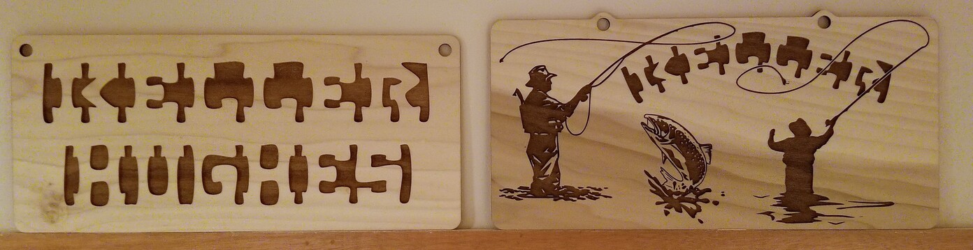
I was making signs today and had fun matching the differences in the wood grain/color to the various sign designs. Both of these are PG Poplar Hardwood but I really like how the sign on the right has a lower dark nature that fits the scene. It’s great that the PG masking is translucent enough to allow for artistic choice.
21 Likes
Nice! It looked to me like some kind of new hieroglyphics until I refocused my eyes and was able to read it.
3 Likes
Great looking signs.
2 Likes
These are great!
1 Like
Great signs but I could never see those hidden pictures.
2 Likes
Yeah the variance in poplar is really cool, I’m glad someone has shared an example of — is finally able to read the signs — oh my goodness what have you done to my brain!
1 Like