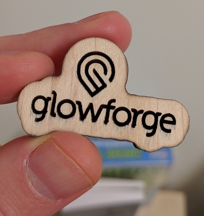
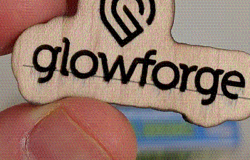
We’ve talked about how we usually demo in “draft” mode at fairly low resolution (225 lines per inch) - I just printed our logo at max vertical resolution, 1.3k lines per inch, and thought you might like the see the results.
There’s a lot more improvement coming from @rachael’s work (you can see some subtle imperfections if you stare at it under magnification) but it’s pretty solid.
Now that’s just lovely. It seems logically that there is a higher risk of burning at the higher resolution–is that the case? Being a laser newbie, I wouldn’t know. But if so I would expect to be more vigilant at high resolution.
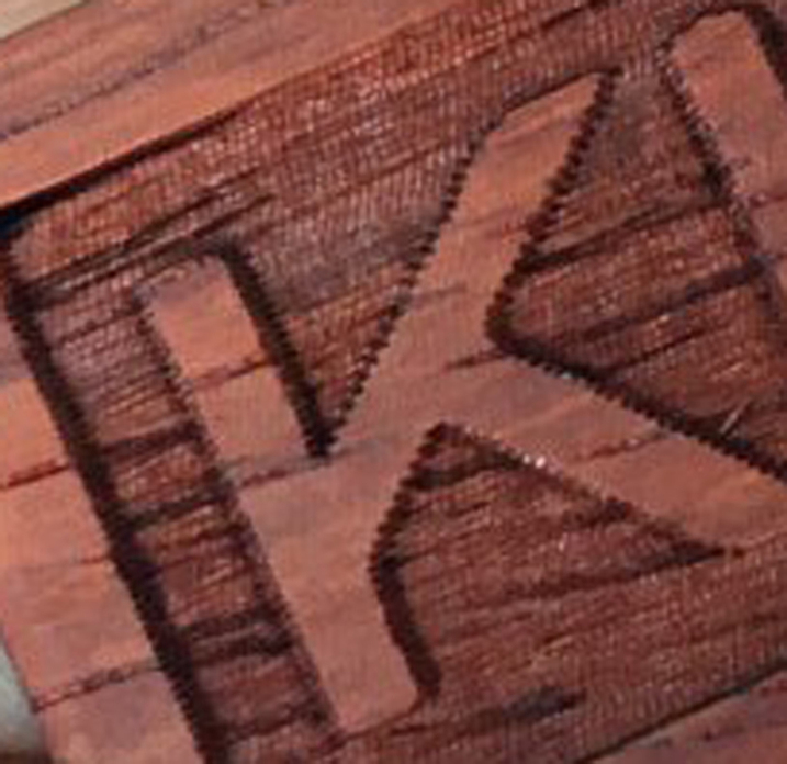
Looking much, much better. Given that the imperfections are linear across the inset “glowforge” I assume that part was done in raster mode. Looks like a relative position missed step but am sure that will be solved with time. I am relieved. Wasn’t going to repost this blowup from yesterday’s twitter feed (@SiemnyKiro7) because was sure it would cause forum grief. Apparently it is at the lower 225 resolution. But now that you have posted a much improved baseline.
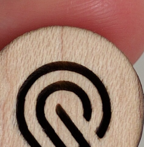
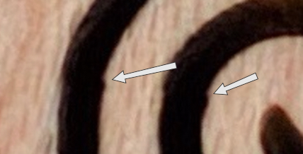
Wow. (yeah, the arcs have one shift to them, but it’s smaller than what’s happening to the edges because of imperfections in the ply.)
So just a clarification: when you say “1.3k lpi” you mean 1300 raster lines per inch? (I ask because part of my youth was spent in the photographic world, where lines per inch meant being able to distinguish a series of parallel lines. And – to a first approximation – being able to distinguish N lines per inch in that sense required 2N+1 pixels/raster lines per inch.)
Ooh, now I am wondering: do people laser-etch intaglio/gravure plates? Or is that incredible stupid?
1.3K/inch precision of the physical positioning of the head. When it comes to actual resolution you also have to take in to account the beam width and effects due to the material type.
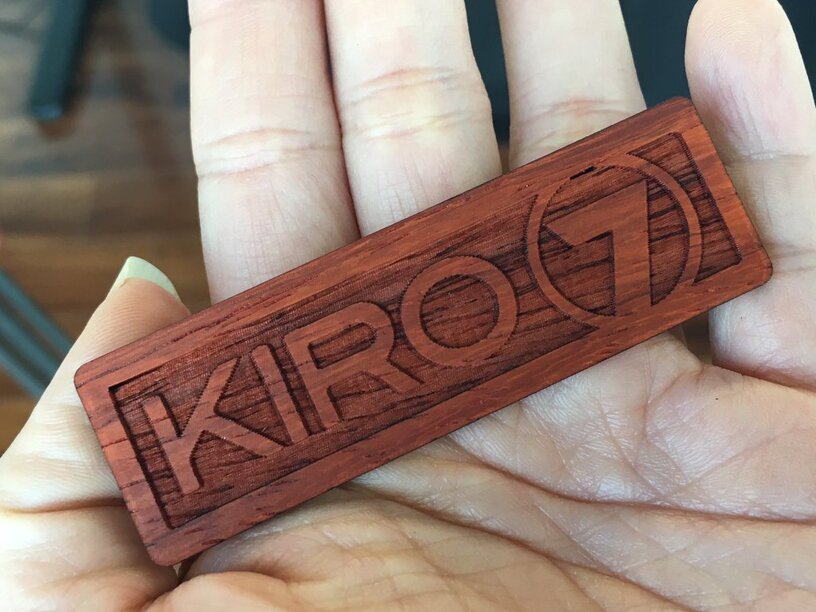
The KIRO 7 was definitely rastered. Meaning the head flies quickly back and forth horizontally with the laser beam turning on and off at appropriate times. The outside cut was vector. I believe sometime in the future the beam power can be variable in combination with the raster movement, not just on/off (but don’t take that belief as fact).
As far as Dan’s glowforge logo, it looks to me to be rastered only because of the way the imperfection shows up across the horizontal axis but don’t know for sure.
There are a bunch of Glowforge videos on youtube that show both the back and forth rastering and the vector cutting of the outside. Don’t have time to search for them right now. Though easy for you to find. I believe the ARS logo video was one of those.
@dan this is a great update we have all been craving. this is great and really shows some good capability. did you deciding to release this picture mark a mile stone in either motion control or power supply ?
That’s what I was referring to when I said it looks like the logo was rastered and there might be a relative missed step. You can see the effect in a straight line across the logo. Look just above the line I superimposed on this image. They have plenty of time to fine tune.
Maybe not. The beam cut width itself is spec’d as .008"-.022" depending on material. Meaning the position resolution will be much, much finer than the line width.