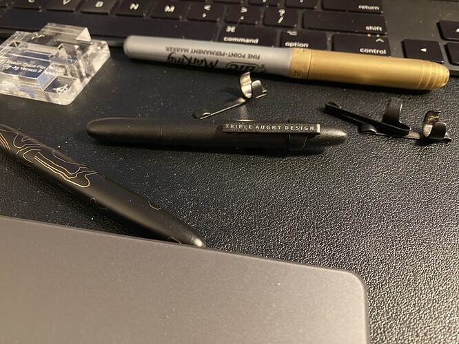
I just bought a nice Fischer pen from one of my favorite outfitting companies, but it didn’t come with a clip. I tend to lose these pens really quickly without a clip, but I wanted it to have the logo.
Thus begins me learning about Hershey Fonts and trying to place text accurately on a clip that is 32mm long and a bit less than 4mm wide, complicated by the fact that the clip is an irregular object.
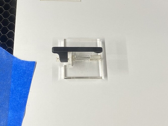
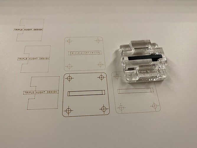
First attempt was a simple jig that raised the clip up enough that it could sit flat. It was superglued to the jig and then I attempted to eyeball placement over an alignment print on some thick card.
That didn’t go so well. Major alignment issues.
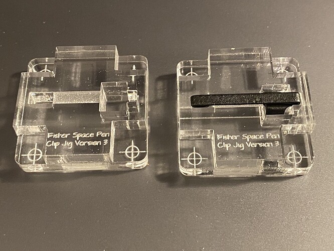
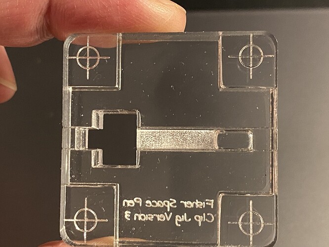
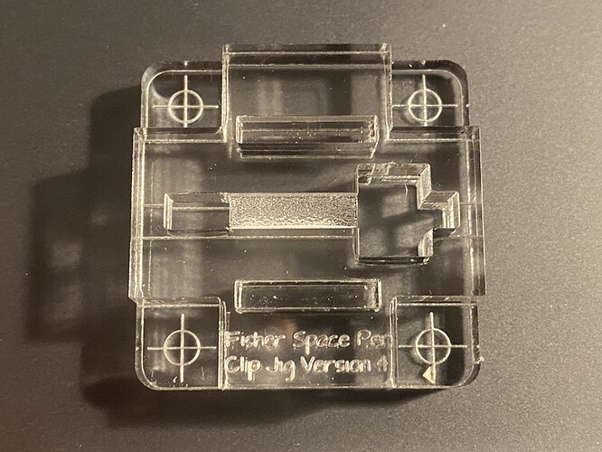
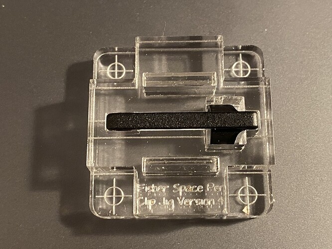
Then it got out of control. Next couple of versions of the jig now involved registration marks, a full build out of thick PG acrylic, and an engraved recess for the clip to recess into. The layer the registration marks are scored into is flipped over so they are close to the card the jig sits on, reducing parallax issues.
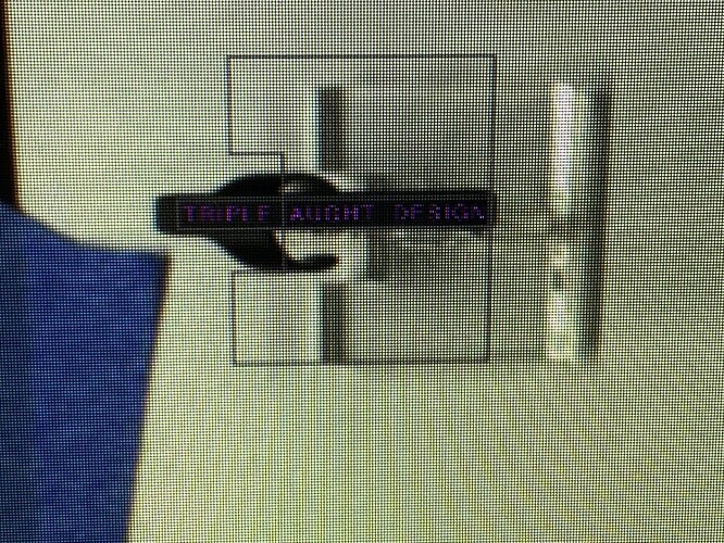
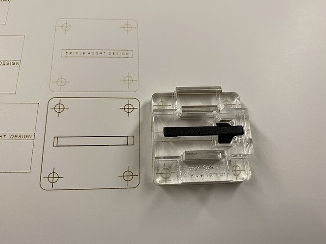
Of note, at this point I am gluing the layers together, which was a big mistake. Alignment issues remain a problem as even the slightest bit off results in visibly slanted text on a 4mm clip. In the next image you can see on the right side of the image that the jig is slightly lower than the left compared to the registration lines. Enough to matter, unfortunately.
So my fourth version of the jig is now assembled taking advantage of the natural slanted kerf of the cut to make small wedges that jam between holes in the the two layers. The length of the slots ensures alignment.
So now I can just score the registration mark on the card which is taped to the bed, drop the clip into the jig and align it, then ignore the registration marks and score the text onto the clip.
And done.
Sorry, photo is of a clip that was minorly affected by the misaligned version 3 jig. But you get the idea I hope.
