Wow! And that looks exactly like the guillotine cutter I used to use. Loved that thing.
1 Like
Nice restoration! Smooth and quiet.
I’ll bet you made louder noises moving it! At least you had gravity on your side, more controlling that effect than lifting!
1 Like
They are showing that product at .063 inches…which is 1.6mm. The kf152 from boxcar…is 1.52 mm … at .1mm off it looks like a very nice starting point. I’m doing the same thing, though I was going to start out with mdf or Lino and build up. Think I’ll purchase some of this sand give it a whirl
I purchased this product and have been doing some experiments today. I made some “plates” in the acetal and some proof grade maple…I have also ordered some exposed polymer but it’s currently lost in fedex-land ugh.
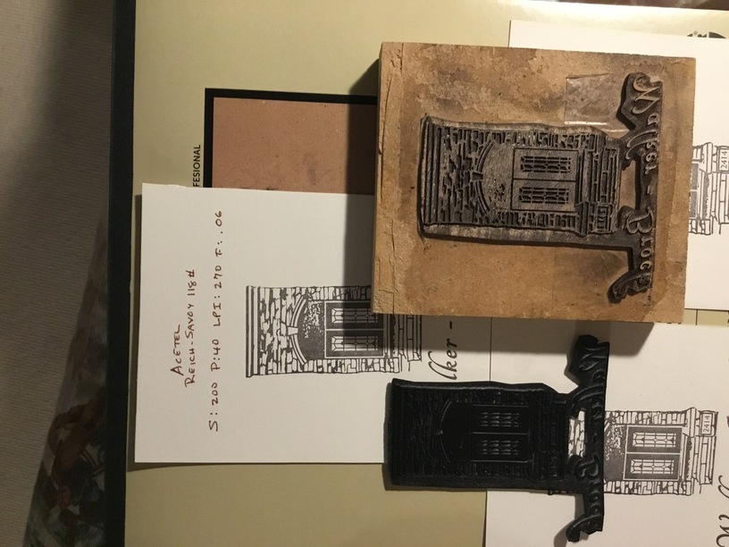
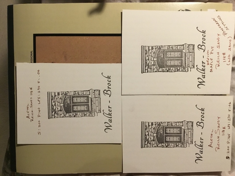
I engraved the acetal with S:200 P:40 LPI: 270 and F:.06 - the result was really promising…thinking I could make a deeper impression with a stronger relief I made another with the power up to 45…also a great result…upping the power further just resulted in too much melt on the base. Both of the successful cuts warped a bit. Then I did another with the proof grade maple.
The acetal was fixed to the boxcar base with carpet tape to account for the warp…both cuts gave very nice results…the lower power setting was better in fact and warped less. The carpet tape is really too strong but I fixed that by sticking to my hand a bunch of times making it sticky enough to grip but not too hard to get off again.
The proof grade maple was a great cut but I would reduce the power considerably…the depth was really not necessary for letterpress and the scorched wood was tough to get clean. The cut was good but the pre-finished product didn’t grab the ink (rubber-based) as well as the acetal - unfinished wood would be better of course. The proof grade maple ply + 3/4 “ Medford = 4 layers of painters tap ended up tho-high
13 Likes
And another test - this was also done with acetal - which really picks up the ink well -…this example was one where the settings were
S:200 P:45 LPI:270 F:.06. - what this is meant to show is that with the higher temperature it also impacted the graphic with the vapourized material - kerf-like. The initials were bolder on screen. I am going to try with a power less than 40 - this may result in less warping - the relief is plenty and the plate may be closer to the original on-screen graphic.
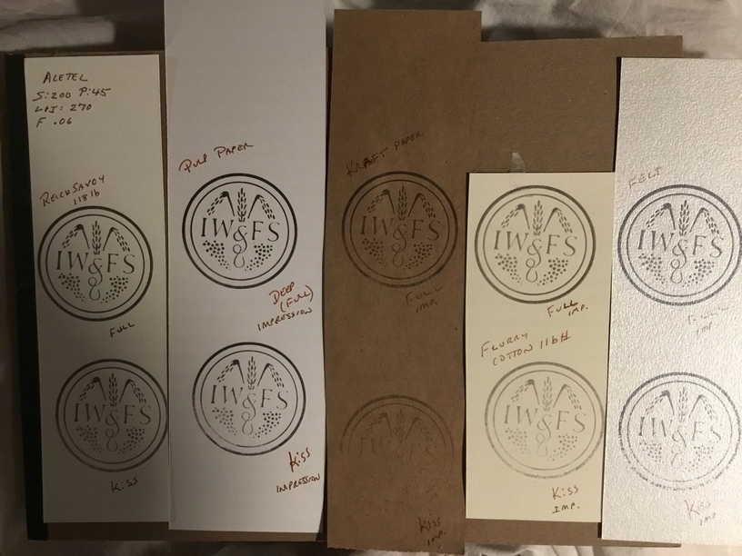
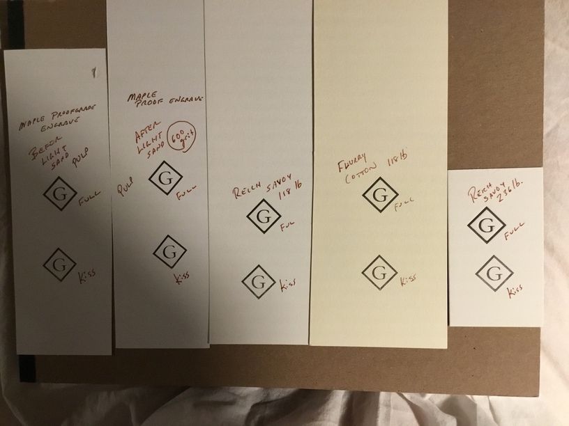
Also result is showing different papers
10 Likes
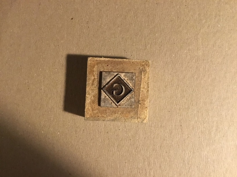
This done with proof grade settings was a wonderful result - better after a light sand on 600 sandpaper - took a nail file to the outside of the square as well - the wood’s grain when burned can impact the graphic.
Once again - proofgrade maple ply + 3/4”mdf + 4 layers painter tape = type high
9 Likes
Looks like some great results, especially your architectural accent. 
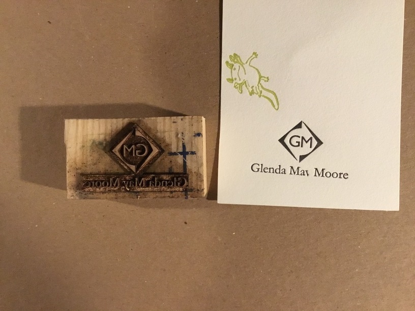
Lastly - the image shows two pieces of my Garamond font - it’s 18pt Garamond light - and the graphic with the font very close to that size. Result was gorgeous but unfortunately the “y” collapsed in the press and the bottom points on the monogram don’t quite meet because it basically got burned away . Using prrofgrade settings is over like for this application. I”love try it again with settings for a less deep engrave… at least before I resort to grayscale shoulders
Too bad - it was looking so promising.
11 Likes
Very cool experiments! I fiddled around with some letterpress-like printing in December for my Christmas cards, using Draftboard, and found that I lost bits by the time I had printed about 50 of them.
2 Likes
I previously used my 3D printer to make blocks…I’m going to do the capital g in a diamond one and compare the result - so far I’m thinking the laser is giving much crisper results… certainly I’m getting very nice detail - finer than I’ve been able to get with the 3D printer.
1 Like
Looks good! I think a little green gremlin photo-bombed that last pic though…
2 Likes