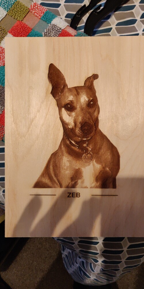
I managed to find a 1" thick chopping board for very little money this week which was going to be perfect for a commission from a friend. He wanted a photo of the dog on it as a gift for his mum. I did the photo and settings and did an engrave test on birch plywood (as I had no other walnut to test …I know, I was nervous too!). This came out just great:
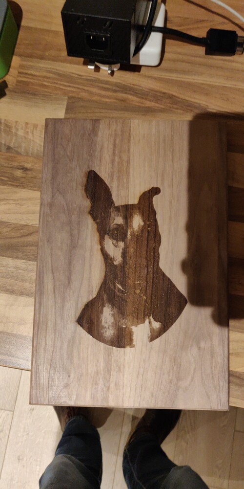
I then went through a bit of a pain full alignment process to try and centre it correctly due to the height of the thing, but that wasn’t the real issue:
Looks great on the birch, what setting did you use for that (curious).
Try sanding it lightly, clean it up and see how it looks. Repeat the process until you are either A: Happy with the results or B: back down to bare wood to start again lol.
Yeh, I was really happy with the birch plywood. Just PG settings for engrave tbh. I think that’s 1000/full power in dots and I ramped it to 265 lines per inch.
I’m wondering about just cleaning the walnut with alcohol in the first instance.
Did you use the Photo Engrave setting on both? (That also looks like you’ll be fighting a variation in the wood - it looks lighter on the right side than the left, and it’s obviously been glued.)
Might be tough to get that one to come out even looking.
One hard thing you will find in photo engraving woods is variation in the wood and the grain will always make a difference in the appearance. I will have to share the picture sometime of a very unfortunate graining in some maple ply. These variations matter a lot less for simple graphics and text, even giving the result some extra character. For pictures, they get tricky. Add the glued board, and it is a trick all around. If you look closely at the board, you will see that the left side is a slice more with the grain of the wood, and the right side goes across the grain. The left side is the type of board you want to look for to get better photo results.
Edit: Maybe better saying that the left side goes more with the ring and the right side cuts through the ring.
What I would recommend is to run a small grayscale engrave on a sample piece of any material you’re going to do and keep it for reference. I’ve done this and it’s saved me so many times.
There’s a good chance you’ll have to run it a few times to get the results you want, but better to do that than to waste a huge piece of material.
Hey @takitus@Jules you’ve both got a ton of experience on this thing now and I wondered if I could run a theory by you on this project please?
I was staring at the train wreck I made of the walnut piece wondering why the darkest engraved sections on the lightest parts of the wood are showing very little in the way of staggered depth compared to the plywood section and had a thought. The plywood test is running a 1000/Full (but power is being adulterated based on how dark the grey in the image is). The Walnut piece is running 350/11, again with power being adjusted by grey. As a result, where the birch ply test has 100 variations of power/grey combo to chose from giving you smooth depth transition (and therefore colour variation), the walnut run has just 11 to chose from.
Might such low fidelity might be the cause of of the almost on/off nature of the engrave? And, might running at say 100/40 help?
Walnut is pretty hard to get contrast on to start with…it’s a darker wood, and when you burn it, it’s harder to see the results on it. Lighter woods give better results.
Only advice I can give without having you go into something like Photoshop to modify the contrast on the original image is to not try to use depth engraving for color on that one.
Try the Draft Photo Engrave setting…you want that dithered not deeper. (Grayscale - Convert to Dots, 170 LPI. And you can lighten the darkness and increase the contrast using the Pattern Density bar…just lower the upper limit on the density. Run a few tests to see what you like.)

 maple ply. These variations matter a lot less for simple graphics and text, even giving the result some extra character. For pictures, they get tricky. Add the glued board, and it is a trick all around. If you look closely at the board, you will see that the left side is a slice more with the grain of the wood, and the right side goes across the grain. The left side is the type of board you want to look for to get better photo results.
