I’m just going to put this here but of course “Your design, Your rules”. You spent $2000+ on a laser. Consider spending ~$20 on an original typeface.
17 Likes
When told I must never I almost always. What load of pretense.
13 Likes
Or know your audience. I snapped this photo a couple days ago of the sign at the local children’s museum. It serves its purpose.
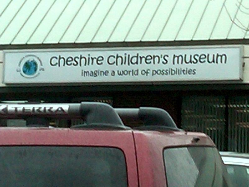
17 Likes
So I can’t use texts anymore  they choose almost everyday fonts… except Time News Roman
3 Likes
I mean absolutely zero disrespect toward people who love papyrus or impact and totally get the urge to be a contrarian toward hardfast rules but when striving to get better at something, sometimes it may be necessary to upgrade. These fonts probably came with your computer and were designed (some quite poorly) to fill some random need in the 90’s and I think some specifically for now obsolete computer monitors. So i don’t think it insane to question their overuse. They’re over used. Everyone has them. It’s the same pop song over and over. It’s the same plot to the same movie ad infinitum. Yada yada yada.
If you get started making music in GarageBand or FruityLoops you might see the need-or-want to upgrade to Logic or another DAW. If you want to get better at making movies you might not keep using iMovie or windows movie maker just because it came with your computer. You invest (or hopefully not pirate) and step up to something like Adobe premiere or final cut etc. You don’t keep recording with your phone, you invest in a camera and some gear. When you buy a saw you don’t only use the blade that came with it just because it came with it, and you certainly don’t avoid trying other blades because someone suggested that the one that came with it might be useable but garbage. I think the same applies to design elements with no need for pretense. Our designs can only benefit.
16 Likes
I see all kinds of fonts that the font police don’t want me to use, well how about a list of fonts that are "approved " and when to use them. 
6 Likes
It is always and never that I have a problem with, each of those fonts are perfect somewhere. None of them are right everywhere or even most everywhere.
I’d love to see a good non-pretentious article on picking the perfect font for a situation. That was not it. It reminded me a lot of being told to never use the passive voice.
8 Likes
Feels like the author is a bit double minded. Don’t use these because they’re overused by people trying to be trendy, but don’t use helvetica because it’s overused and NOT trendy enough.
I agree with many artists that there are some fonts that get a little tired out as movie titles and logos, but some of the fonts on the list are body text fonts, I really don’t think those need a list.
I would agree that it’s better in most cases to use serif fonts for body text in most cases. Eye fatigue and all that.
Don’t agree with helvetica being on the list. Helvetica is the timeless peoples font. It’s probably not going anywhere. It has been the font recently that designers seem to rail against because it’s so good, it can make us lazy.
5 Likes
Right, right there with times new roman. They are not going anywhere, they are not for graphic artists, most of the time, and make for readable text.
4 Likes
I had someone try to throw some shade on a poster I’d done because I’d used Papyrus. I pointed out that a) it wasn’t even actually Papyrus but a vaguely similar looking font I’d found online that was kinda like papyrus minus the degraded bits, and b) that it was a poster for an Egyptian dance and drum class and quite possibly the world’s most appropriate place to use Papyrus.
People get so caught up in what they’re told to think, sometimes they forget to think at all.
17 Likes
I love Comic Sans, Papyrus, and the Bradley one ( can’t remember the exact name). But my business is whimsy, so it makes sense for me. 
7 Likes
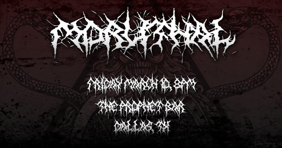
I like the spooky Halloween ones, with the dripping blood. MWAHAHAHAHA!! When I am emperor, it will be the official font of the empire, and all other fonts will be banned. BANNED, I SAY!!
14 Likes
I once needed a font to represent a perilous coffee situation. I used one of those dripping blood fonts and recolored the blood from red to brown. Worked great.
8 Likes
Agreed. Almost any font has some use as seen here.
There are fonts like Arial I wouldn’t touch at all but all in all I think there are thousands of fonts out there who are way worse than the ones on the list. A »timeless« font doesn’t mean that it’ll be suitable for any purpose and sometimes there are more interesting (free)fonts out there to use. So, if in doubt use what you have, otherwise check out sites like https://fonts.google.com or https://www.fontsquirrel.com you’ll might find a really nice alternative. At least that’s what I tell my students. ![]()
7 Likes
I once made an onscreen keyboard where the keys/buttons where blood drops and when pressed they become blood splatters. It was for a medical device, and it was the proof of concept code not intended for customer use, but I don’t remember the font I used. The program manager loved it; everyone else rolled their eyes. Hmmm, maybe it was the font and not the splattering keys that caused the eye rolling 
7 Likes
The advantage of not having the title, Designer or Graphic Artist, attached to my name means I don’t take their rules seriously.
12 Likes
Some people care about fonts just a little too much.
14 Likes
That was great!
1 Like