I could only make out the time. The rest is fractal nonsense. I suspect they were HOPING nobody would show up.
3 Likes
2 Likes
7 Likes

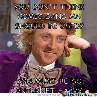
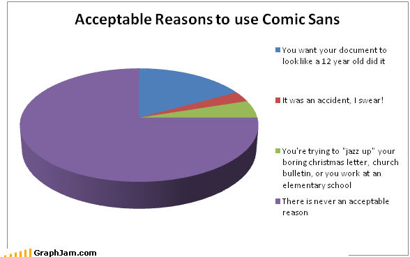
Oh god, you’re blending pet peeves! Now my font snobbery is slamming into my distaste for improperly used graphs. I can feel a pretentious aneurysm forming! *collapse
10 Likes
Like Papyrus was perfect to use for my Passover project since they literally wrote on papyrus in ancient Egypt…
4 Likes
How’d you even read that?! You squint or something?
Now that you wrote what it says, I can kind of make it out if I squint at it, but dang…impressive!
1 Like
My font of choice is Segoe UI Semilight (when I write a lot). Seems to be nice and easy on my eyes.